Trine Rask on observing letters and humans
Name: Trine Rask Educated: Graphic design, Grafisk Høyskole, Copenhagen. Type and Media in The Haag (2003-2004) Works from: Copenhagen, Denmark Background in typography: Trine Rask fell for typography and type design in her graphic design education and further pursued it as a hobby-specialization in the Haag. She has been working both freelance and as an educator. What’s interesting about type: Typography as a tool for achieving clear communication in human interactions. Inspirations: Trine is inspired by the illogical and unique, the non-mechanical, the typographically “wrong”, communication and observation.
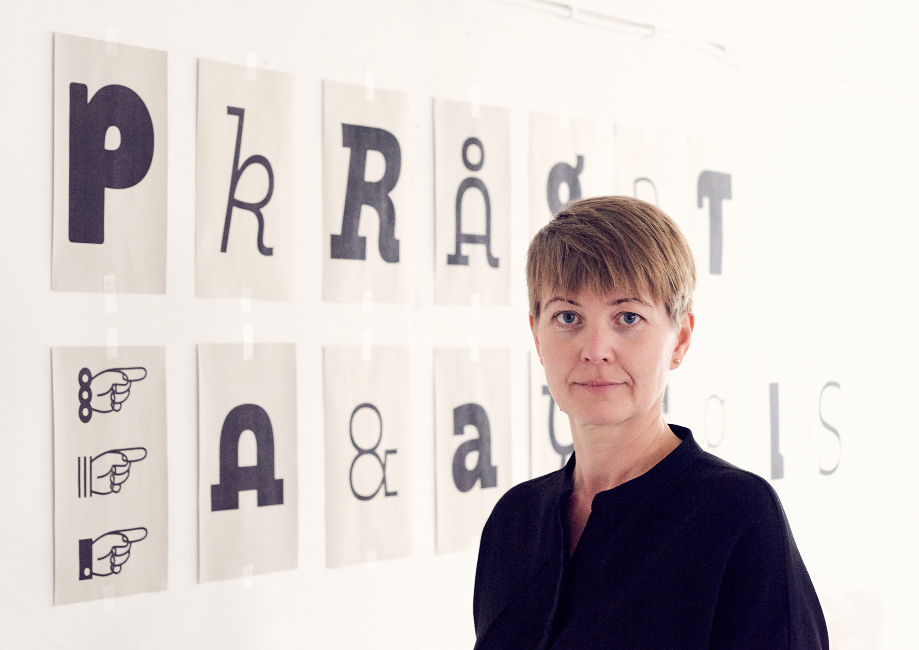
It was a pleasure to interview Trine Rask! We found ourselves jumping from the concrete to the conceptual and back again. Trine is a Danish type designer and creator who values honesty, patience and clarity. She is an observer who constantly seeks to grasp the essence of what people are really saying to each other. The importance of knowledge-sharing and using type to showcase a message in an authentic and intentional way really shines through in her work.
“She is an observer who constantly seeks to grasp the essence of what people are really saying to each other.”
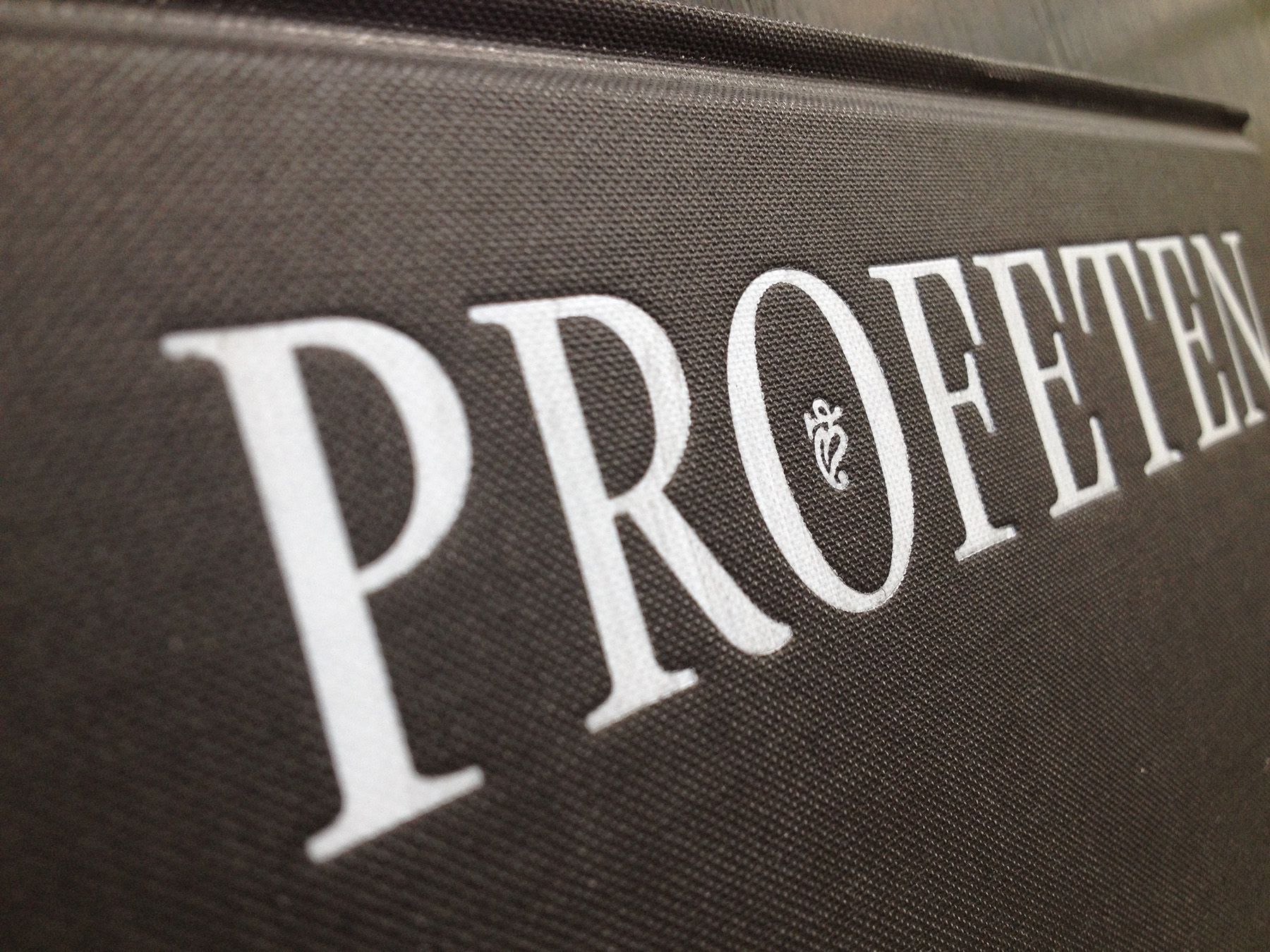
During our conversation with Trine we noticed her desire to provide a flexible solution to a problem, rather than only a beautiful form. This further aligns with her goal of demystifying typography. Her observing personality is visible both in how she situates herself within the context of typography as well as in her designs. Trine is a thoroughly skilled type designer who has managed (and prioritized) working freelance and in education rather than entering bureaus where she wouldn’t be able to work as honestly with typography as she envisioned. Through her work she is able to touch traditional type-setters, children, students and other contemporary designers. If you haven’t seen her work yet, it is about time.
We met Trine for a digital interview on a Friday, just after her lecture at DMJX where she teaches type design for three weeks every year. We get to talking about who she is and almost immediately take a deep dive into what Trine finds interesting about typography.
“I’m very interested in communication, to remember to actually listen to one another when we speak to each other, instead of just making assumptions. I think this is very important in relation to design, that we try to communicate as clearly as possible to avoid misunderstanding and miscommunication. It is in my personality to listen carefully, observe my surroundings and try to grasp what it is people try to say to each other. Type design and typography might be kind of an unseen part of design, but it intrigues me to illuminate the fundamental message in human interactions with other people.”
"I’m very interested in communication, to remember to actually listen to one another when we speak to each other, instead of just making assumptions."
Trine tells us about being inspired by the illogical. She finds it interesting how something that is considered "wrong" or outside the consensus can work as a source of inspiration for designing type. She describes her process as quite mechanical, but that she can gather inspiration from the most non-mechanical, unsystematic and typographically wrong. This could be hand lettering or sign painting, where it just works visually without necessarily following the “rules” of type design.
Trine elaborates on this: “I try to find what’s illogical, because it would be so easy for me to make the obvious or logical. I investigate how I can create something exciting from the unexpected.”
She continues by comparing type to nature, where the most beautiful things cannot be described when drawing them mechanically. Let’s say a tree has seven branches, but all the branches are the same length and thickness. The tree appears unnatural. What if we give the branches more dynamic and varied shapes? That’s how it is to work with type. By changing small details, and daring to step out of the system, you can get rid of the stiffness and staticity and create something that looks effortless.
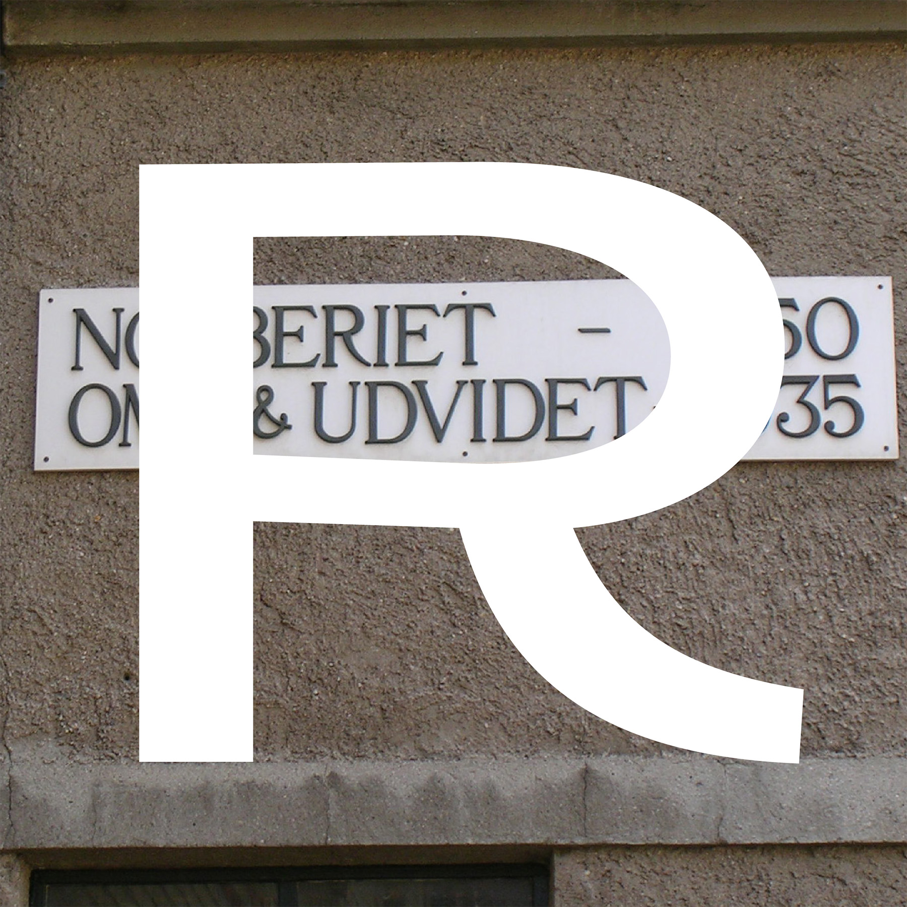
We wanted to learn about Trine’s relationship to type and her thoughts and reflections on typography as a nomadic and ever-changing field. She talked about her journey from pursuing type design as both a hobby and a personal interest, to eventually building a career combining teaching and type design. Her works are not created in a vacuum, but she has encountered different obstacles in her professional life that she has sought to solve through type. North is tailored to our consonant-filled Scandinavian languages and Matita is designed to give children confidence and education in handwriting. We clearly see her wish to empower people and change how typography exists not only in design, but also in society and in relation to our personal identities.
How did you start your journey in type design? “During my education I found a deep interest in typography. In retrospect I wonder why and how, since it wasn’t a topic we really touched on. I think my teachers found it slightly irritating that I found interest in something that was outside the syllabus. But I would like to think that my fascination for typography and type design is connected with my interest for people to express themself in a clear way. I consider myself a person merged together with her work. I often notice things in other people around me, and try to simplify what I see.”
“I would like to think that my fascination for typography and font design is connected with my interest for people to express themself in a clear way.”
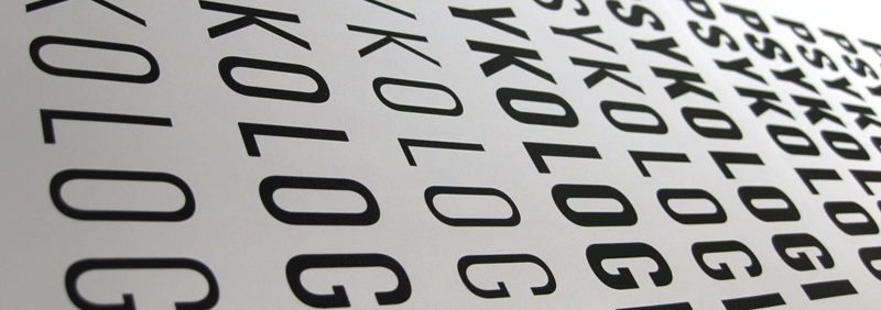
Trine has witnessed the journey of typography as a field in change. During her studies, typography didn't play a big role in design, and type design was secondary. As a mother, she talks about Danish schools not prioritizing time for children to learn how to write by hand. Writing is something you’re just supposed to know instinctively, without really having the tools to fully understand it. About her time in the Haag, she talked about how different typefaces work better for different languages. North was designed as a wish to optimize a typeface to Scandinavian languages. Regarding North, Trine writes: “Languages do not only sound different, they look different when they use the same alphabet. Scandinavian languages have a higher frequency of the letters f and g.”
“My teacher asked me why I wanted my text images to look Spanish, but that wasn’t what I wanted at all! None of the others could read Danish so they couldn’t really understand the issue with the typefaces we were using. When I came home to Denmark, I visited retired typesetters that used to work with letterpressing and told them about North. They were really touched by this design because they themselves had noticed the same issue, but when they raised it, they were told that that’s just the way it is, and there’s nothing to do about it. In turn this touched me, because I listened to my gut and was able to create something that is more than just a beautiful form. Optimizing text with typedesign is, in my opinion, invigorating.”
Trine compares the letters' relationship to one another to the relationship between a group of people in a room. At the start of a social encounter, it may seem uncomfortable and awkward, because they don't know the room or each other. But after a while, getting to know each other and adapting to the gathering, a comfortable inter-human dynamic can develop. It’s the same with letters and type. Working with details that no one can really see, can in time develop into a well functioning sentence, title or body text. Which in turn can make an impression on people’s identities and abilities to express themselves across all areas.
Trine recommends we check out: Linda Hintz (German, works from Copenhagen) https://www.lindahintz.com/ Clara Jullien Isaksson (French, works from Copenhagen) https://claraisaksson.com/ Kasper Pyndt (Danish) https://kasperpyndt.dk/ Sun Helen I. Kalvenes (Norwegian, works from California) https://www.instagram.com/sunhelen/ Allan Daastrup http://www.oldtooltypes.com/ Franziska Weitgruber (German (?), works from South Tyrol) https://franziskaweitgruber.com/