The New Typography and type design in 1930s Scandinavia
Literature on the New Typography tends to focus on the work of a small number of central and eastern European avant-garde artists and poets. In the past few years, starting with Julia Meer’s Neuer Blick auf die Neue Typographie [A New View of the New Typography] (2015), design historical focus has shifted instead towards the New Typography’s broader uptake, modification and use in the printing trade.1 Meer focuses on the German trade, but as I argue in my recent monograph The New Typography in Scandinavia: Modernist Design and Print Culture (2020), the New Typography also gained significant use in the Scandinavian countries during a brief but productive period spanning from around 1927 to 1943.2
The first part of this article briefly presents some of this book’s main findings. First, it traces the New Typography’s origins and explains how this style of typography travelled to Scandinavia through type samples issued by German foundries. This is followed by a discussion of how this typographic style was received and modified by the printing trade. Close attention is paid to the relationship between the Stockholm Exhibition 1930’s use of the New Typography for its graphic materials, and its role as a popularizer of functionalism. The article’s second part adds to my monograph’s narrative by exploring the Scandinavian type design of the period. It focuses on work by the German typographer Jan Tschichold (1902–74) and Danish typesetter Kai Pelt (1915–63) for William Simmelkiær Skriftstøberi in Copenhagen, and the Swedish calligrapher and type designer Karl-Erik Forsberg’s (1914–95) designs for Berlingska Stilgjuteriet in Lund. Although Forsberg’s type design has previously been described elsewhere,3 this article makes new observations on his working method through close readings of original sketches.4 To my knowledge, this article is the first to discuss type design at the William Simmelkiær Skriftstøberi, which was also known under the trading name Grafisk Compagni.5
Origins of the New Typography
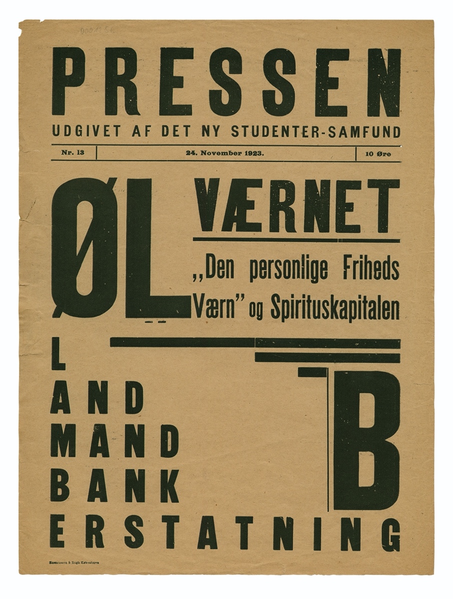
The New Typography emerged in central Europe during the 1920s as the modern movement’s manifestation in the field of printed communication. It can be seen as a counterpart to other ‘new’ movements like the neues Bauen [New Building] in architecture or neues Sehen [New Vision] in photography. Its roots can be traced to the work of a small number of avant-garde artists and poets, who shared an interest in creating new ways of reading or creating new visual languages, as part of their artistic projects or as part of their efforts to create a new utopian society. These practitioners were spread across the European continent. Examples of Scandinavian avant-gardists who experimented with typography include the Swedish painter Georg Pauli (1855–1935), who published the art journal Flamman [The Flame] (1917–21), and the radical D.N.S.S.-group in Copenhagen, led by the poets Harald Landt Momberg (1896–1975 and Rudolf Broby-Johansen (1900–87). D.N.S.S. issued several publications devoted to poetry, visual art and politics. One of these was the political broadsheet Pressen [The Press] (1923–4).
In 1925 Jan Tschichold emerged as the New Typography’s most prominent spokesman when he published a manifesto titled ‘elementare typographie’ [elemental typography].
In this manifesto, Tschichold distilled the avant-garde’s experiments into a series of ten intelligible principles which ordinary typesetters could use to construct New Typography.These principles can briefly be summarized as expressing a preference for asymmetrical over axial composition, for sans-serif over roman or blackletter type, for photography over illustration and for the active use of the unprinted paper surface in composition. Tschichold also argued in favour of standardized DIN (Deutsche Industrienorm) paper formats, as well as for a radical orthographic reform programme known as kleinschreibung [writing small], which called for upper-case letters to be abolished.6
Tschichold’s manifesto appeared in a special issue of Typographische Mitteilungen [Typographic Messages] which he had edited and designed. It also bore the title Elementare Typographie. Typographische Mitteilungen was published by the Educational Union of German Printers [Bildungsverband der deutschen Buchdrucker], which after a period of intense debate integrated the New Typography into its educational efforts. German type foundries quickly recognized the New Typography’s advertising potential and used it to advertise geometric ornaments and older sans-serif typefaces, like Reform Grotesk (1904) or Venus Grotesk (1907). The foundries also began to produce new materials suited to the New Typography, like the geometric sans-serifs Erbar Grotesk (1926) and Futura (1927), Paul Renner’s (1878–1956) celebrated typeface.
The New Typography in Scandinavia
For most Scandinavian typesetters, first contacts with the New Typography did not come through interaction with local avant-gardists or by reading Tschichold’s ‘elementare typographie’ manifesto. Rather, it came through the type samples German foundries sent out to advertise their products.
Scandinavian printers were heavily dependent on imported type, and much of this came from Germany. This is not to say that there were no Scandinavian foundries. Norstedts Stilgjuteri in Stockholm, Berlingska Stilgjuteriet in Lund, William Simmelkiær Skriftstøberi in Copenhagen and Olaf Gulowsen in Oslo were all active during the 1930s. However, the typefaces they produced tended not to be of their own design. Instead, they cast type using imported matrices. As will be discussed, it was only towards the end of the 1930s that these foundries started producing a few original display typefaces. Scandinavian printers were therefore particularly dependent on foreign foundries for innovation in type design.
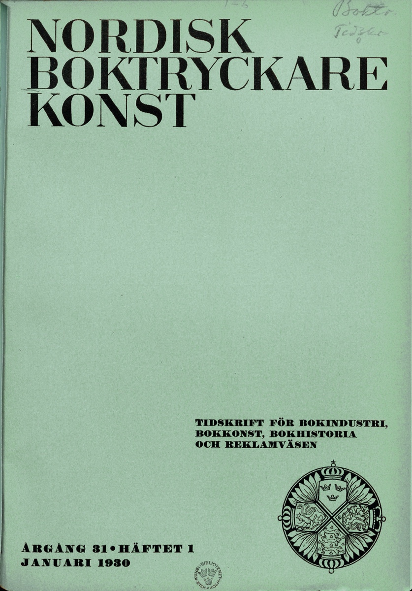
The first trade journal article on the New Typography in Scandinavia was published in 1927 by Swedish master printer Hugo Lagerström (1873–1956). It appeared in his own journal, the influential Nordisk Boktryckarekonst [Nordic Printing Art, 1900–61]. Spurred on by the influx of German type samples executed in New Typography, Lagerström found it necessary to speak up in defence of the Swedish neoclassical typography he had long advocated, and to issue some ‘words of warning’.7 Whilst Lagerström was clearly no adherent of the New Typography at this point in time, his article nevertheless contained a Swedish translation of the ‘elementare typographie’ manifesto and a remarkably even-handed description of the movement as he saw it. Other early articles on the New Typography were less diplomatic. The Danish trade school teacher Emil Selmar (1854–1934), the respected author of two typographic manuals widely used in Scandinavia, labelled it a ‘dysmorphic’ result of a contagious mental illness.8
The Stockholm Exhibition 1930
The Stockholm Exhibition 1930 was an important catalyst for the New Typography in the Scandinavian countries. Often considered functionalism’s breakthrough moment in the region, this was a world fair devoted to Swedish architecture, craft and design arranged by Svenska Slöjdföreningen [The Swedish Society of Crafts and Design]. The exhibition’s profile was shaped and managed by Gregor Paulsson (1889–1977), chairman of Svenska Slöjdföreningen and the exhibition’s commissary-general. Through active commissioning, Paulsson ensured that everything from the exhibition’s architecture to its graphic materials conformed to the same functionalist vision.
Many of the exhibition’s most high-profile graphic elements were designed by the architect Sigurd Lewerentz (1885–1975). Among these was the winged V-symbol, visible everywhere in the exhibition grounds—on printed materials, on flags, and at the top of the iconic, 80-meter-tall advertising mast. Lewerentz also designed the mast’s illuminated signs and the geometric sans-serif letters exhibitors were required to use for their signage. Lastly, he designed the exhibition’s two official posters, both of which featured geometric sans-serif lettering of a similar design to that used for the signage. The consistent use of the era’s most modern letterform served to tie the Stockholm Exhibition’s functionalist programme and the New Typography tightly together.
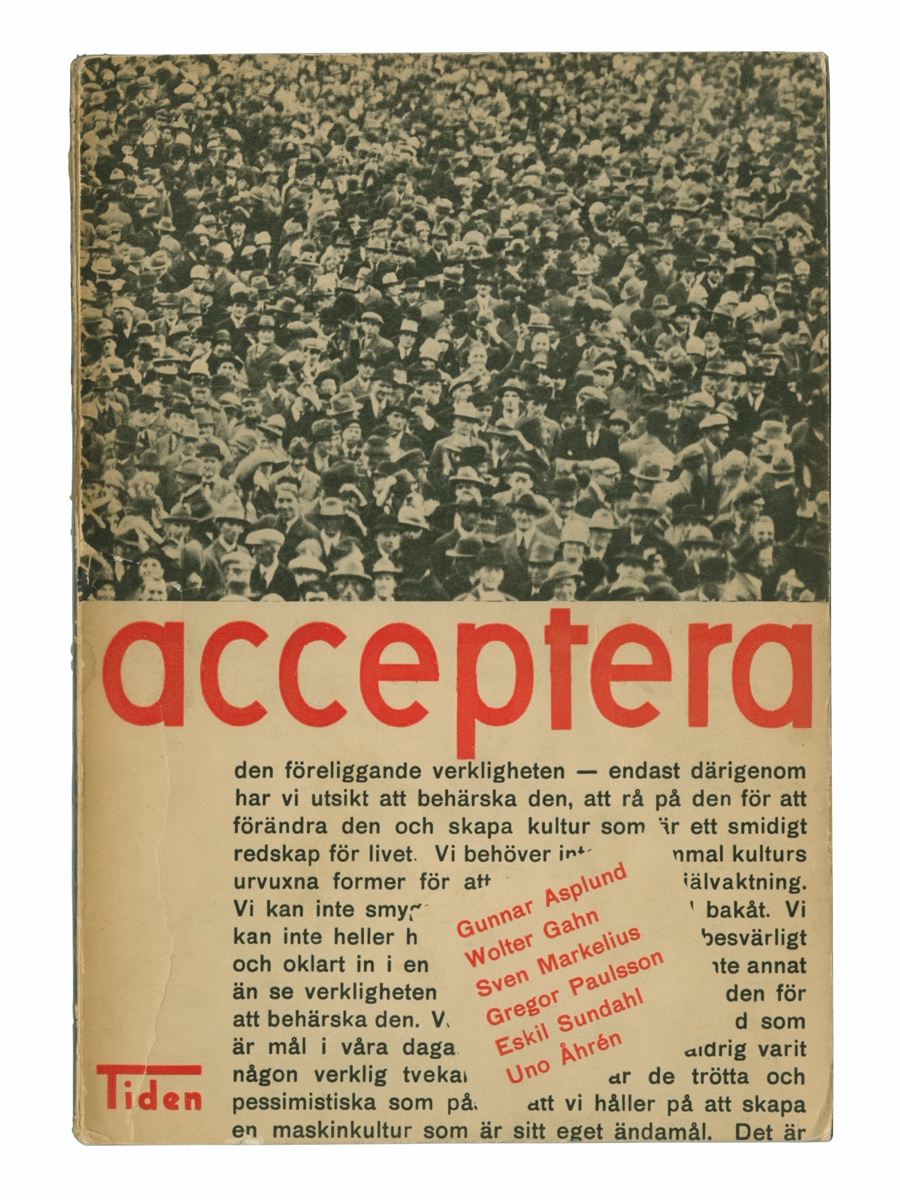
The closest alignment between functionalism and the New Typography can arguably be seen in the cover design for Acceptera (1931). This book, sometimes referred to as a ‘functionalist manifesto’, was written collectively as a defence of the exhibition by Paulsson and three other central figures responsible for its organization. The cover design corresponded diligently to Tschichold’s principles of ‘elementare typographie’. It employed an asymmetric layout. The text was set entirely in sans-serif type. The title was set in lower case, in partial fulfilment of the call for kleinschreibung. Photography was used instead of hand-drawn illustration. The author’s names were set at an angle to instill a sense of urgency, and extreme variations in size were used to create a logical visual relationship between the different groups of type.
Domestication
Although the New Typography initially received a cool reception in the Scandinavian trade press, Lagerström and others soon started softening their criticism and began to search for ways to modify the New Typography according to the needs and preferences associated with commercial printing trade practice and their local circumstances. By 1929 Lagerström was prepared to state: ‘it is now time to go ahead and try the new phenomenon, “the new style of our times”, and retain the good but reject the bad’.9 In 1930 Nordisk Boktryckarekonst was redesigned to a standard DIN A4 format. The previous neoclassical cover design was traded in for an asymmetrical composition printed in dark blue ink on a bright eggshell blue card. However, the cover was set in a bold Bodoni, rather than a sans-serif typeface. Although Lagerström was prepared to adopt several of Tschichold’s principles, he remained unconvinced by the call for sans-serif type.
Typographic development was influenced by functionalism in several sometimes-conflicting ways. The popularity it gained through the Stockholm Exhibition led to a fashion known as funkis, which applied functionalism’s stylistic attributes with little consideration or understanding of its underlying principles. In typography, funkis was characterized by tropes like pictorial typography, geometric ornaments and the use of justified text-blocks, all of which subjugated clear communication the hierarchy of the text to visual considerations. In August 1935 Tschichold visited Copenhagen to give a series of talks on the more moderate version of the New Typography he had been developing in the intervening years, and which he would disseminate to a wider audience later that year in the book Typographische Gestaltung [Typographic Design]. Tschichold’s talks were enthusiastically received by local printing trade figures for their descriptions of a genuinely functional typography freed from the ‘misunderstandings’ of funkis. When Typographische Gestaltung appeared in Danish translation it was duly given the title Funktionel Typografi (1937).
By popularizing the idea of functionalism, the Stockholm Exhibition shifted the focus of debate on the New Typography from its formal means to its function.This opened for a host of new interpretations, even in the traditional field of book design. In Sweden, for instance, the artistic director of printer-publisher Nordisk Rotogravyr Anders Billow (1890–1964) was inspired to develop a reformed style of photographically illustrated book which made the most of the rotogravure printing process his employer specialized in. In Denmark, architect Steen Eiler Rasmussen (1898–1990) designed a series of books which in visual terms had little in common with the New Typography, but which relied on functional forms refined by tradition or identified in historical examples. Although Scandinavian practitioners found ways to adapt the New Typography to book design in such ways, it was still predominantly considered an advertising style.
Scandinavian type design
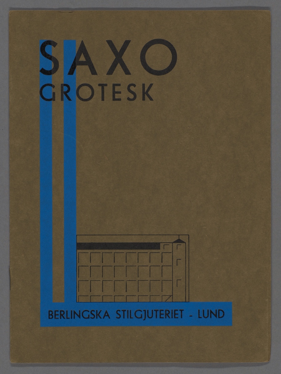
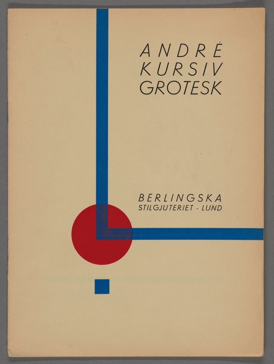
As mentioned previously, Scandinavian foundries lacked a tradition for type design and cast type using imported matrices. The resulting typefaces were nevertheless often marketed with names that differed from the original, and sometimes with ones that had local or national connotations. For instance, Berlingska Stilgjuteriet produced a version of J. John Söhne’s Polar Grotesk (1930) with the name Saxo Grotesk. ‘Saxo’ was a reference to the medieval scholar Saxo Grammaticus (ca.1150–1220), who lived and worked in Lund where Berlingska was based. Despite Lund being Danish in Saxo’s time, a type sample for Saxo Grotesk lists its Swedishness, high quality and low cost, as selling points.10 The design of the type sample was not traditional, however. Berlingska Stilgjuteriet followed the German foundries’ lead by setting it in New Typography. This visual strategy was even more pronounced for another of Berlingska Stilgjuteriet’s sans-serif typefaces, André Kursiv Grotesk, where the asymmetric composition is accompanied by geometric ornaments and active use of the unprinted paper surface. Appeals to patriotism, mixed with promises on quality and price, were used as selling points by other Scandinavian foundries too, suggesting it may have been a common strategy. A type sample issued by the Oluf Gulowsen in Oslo advertised: ‘Our typefaces are completely Norwegian and really good, additionally they are cheaper than others’.11 However, the matrices used originated from the Monotype Corporation in Britain.12 Whilst most of the type issued by Scandinavian foundries were produced along the lines described above, William Simmelkiær Skriftstøberi and Berlingska Stilgjuteriet commissioned and produced a handful of original designs from the mid-1930s onwards.
William Simmelkiær Skriftstøberi
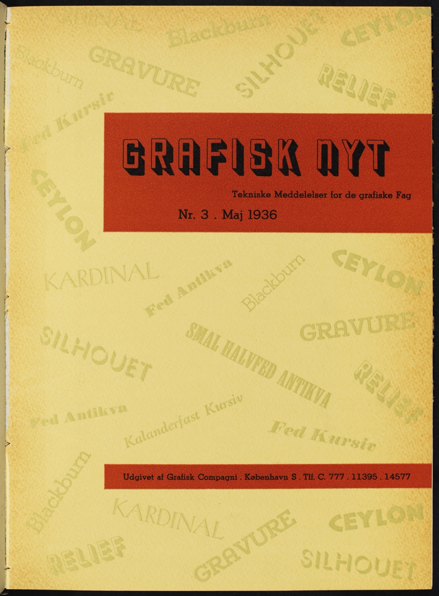
William Simmelkiær Skriftstøberi, also known under the trading name Grafisk Compagni, first attempted to commission an original typeface in 1935. During his visit to Copenhagen that year, Tschichold toured local printing establishments and met with important figures in the Scandinavian printing industry. A visit to William Simmelkiær Skriftstøberi and a meeting with director Svend Simmelkiær (1892–1939) formed part of this itinerary. Their meeting was productive. According to the foundry’s house organ Grafisk Nyt [Graphic News] (1935–43), Tschichold agreed to design a typeface for the foundry. According to the plan, it would be released the following year.13
A finished typeface never materialized. However, it seems Tschichold did work on the commission. A sketch for a surprisingly playful and idiosyncratic display typeface, containing a complete set of upper- and lower-case letters alongside the words ‘grafisk compagni’ and ‘KØBENHAVN’, can be found reproduced in Christopher Burke’s monograph Active Literature: Jan Tschichold and the New Typography (2007).14 Many of the letterforms featured contrasting stroke widths similar to those found in Morris Fuller Benton’s famous art deco typeface Broadway (1927), others were executed solely in a thin or a thick stroke. Selected letters were given curious rounded terminals, and the upper-case ‘V’ and ‘W’ unusual wavy strokes. Burke speculates that the design may have been intended for the Uhertype company. In my opinion, the inclusion of the names Grafisk Compagni and København [Copenhagen] implies it was created for William Simmelkiær Skriftstøberi.
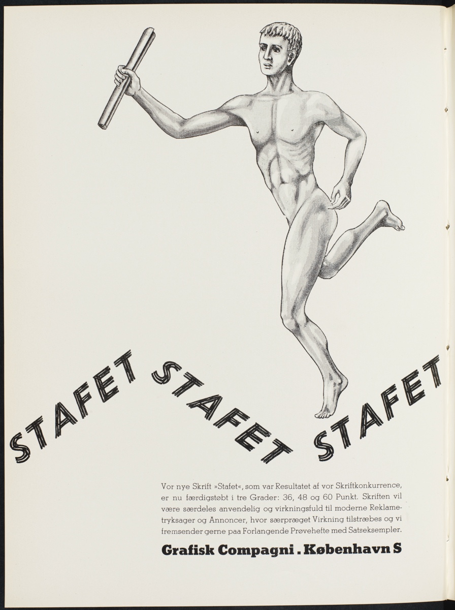
Two years after the attempt to produce the Tschichold typeface Svend Simmelkiær announced a type design competition in the pages of Grafisk Nyt. Assuming many would find the task unfamiliar, Simmelkiær sought to make participation as easy as possible. All that was needed to enter the competition was to submit a ‘loose sketch’ communicating the essence of the proposed typeface.15 The job of turning the sketch into a finished product could be completed in-house. The competition’s winner was Kai Pelt, a typesetter at the Aalborg Stiftstidende newspaper.16 His entry was initially referred to as Palet [Palette], but upon publication this had changed to Stafet [Relay]. Whether Pelt was inspired by Simmelkiær’s mention of a loose sketch is unknown, but his design was certainly sketch-like in appearance. The letterforms were clearly modelled on an oblique sans-serif, but instead of solid strokes the letters were made up of three parallel lines. The width of these three lines varied, so that they at times merged into one another, and at others remained separate. Thereby, Pelt created interplay between light and shade. The typeface’s sloping angle served to strengthen associations to handwriting.
Articles about Stafet appeared in Grafisk Nyt, and adverts were placed in local trade journals like Bogtrykkerbladet [The Master Printer’s Journal]. Type samples were also developed.17 However, although the typeface gained some use immediately after publication, it failed to make any sustained impact on Danish, or indeed Scandinavian, printing. A brief history of William Simmelkiær Skriftstøberi published in 1948 lists numerous typefaces produced by the foundry but does not mention Stafet.18 It seems Pelt’s typeface was already forgotten.
Berlingska Stilgjuteriet
Type design at Berlingska Stilgjuteriet is near synonymous with Karl-Erik Forsberg. Best remembered today for his roman Berling (1951), Forsberg also designed a handful of modern display typefaces during the 1930s. Forsberg’s first design was Ballong [Balloon] (1932), a geometric sans-serif constructed entirely with a compass and ruler. Noticeable characteristics included a combination of long ascenders and short descenders. Ballong also contained a ‘ball-and-stick ‘r”, like that found in early versions of Renner’s Futura, as well as filled counters inspired by Renner’s later stencil face Futura Black (1929). Upon their completion, Forsberg submitted the drawings for Ballong to Berlingska Stilgjuteriet, suggesting it could be produced as a wooden poster type. Whilst the foundry rejected his proposal, it also encouraged Forsberg to send any future designs for consideration.19
Forsberg took the foundry at its word and submitted drawings for two further typefaces, Parad [Parade] in 1934 and Lunda [From Lund] in 1936. This time Berlingska Stilgjuteriet agreed to produce Forsberg’s designs. Parad appeared as a finished typeface in 1938 and Lunda in 1941. Parad was an elegantly proportioned set of condensed decorative capitals. Their upright form was emphasized through the design of the vertical strokes which were made up of four evenly spaced lines, three hairlines to the left and a single thicker line to the right. These four lines merged into thin horizontal hairline strokes, which at the top and bottom of the letterforms carried seamlessly into bracketless serifs. Forsberg’s next design was the cursive Lunda. The typeface’s most notable feature was arguably the large contrast between the broad vertical strokes and the thin hairlines, which in the lower case were sharply diagonal. Though described here as cursive, Lunda was geometrically constructed rather than calligraphic. It can therefore be seen as a continuation of the modernist type design tradition Forsberg had entered with Ballong, rather than a rupture paving the way for his later traditionalist work.
The drawings for Parad and Lunda show a change in Forsberg’s working method. For Ballong he started with a plain piece of paper onto which he drew the baseline and lines for the x-height and cap height, before constructing the letterforms with a compass and ruler. Parad and Lunda, on the other hand, were constructed and structured using graph paper. Parad, with its vertical stress, mirrored the structure of the graph paper particularly closely. Following the paper’s square grid, Forsberg drew pencil outlines which were later filled in with ink. The grid was used to structure all details of the letterforms, right down to the width of the hairlines, which were one square wide. Although less immediately apparent, graph paper was also used actively to construct Lunda. By using the grid to place his ruler at a fixed angle, Forsberg could easily construct the typeface’s consistent sloping angle. For both Parad and Lunda curved lines seem to have been drawn freehand.
Conclusion
Scandinavian typesetters first became acquainted with the New Typography through German type samples, not through interaction with local avant-garde practitioners or by reading Tschichold’s ‘elementare typographie’ manifesto. Although initially dismissive, local trade journals soon after became arenas for debate on how the New Typography could be modified to suit local and commercial needs, preferences, and circumstances. Uptake was aided by the Stockholm Exhibition 1930’s popularization of functionalism in the region. Scandinavian foundries followed their German counterparts’ lead by issuing type samples in keeping with the New Typography. Two of these, Berlingska Stilgjuteriet and William Simmelkiær Skriftstøberi produced a handful of modern display typefaces. Interest in such typefaces, intended for advertising, would have increased in parallel with the New Typography’s popularity Although they did not result in finished typefaces, Forsberg’s design for Ballong and Tschichold’s probable design for William Simmelkiær Skriftstøberi manifested an even closer relationship between the New Typography and Scandinavian type foundries; the former by drawing on formal aspects of Renner’s Futura, and the latter through association with the movement’s most prominent spokesman.