Interview with typographer Ida Nygaard
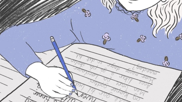
Can you remember learning to write for the first time? Repeating the same letters over and over again. For example the capital A or a small o. Over time you learned to connect these letters into words. If you grew up in Norway in the 70s, you probably learned to write in løkkeskrift. Or if you went to school a little later, maybe you learned stavskrift.
Ida Nygaard has made Stavskrift and Løkkeskrift into digital typefaces. These are the typefaces used to teach children handwriting in Norway today. Ida works as a typographer and graphic designer, and we were curious to know more about her and her relationship with type.
Bio-questions:
Who are you?
My name is Ida Nygaard, I’m from Oslo and I’m 55 years old. I live in Vålerenga and have been running my own business since 2004. I work from a shared office space in the house next to mine, so that’s great. And I am a typographer.
Where did you get your education?
I did my education at Sogn Videregående skole and was an intern at Grafisk sats og repro in Oslo. Two years in school and two years as an intern. After that I could call myself a typographer.
Where do you work?
Well, usually I work in this shared office space, but in the last 9 months I have been working from my cabin, as we have been in covid-exile. I can work from anywhere, so I’m lucky in that way.
What is your experience with type design?
The skoleskrift typefaces were made from a coincidence really. I’m actually not a type designer, so Stavskrift and Løkkeskrift were the first typefaces I made. When I got the question if I could handwrite some stavskrift for educational books, I thought to myself that it was a lot of text. Why not just make it into a font? So that’s the back story.
Why are you interested in type?
My father is a typographer, so I grew up watching him at work. He was very good at explaining and drawing, and after some time he became a teacher at the vocational school. I was introduced to this world through my father. As I grew older, I wanted to become a typographer or a teacher, but I am very happy that I chose to study typography.
Do you have any source of inspiration when it comes to typography?
I have to say my father again, and his colleague Øyvin Rannem. The day he turned eighty years old we went to Rome, and he showed us a lot of sites with typographic history. Very old scripts and parts of the typographic evolution. Things like that inspire me a lot.
What does your everyday life look like?
When working, I spend a lot of my time in front of a screen. I feel lucky to have some regular clients that I work with. I spend maybe half of my time producing and designing, and the other half I am talking to clients and running my business. I work all by myself, so I must do the accounting as well. I produce a lot of books for children in primary school and that’s something I love to do. Varied projects are nice.
I feel lucky to be working on books that are still being printed. The kind of books I make are still in production and are probably some of the few books that haven’t gone digital. It’s important for children to learn how to write by hand, with a pencil on paper. I don’t think this will ever go away. Everyone needs to learn how to write by hand.
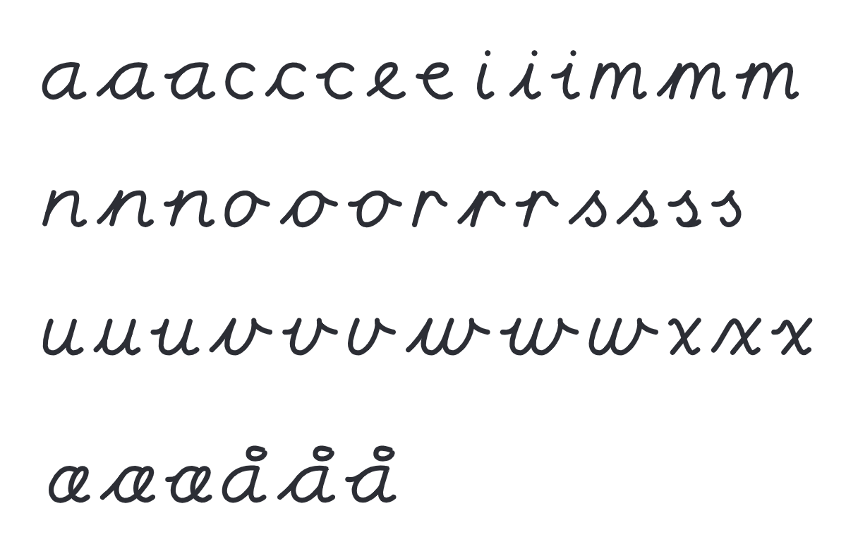
How was the work process behind your typefaces for handwriting in school, Stavskrift and Løkkeskrift?
The typefaces had to fit into the curriculum, so the technical aspect was the most important. Especially to figure out how the handles for each letter could connect. I have to say that I had lots of good help on this project. I mapped how the letters should look, drew them by hand, and then got help making them into vector drawings.
Trine Paulsen helped me with drawing them digitally, and Trine Rask did the programming. They are both very talented, efficient people, and really know what they’re doing. These are quite special typefaces that needed a lot of tweaking, because the letters should be able to connect with each other. If you have different letters in a word, it may be that the handles for each letter look different than in another word with the same letters. I had to make several variations for each letter, some of them have up to four different variations. These are called contextual alternates, which means that the letters change according to which letters are in front of and behind them. That is the most challenging part of this typeface.
What I had hoped for these typefaces, and haven’t managed to do, is that the schools had used them more. When children learn stavskrift and løkkeskrift at school, it would be wise of the teacher to also use the typefaces in communication with the children. In notes they send home to their parents and such. I probably should have made the typeface available on other sites as well, but I have stayed with Luth. I can’t say that I have become rich from it, that’s for sure.
As of 2020, it is no longer mandatory to teach children løkkeskrift or stavskrift, but more focus on developing one’s own personal handwriting. What do you think about this?
If you want to write by joining letters, you will probably end up with something that resembles stavskrift. When I was in primary school in the 70s, we all had to learn løkkeskrift. But if I had met all my classmates today, we would all have different handwriting. It’s about having a foundation before you start finding your own style. It is important to have a good base before you develop your writing into your own.
What projects are you working on right now?
I work a lot for primary schools, and a teaching material called Magi. It consists of books for pupils and teachers, and teaches the Norwegian language. It is published on GAN Aschehoug, who I work the most with. I also do projects for Boldbooks, which is a portal for authors that want to publish their own book. It’s very fun, as there are many people that are truly passionate about their projects.
Are there any projects you want to do more of?
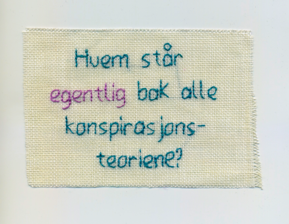
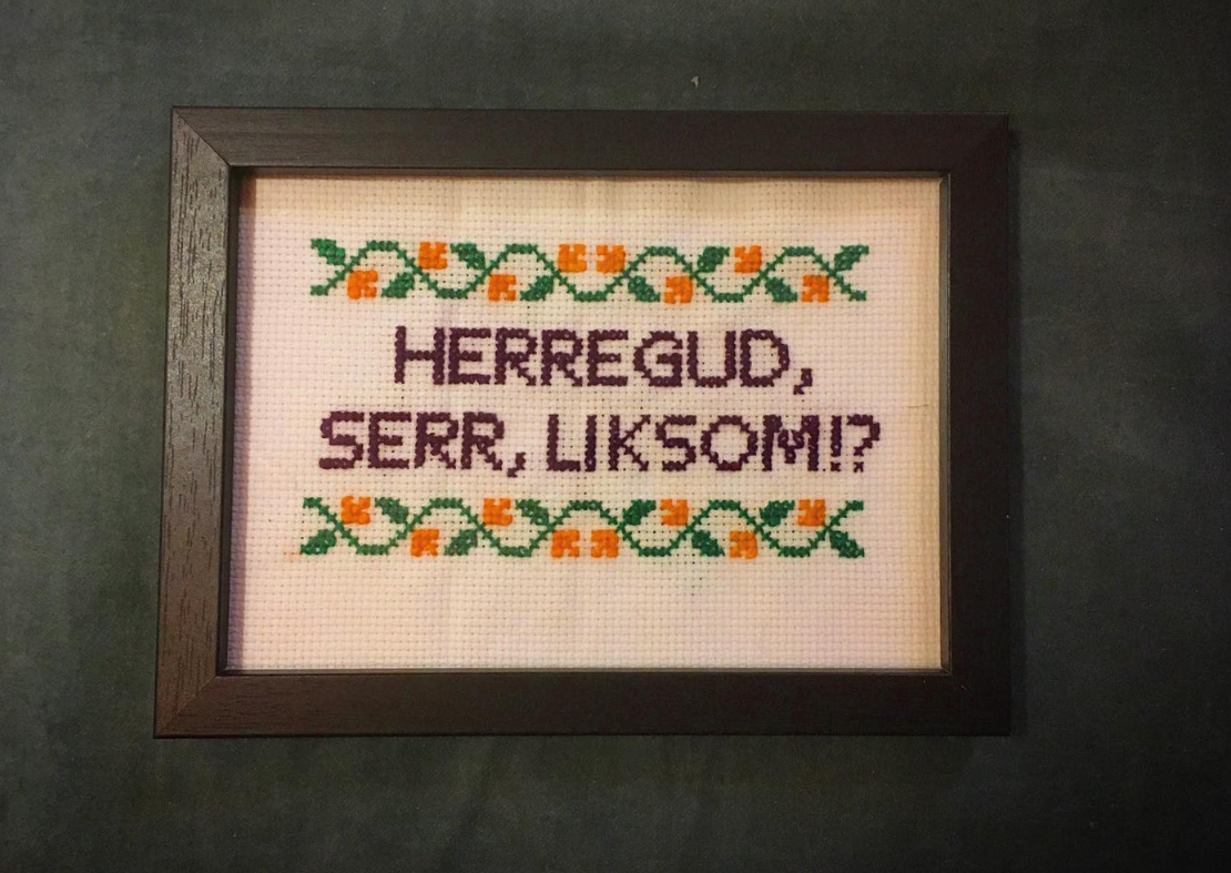
I enjoy having varied tasks. I find lots of inspiration in geriljabrodering for instance. I also have an idea of making a podcast, just one episode, but I have many things I want to do. I like having some projects as a base, and then being able to add some fun things on top.