Interview with Stefan Ellmer
Stefan Ellmer is a type designer from Austria. He has studied in Vienna, Arnheim, Netherlands and Leipzig, Germany. Currently he lives and works in Oslo, Norway. Drawing inspiration from type design throughout history he has created several typefaces and designs with a good sense of variance.
We interviewed Stefan to find his unique perspective on type design in Norway and in this specific moment in history. Is there such a thing as Scandinavian or Nordic type, and how does type design reflect a cultural moment? These are some of the things that we discussed with Stefan.
Is there such a thing as a Scandinavian/Nordic type?
Scandinavia wants to have this label that is Scandinavian design in its expression, but I’m not quite sure if this really exists. Maybe more in furniture and interior design. In graphic design, I’m not quite sure.
I have a clear opinion when it comes to design culture, especially when it comes to the position of typography serving these very practical and transparent tools for communication, like all the grotesque, neo grotesque and geometric grotesque that are released every day, I have nothing to do with those. I think culture deserves something more varied and diverse than the same thing over and over again.
It also does something to the reading of a culture if everything looks the same. If you cannot see the difference between, let's say, an experimental music festival and the identity of a bank, then there is a problem because there is no cultural reading of these two quite different organizations. I think voices should be individual and kept individual, and maybe even amplified in their individuality to an uncomfortable degree.
You take inspiration from history in a lot of your work, how do you work with historical references?
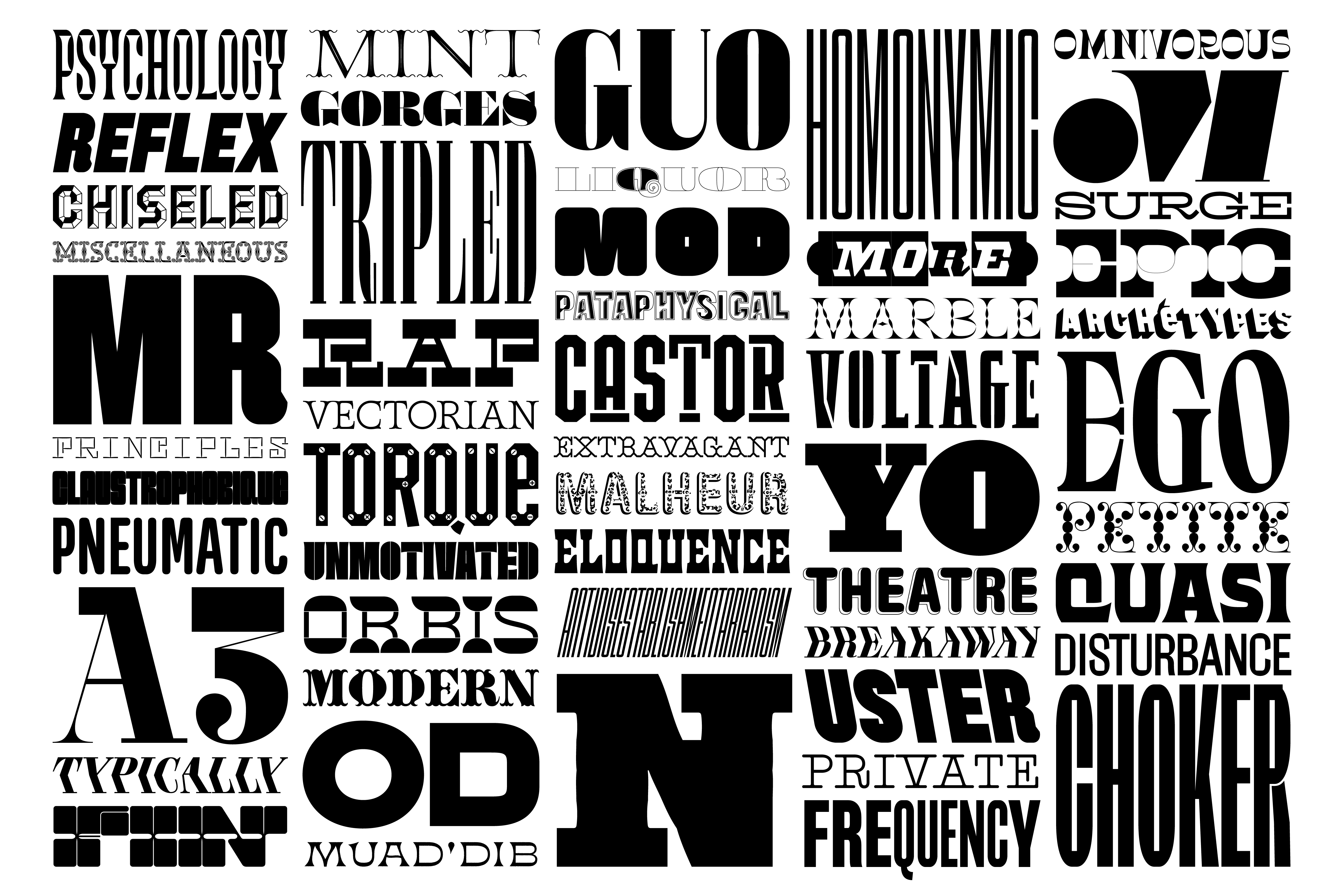
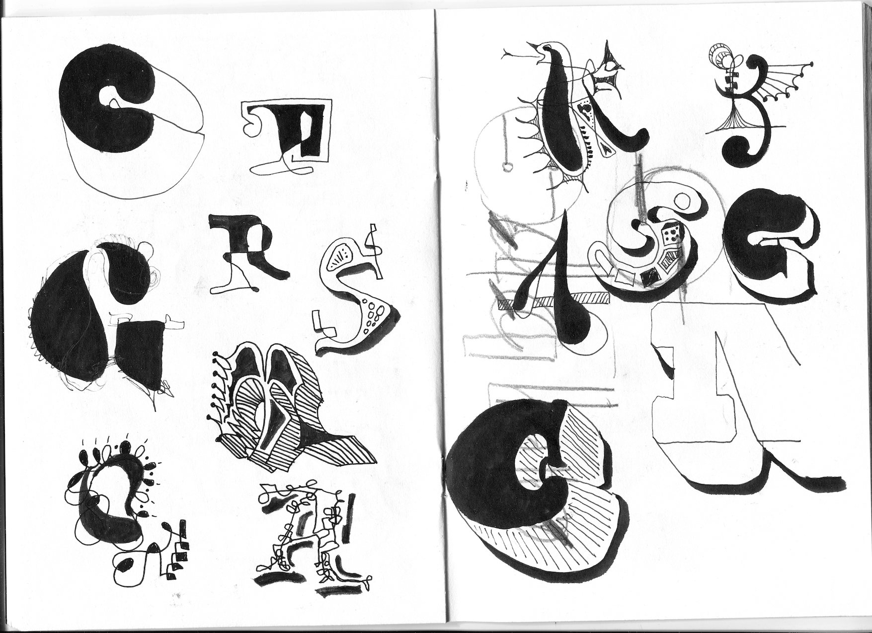
One thing is to find stuff that others have overlooked. I think there is still so much that is undiscovered that has relevance in our time. Some of the projects I do are close to revivals, taking historical materials and translating it to digital media. Others are more vague, more chaotic and more personal, where there are aspects here and there that I put it into a mixer and make my own. This can be very subtle, where I amplify a detail that was not yet very visible, or work on the structure where letters get new relations in a rhythmical arrangement.
There is always a conversation between type and handmade forms. From the very beginning, typography was very closely related to the structure of a broad nib pen, then emancipated more and deviated from it. There is always this breathing between more rationalized constructed forms and organic, human, handmade shapes and these two extremes are what I am interested in.
There is also this notion of “beautiful writing”, already in the word calligraphy (meaning the art of beautiful handwriting), that I do not agree with. Beauty is such a vague concept; I would rather make interesting letter shapes than beautiful ones.
Is there a typeface or font that interests you?
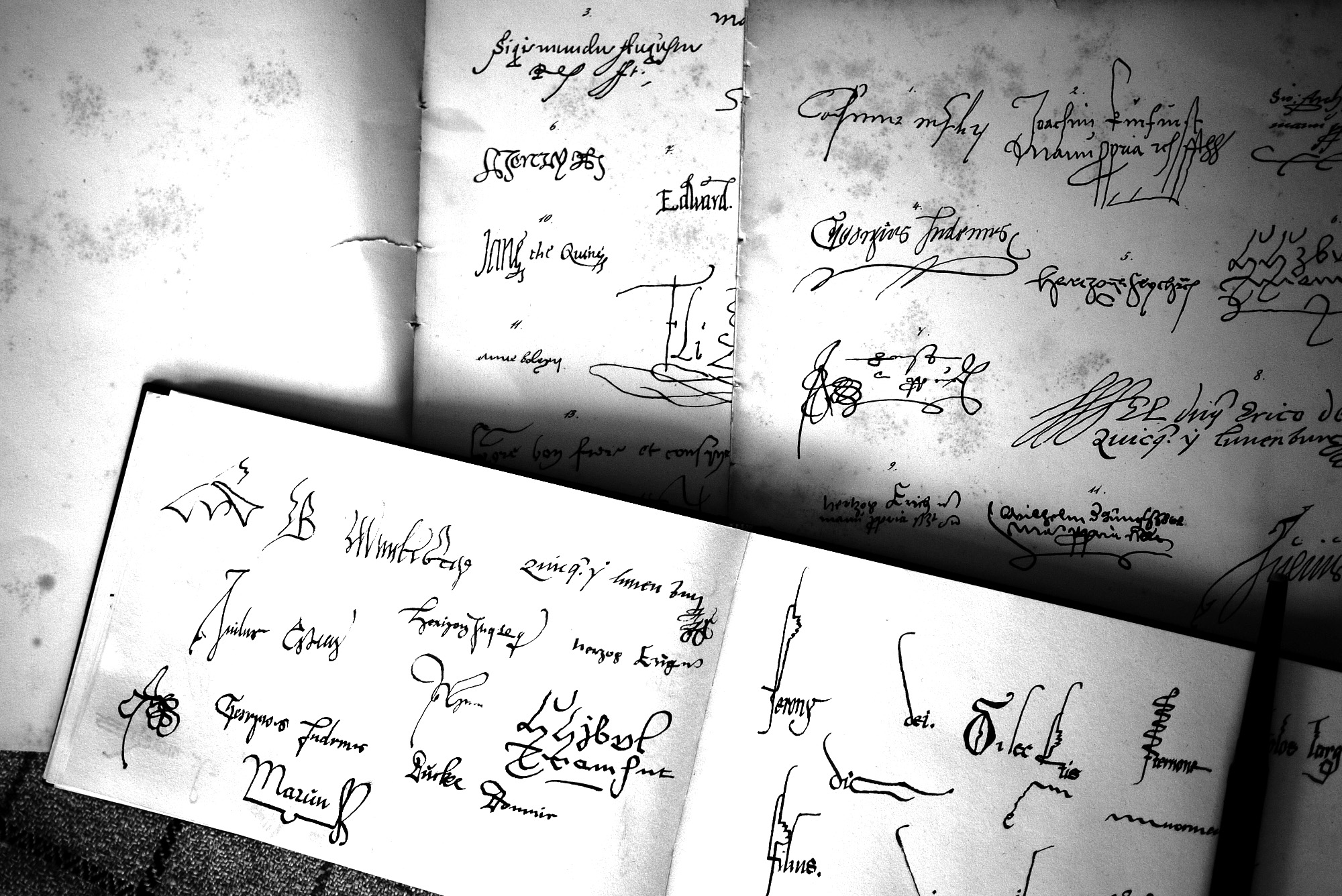
In typographic history, one of the periods that interests me at the moment is the transition from the renaissance to the baroque. Things got quirkier in a way, and more fluid during this period.
There was an ideological conflict in Europe at the time. This shows rather clearly if you have an eye for it in the type production, as it does in the general production of culture, like music and painting. I very much like to see type design as one of those cultural expressions. Type should sit next to the music of a period, in addition to the painting and the poetry.
Do you see any trends or moods in type design today that you think reflects the times we are in?
It’s so diverse that it’s hard to point out something specific. It will be interesting to see what is left of this moment once ten or twenty years have passed.
I do feel that there is once again a conflict popping up between ornamentation and minimalist shapes. There are more and more expressive display typefaces being produced, but of course a counter movement to this very sober graphic design culture that is always there on the surface, but should be softened a little.
With digital publishing now anyone can open a foundry, it has been democratized, both the tools of making them and the tools of publishing them, so there are a lot of things happening.
Do you have any favorite projects?
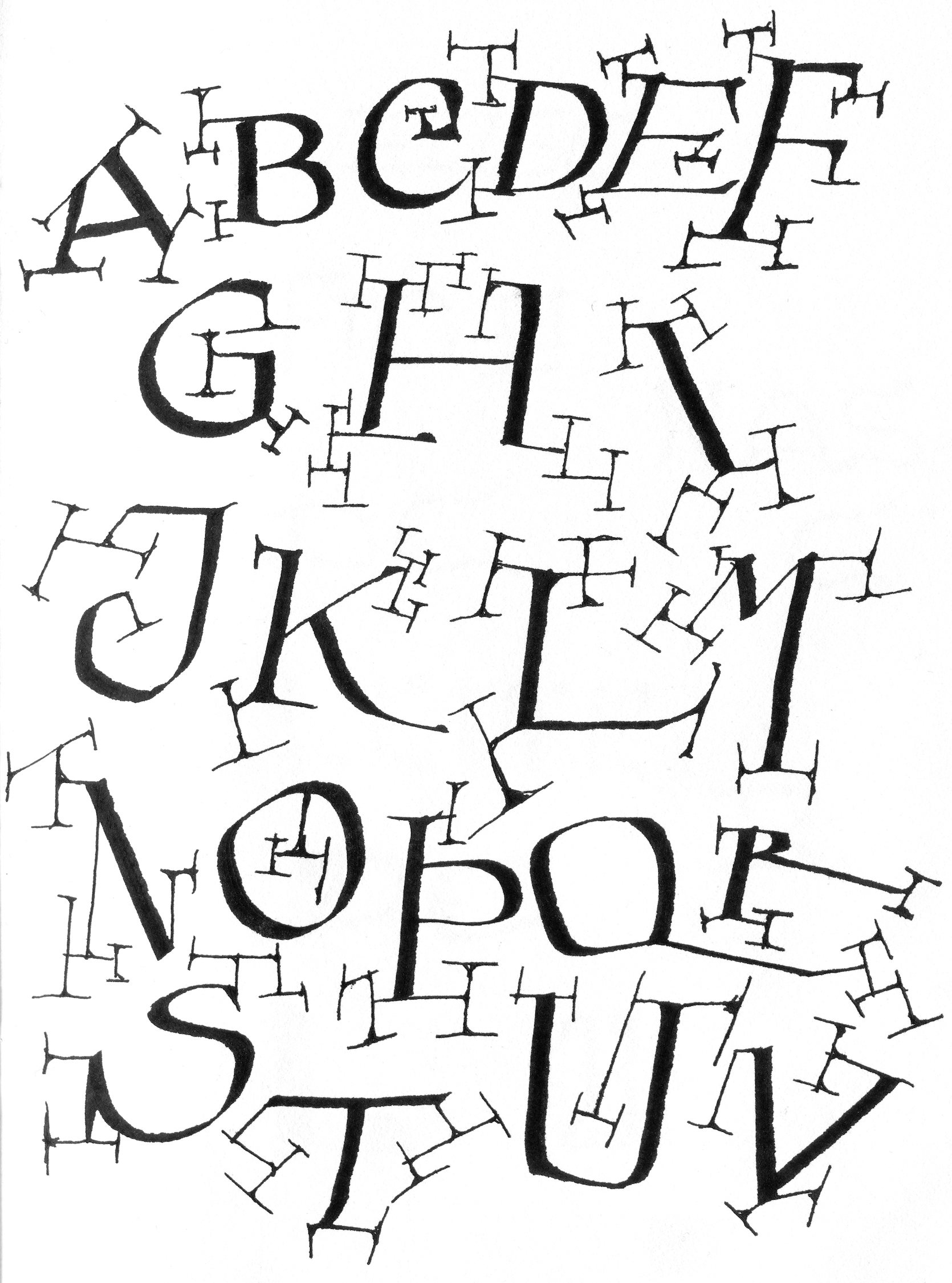
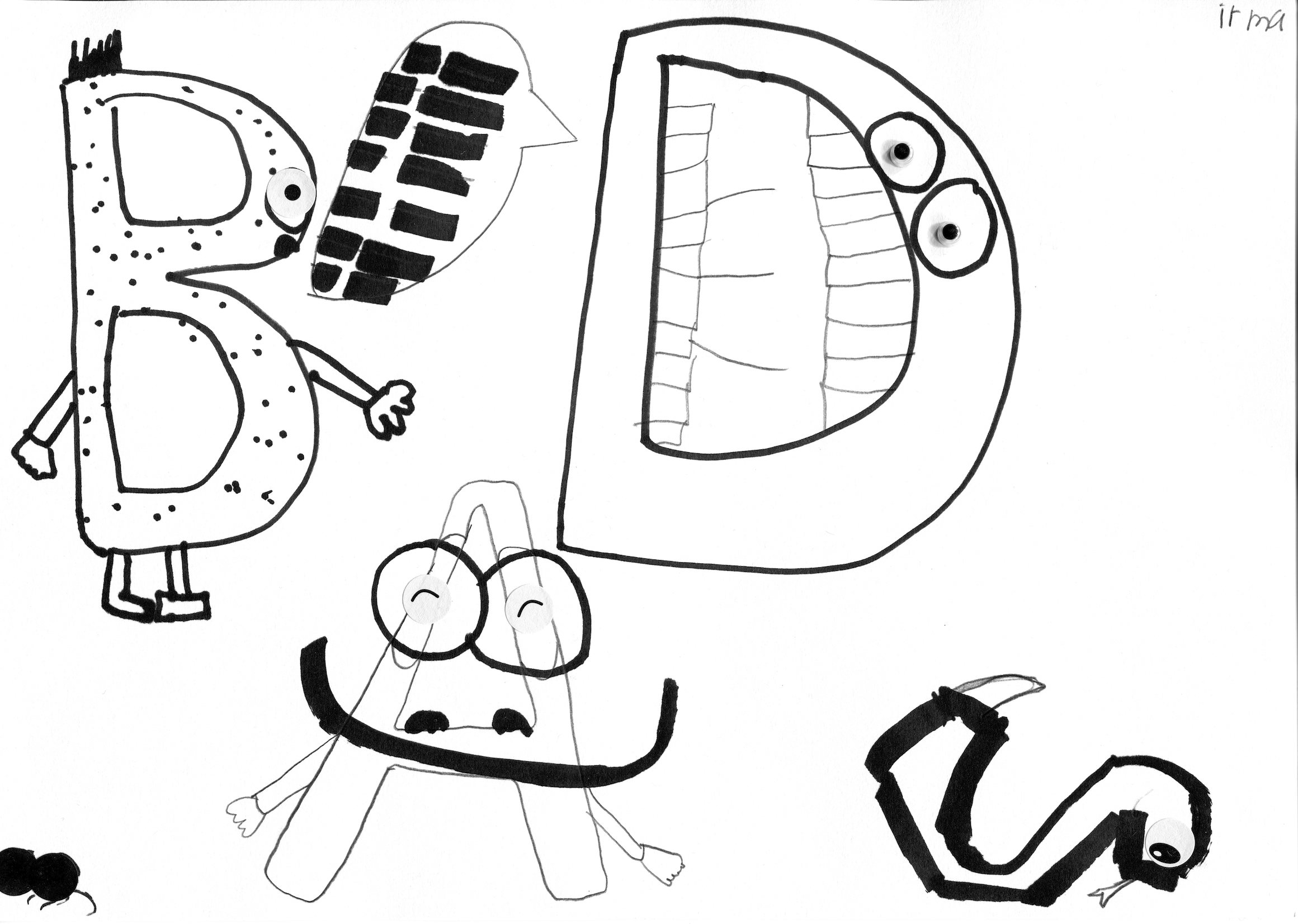
I, together with a colleague and friend of mine, wanted to introduce children to the world of lettering through illustrative and decorative letterforms. For example, using organic human or animal figures that make up a letter of the alphabet.
We wanted to open a sphere of expression, so we organized this project with my daughter’s class, where we had one day with a bunch of seven year old's drawing all kinds of weird and fun letters. We then added their creations together into a small publication that we gave out to the kids and their families as a present. The results were just amazing.
That might be a mission statement, an umbrella over my whole work. I don’t like things being boring. And if kids are told that the alphabet is boring then I have to say absolutely not, it is not a boring thing at all. It is fantastically flexible, there is so much variety and there is so much to explore. It is a fabulous medium.
Do you have any tips for students getting started with type design?
It is a business, but students should also not be killed by the perspective that out there everything is very serious, you must make money and you have to answer the client brief and so on. It is rather hard, this balance of experimenting with an artistic approach and the business side of things.
Develop your technical skills in parallel to your conceptual skills; find references also outside of the design field, because nothing is created ex nihilo. And, when it comes to drawing type, I guess imitation is the first step in the learn process, originality is an add-on that takes a lot of time and energy to achieve; don’t aim there from the very beginning.