Blimey! It’s like being in a Harry Potter film!
When I first started working at Kunsthøgskolen i Oslo (KHiO) I was walking along the wide and spacious corridors of Ullevålsveien building with my colleague Alan Mackenzie Robertson, and dotted along as if on display in a museum were very many old printing presses. I remarked to Alan that “it’s a pity that you have all these printing presses and none of the letterpress cases”. He looked at me, and pointing his finger up towards the ceiling he said “Oh no, it’s all stored away up in the loft!”.
A few minutes later I was climbing into the dusty loft of the 100 year old Art & Crafts building which had housed the Statens håndverks- og kunstindustriskole (SHKS) since 1903. And there it all was, along one side of the loft, as if it had just been roughly thrown away up there without any organisation, about 300 cases of lead and wood type, boxes of loose “sorts” and a jumble of “furniture” and “chases”– (these being English printing terminology). In effect all the accoutrements needed to run a letterpress workshop.
I had arrived from London, where I taught at the Graphic Design department of Central Saint Martins College of Art & Design. Though not a crafts school, it had retained its letterpress facilities, which enabled the teaching techniques of letterpress printing (and also onto contemporary digital output for press). Since the 1980s the letterpress press workshops had become a hub for exciting, experimental and innovative work by students and staff alike and stood out as a learning space that contrasted digital teaching and learning.
Intrigued by letterpress techniques of printing, which I had learned as a student, my colleague Susanna Edwards and I embarked on the Codex research project in the early 2000 (Raein, Edwards and Lockheart, 2003). In Codex we made the case for the use of letterpress in the education of contemporary graphic design students, which we saw as a distinctive counterpoint in the learning and teaching of typographic constructs were an understanding of letterforms and their presence on the printed page could embrace materiality and a physical presence. We came to understand that the handling of lead type, with their hands, laying it out upside down and in reverse using a composing stick, developed a visual and spatial understanding of the abstractions of the pictorial and print space. This act of visual imagination and projection does not happen in the use of programmes such as Adobe InDesign where type is laid out in positive, zooming in and out and the option, at a press of a button changes the constraints of layout (spacing, leading etc.). Moreover, on reflecting on this project, we also became very aware that any entanglement with the learning of lettering or type design needs to address history and develop a knowledge of the various distinctive traditions and conventions of lettering design.
With these issues hanging over my head in my role as a teacher, I was further surprised to find that in the next room, in the KHiO loft, a collection of printed material that had been wrapped up and put away in 1962! Covered in dust and mould, I found books of type samples from famous foundries in Europe, USA and Norwegian printing houses, printing trade magazines from Norway and Sweden. Moreover, a fantastic collection of ephemera, including letterhead mail from famous European designers, including two gems; in the form of signed letters from Jan Tschichold and Max Bill around the time they had their very public row!
These two finds led to the setting up of a letterpress workshop in the basement of the Ullevålsveien’s building, now called the Publishing Workshop in the new KHiO campus. This was an exhausting task of carrying down all 300 cases and letterpress materials, locating, buying and reconditioning working printing presses and creating a workshop. And also alongside, the establishment of the KHiO Letter Archive, which although somewhat grandly called an archive, it is actually at the time just a collection! The important distinction being that an archive needs to have a structure of some sort imposed upon it – a structure that can lead to collecting, preserving and developing a discourse for the discipline of graphic design. In our case the ambition has been to impose a research structure, and to initiate its use as a resource for investigations into letterforms and with an eye on the contemporary and often autonomous graphic design practices taking place here in Norway.
There was subsequently much debate with colleagues in the Norwegian milieu, who were most informative. Amongst them; Torbjørn Eng who has gone some considerable way in recording the history of Norwegian graphic designers and Ole Lund who has an encyclopaedic knowledge of typographic history. Surprisingly, the most difficult discussions were about the translation of equivalent terms to Norwegian letterpress terminology. For instance, the distinction between “lettering” as opposed to typographic was a matter of some debate. The English term “lettering” being a encompassing term for all forms and techniques of letter form construction ranging; from graffiti, tagging to chisel cut letterforms. While typography, as part of lettering, has evolved – principally from calligraphy – so as to operate within a distinctive convention and tradition of production that employs a number of distinctive historic frameworks.
As previously mentioned, the aim has been to develop the collection into an archive by establishing a foundation of research into the Norwegian traditions of lettering and typography. To that end, I would like to point towards a number of research initiatives that have sprung out of this archive. My colleagues Ane Thon Knutsen (the first PhD. in artistic Research in Norway) and Stefan Elmer (typographer and researcher) alongside a number of others have joined me in developing this research base for the archive.
2006
Kjære Ivar Bell / Dear Ivar Bell
Our first research project, Maziar Raein in collaboration Line Monrad Hansen culminated in a exhibition entitled “Dear Ivar Bell” which displayed the letterheads that Ivar Bell (1910 -1965) had collected by writing to leading graphic designers, calligraphers and architects during his time as a teacher at SHKS. This modest exhibition mainly pointed to the lack of resources available, in terms of colour / ink and paper to designers who were pushing a Modernist agenda in the post World War 2 era.
2013
En Form For Historie / A Form for History
Maziar Raein in collaboration with Particular Facts (and with partial funding from GRAFILL); Kristina Ketola Bore (editor), Asbjørn René Josdal & Mats Lande (graphic designer) set out to explore how in Norway, few historians or designers have searched back in order to gain insights into the national roots of the field of graphic design. The exhibition pointed out that in meetings with the lettering archive, one could quickly glimpse a Norwegian history, which is filled with practitioners who had strong and clear contributions for how the subject of graphic design could be practiced.
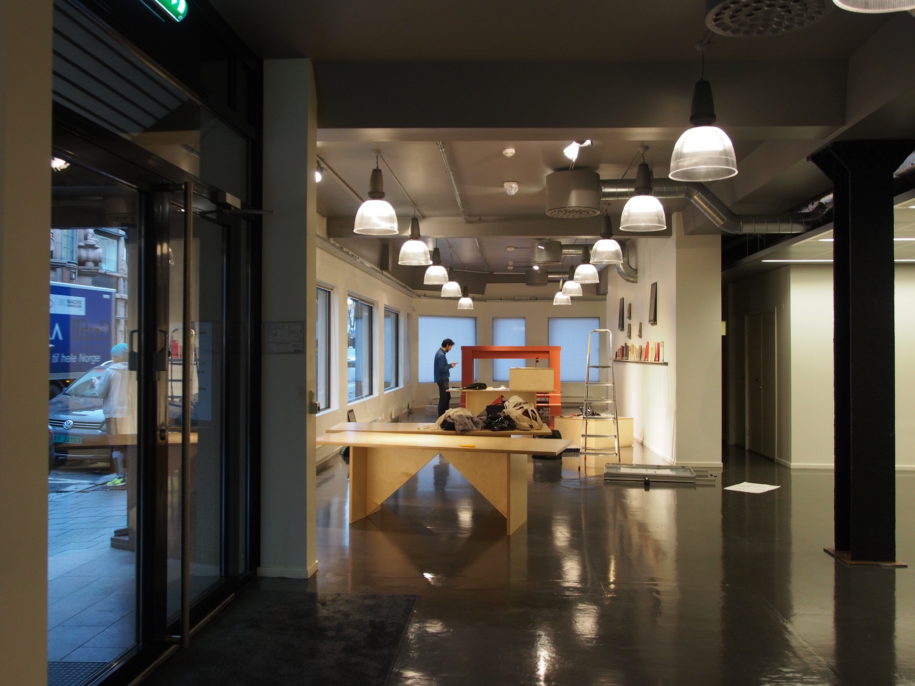
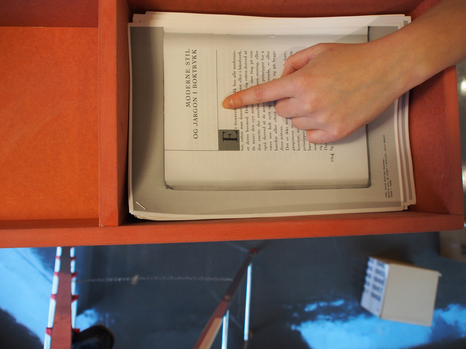
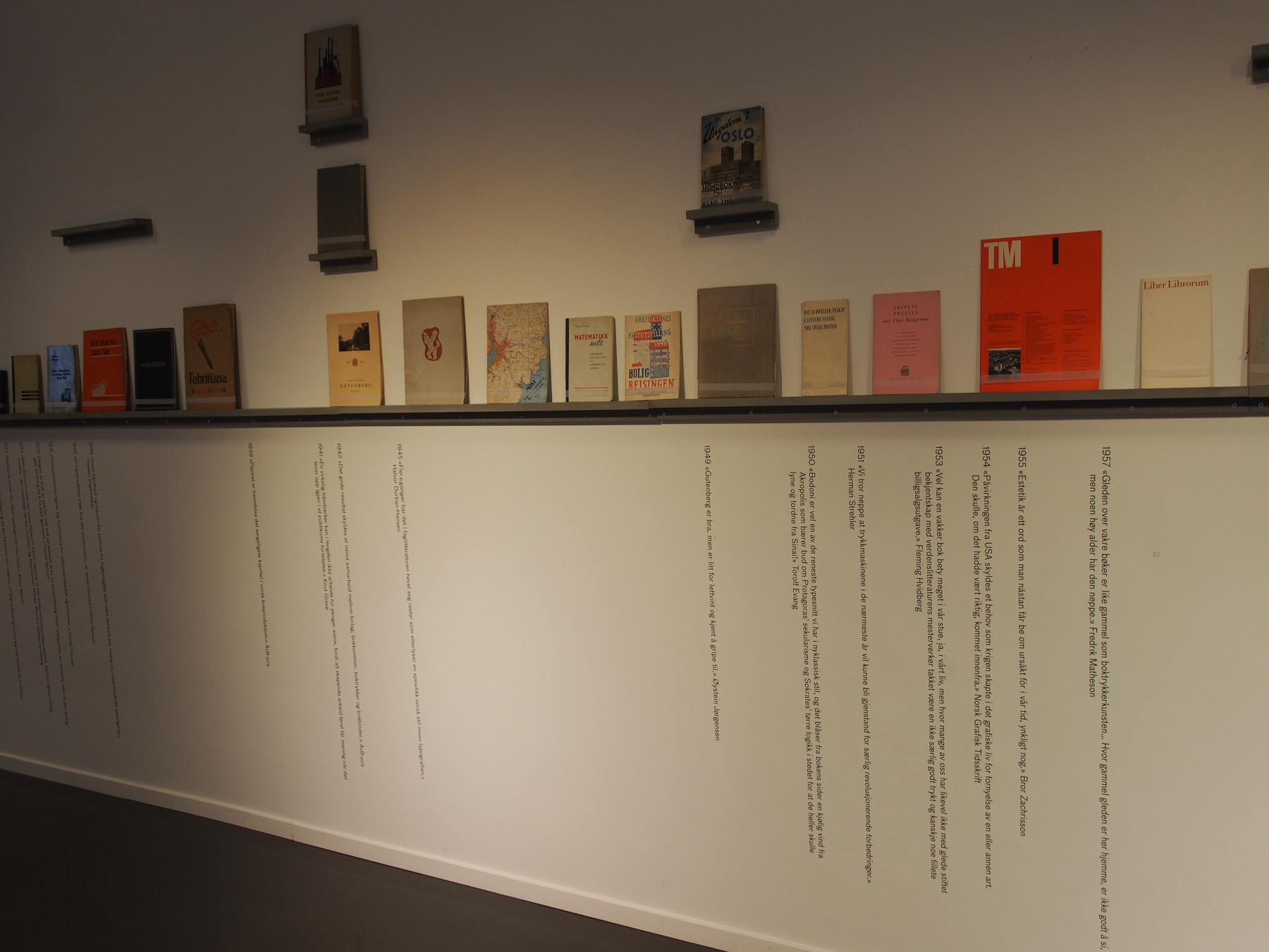
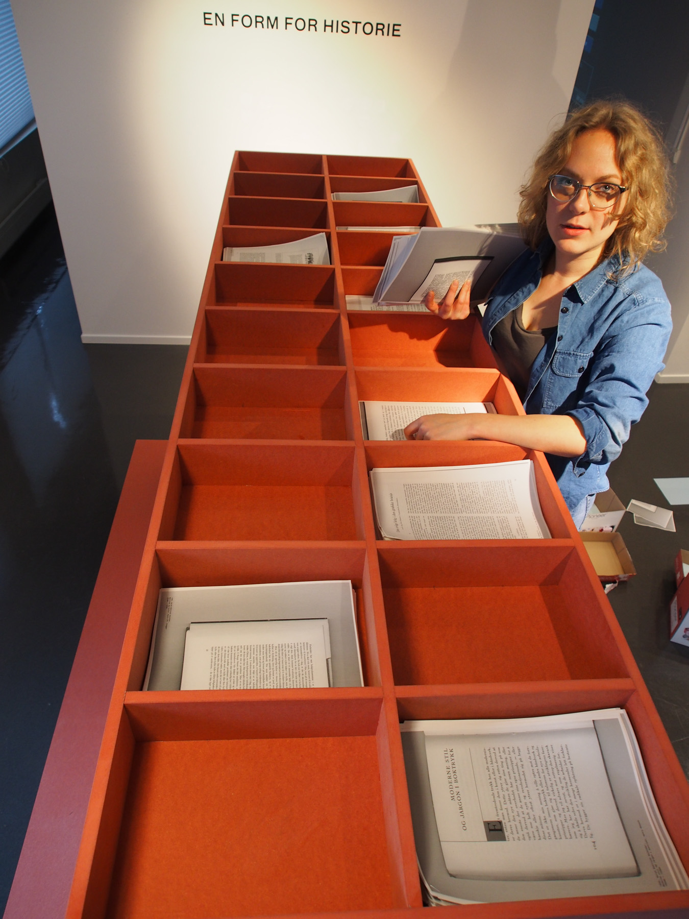
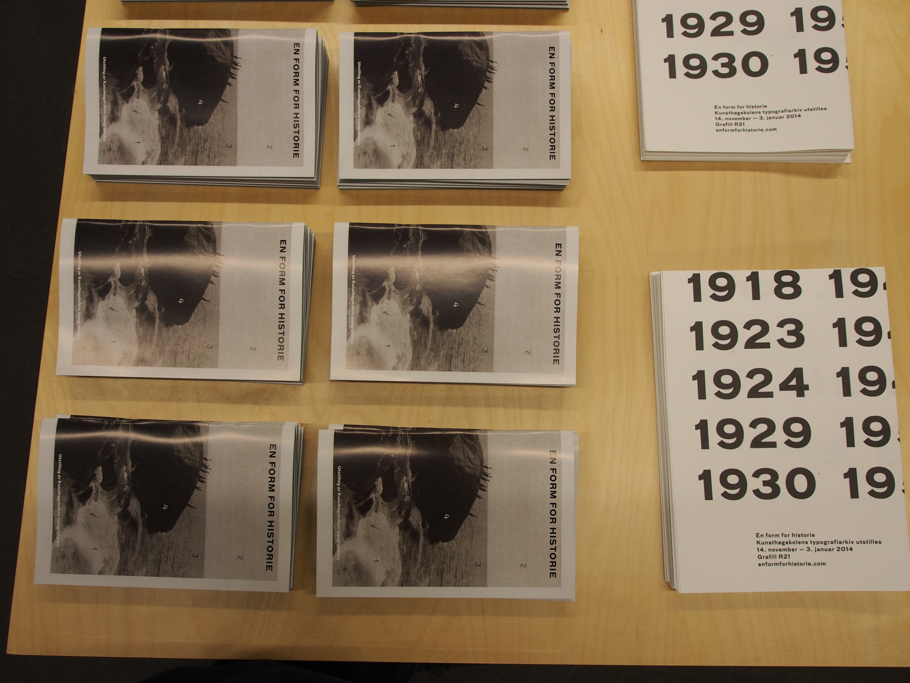
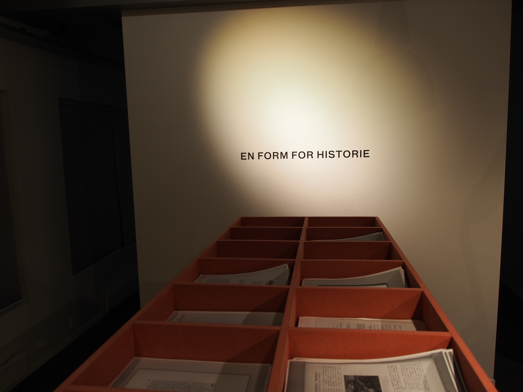
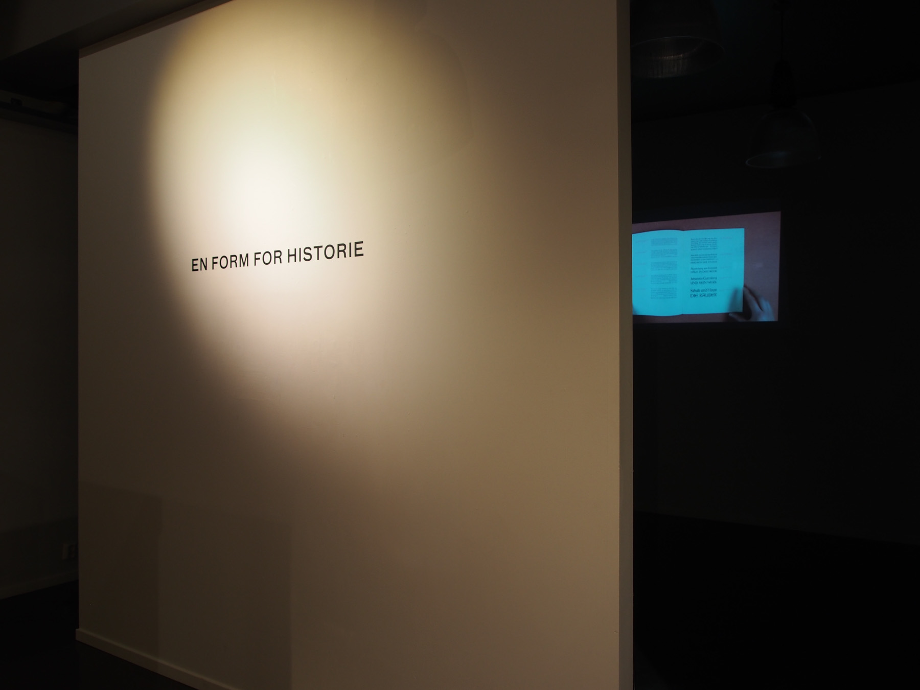
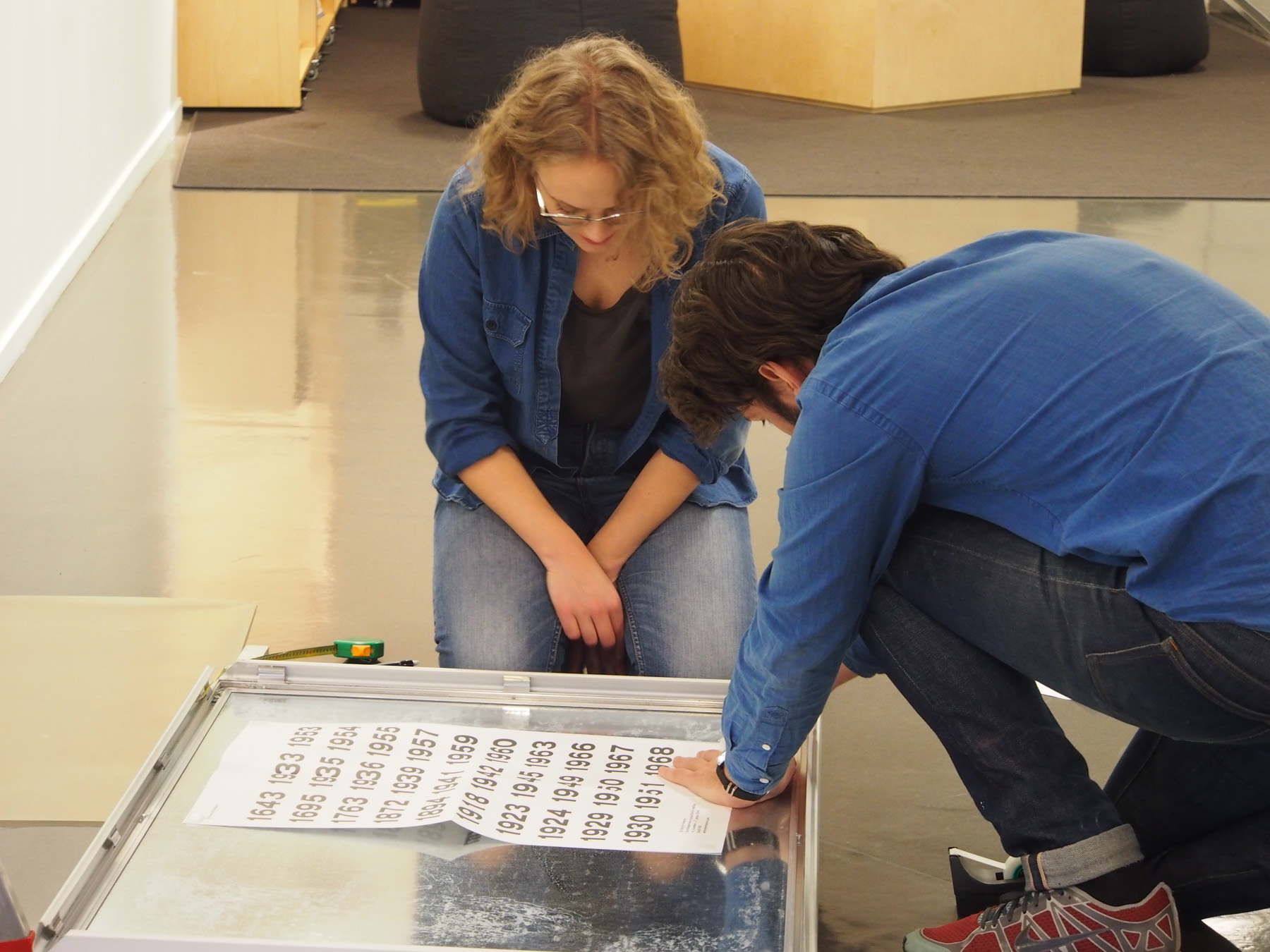
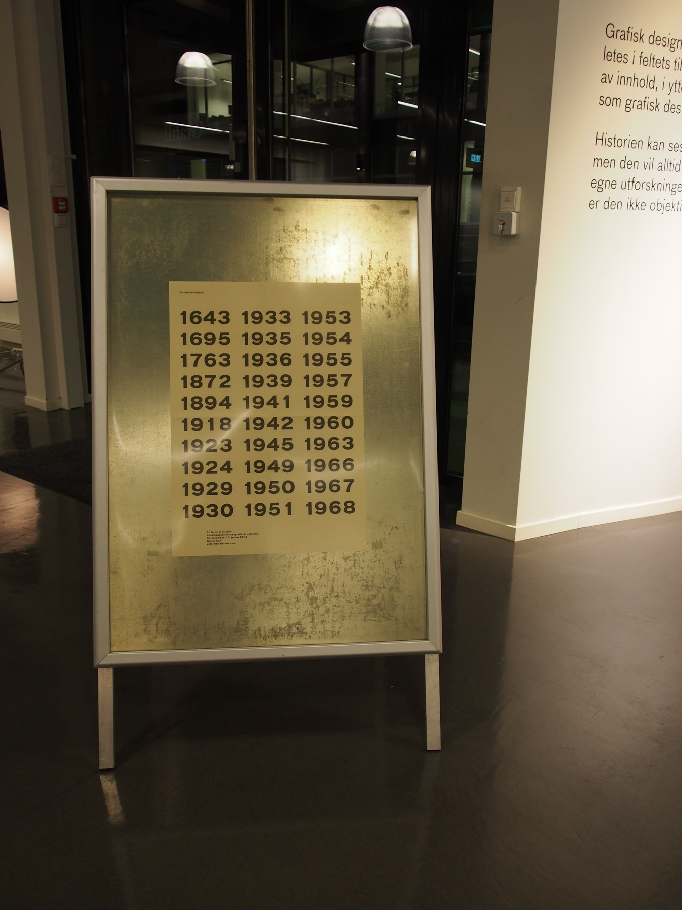
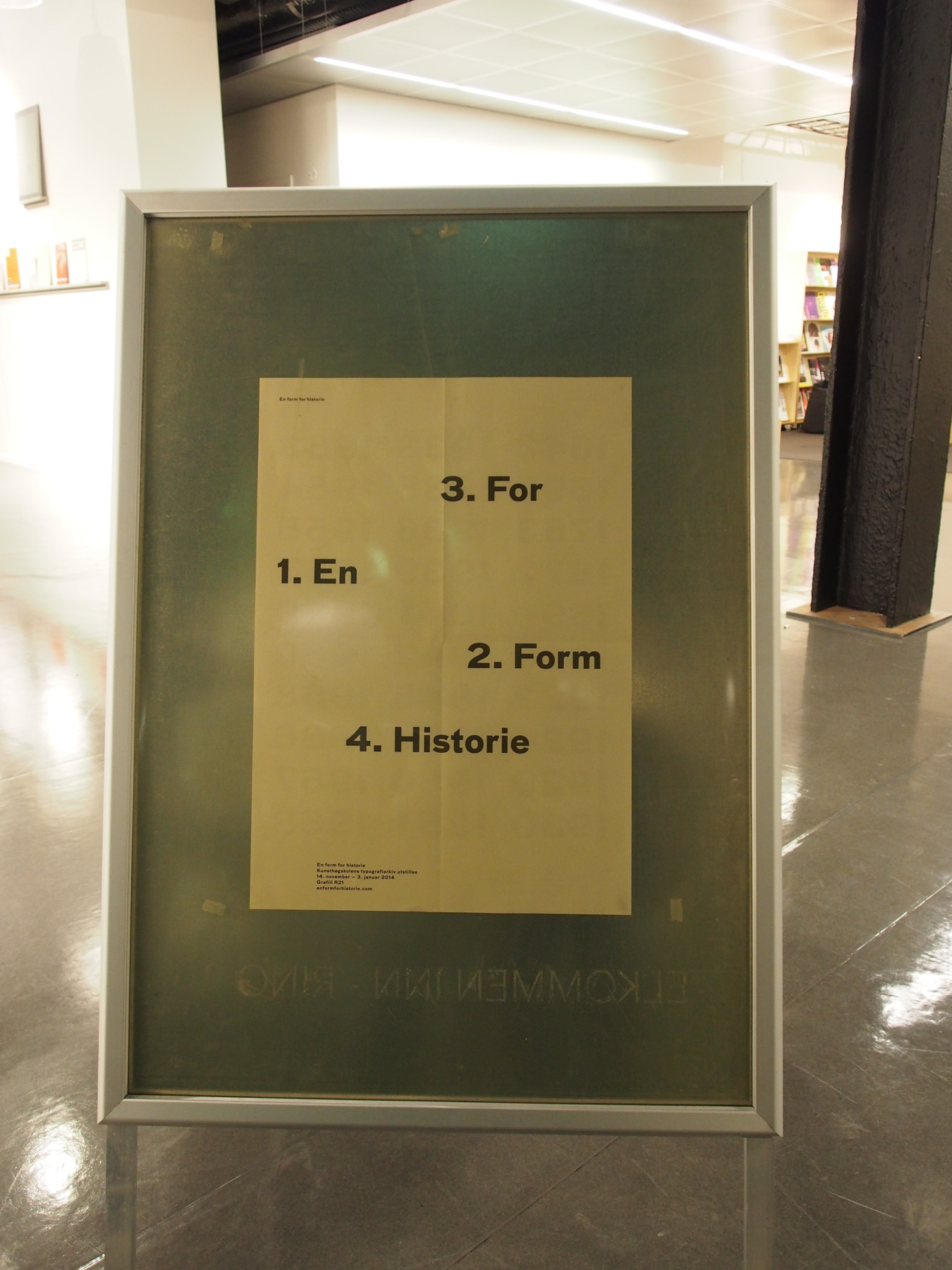
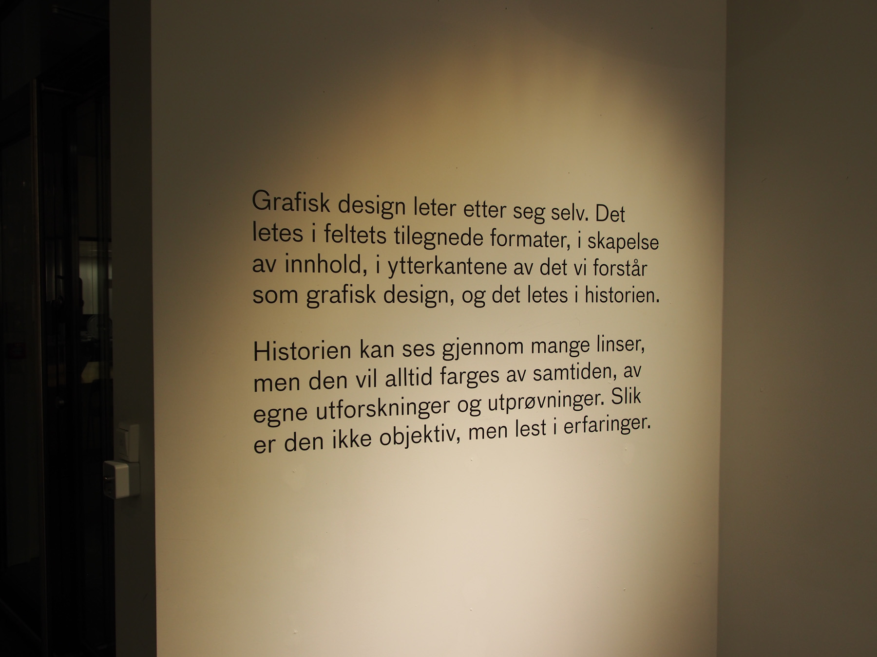
Photographs from the exhibition A form for history
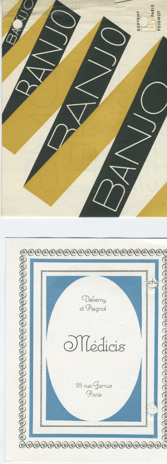
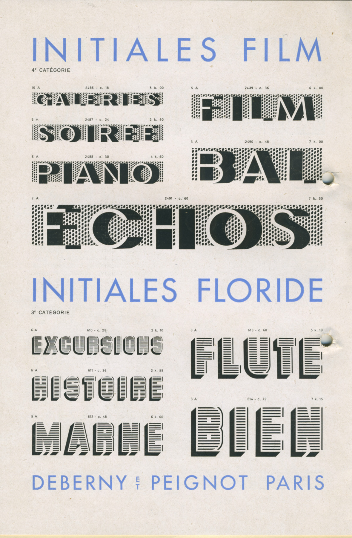
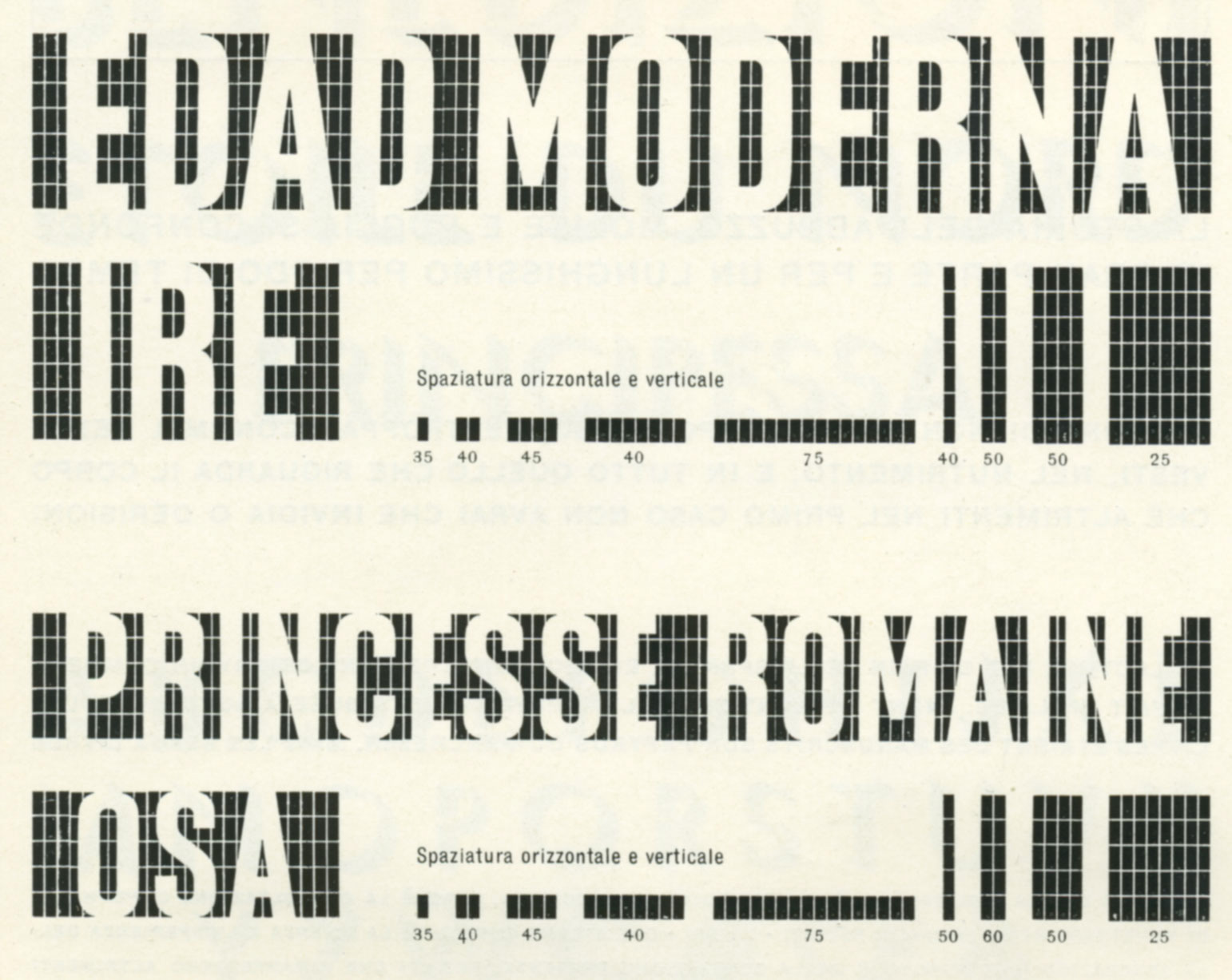
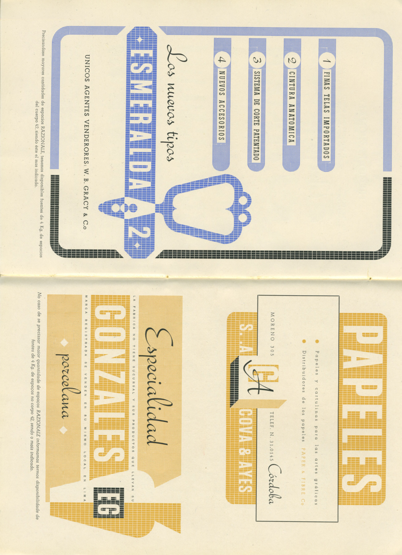
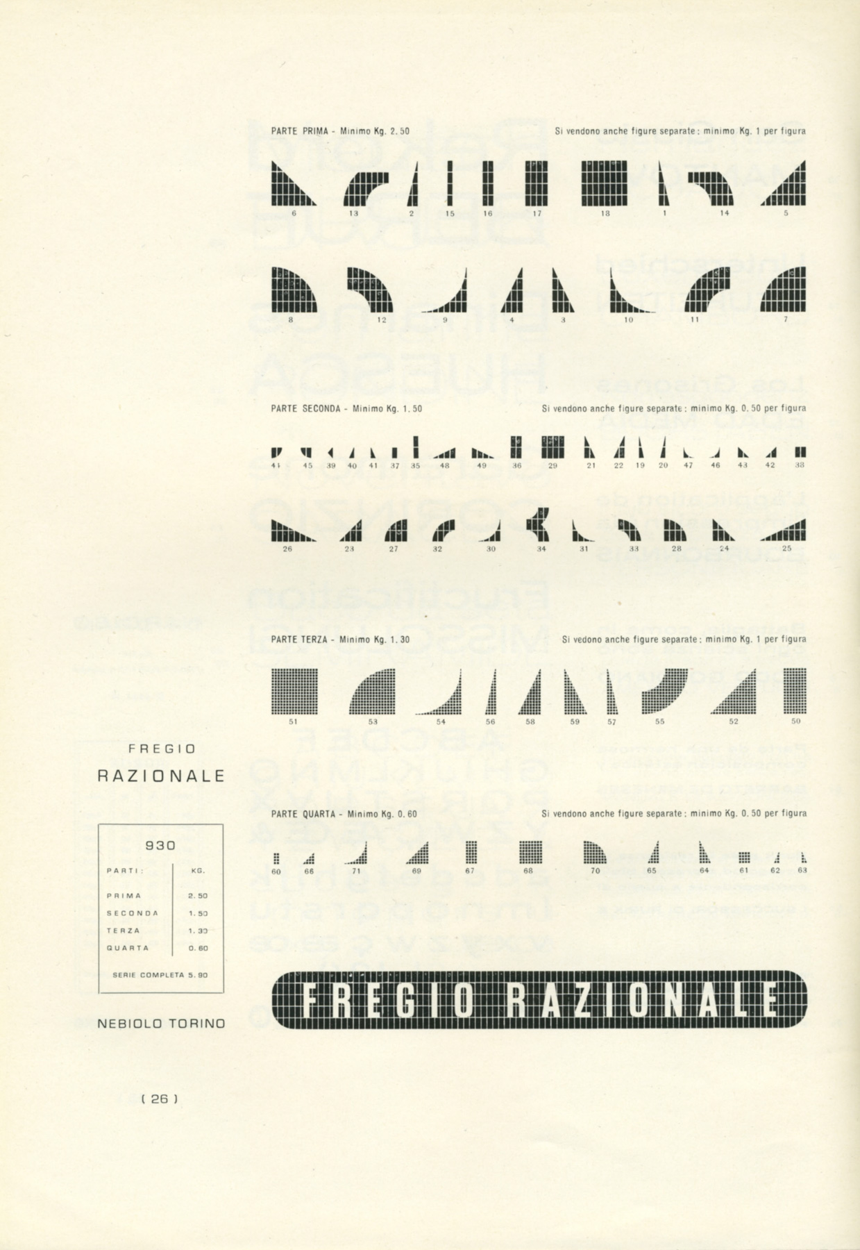
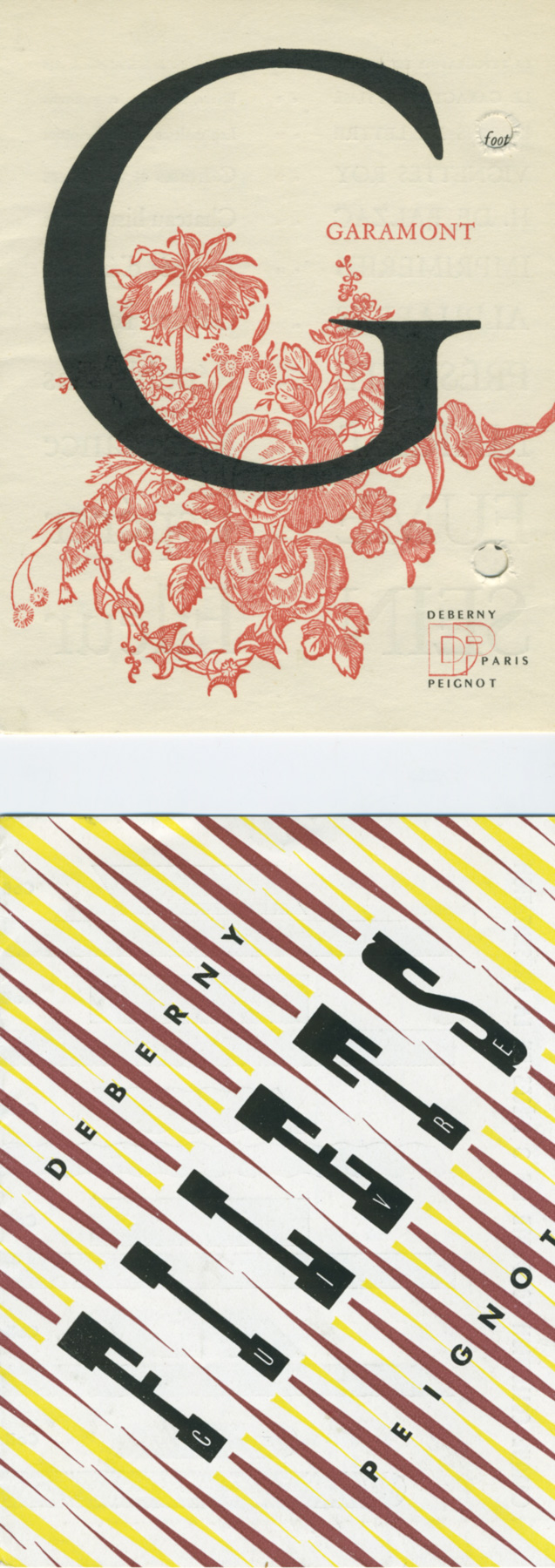
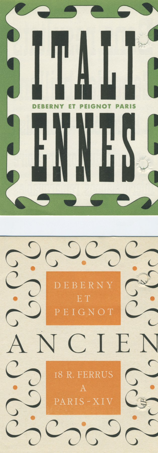
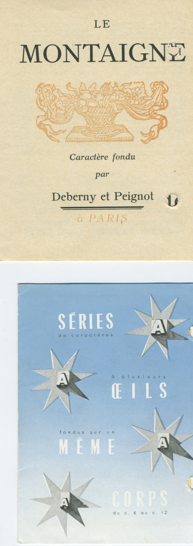
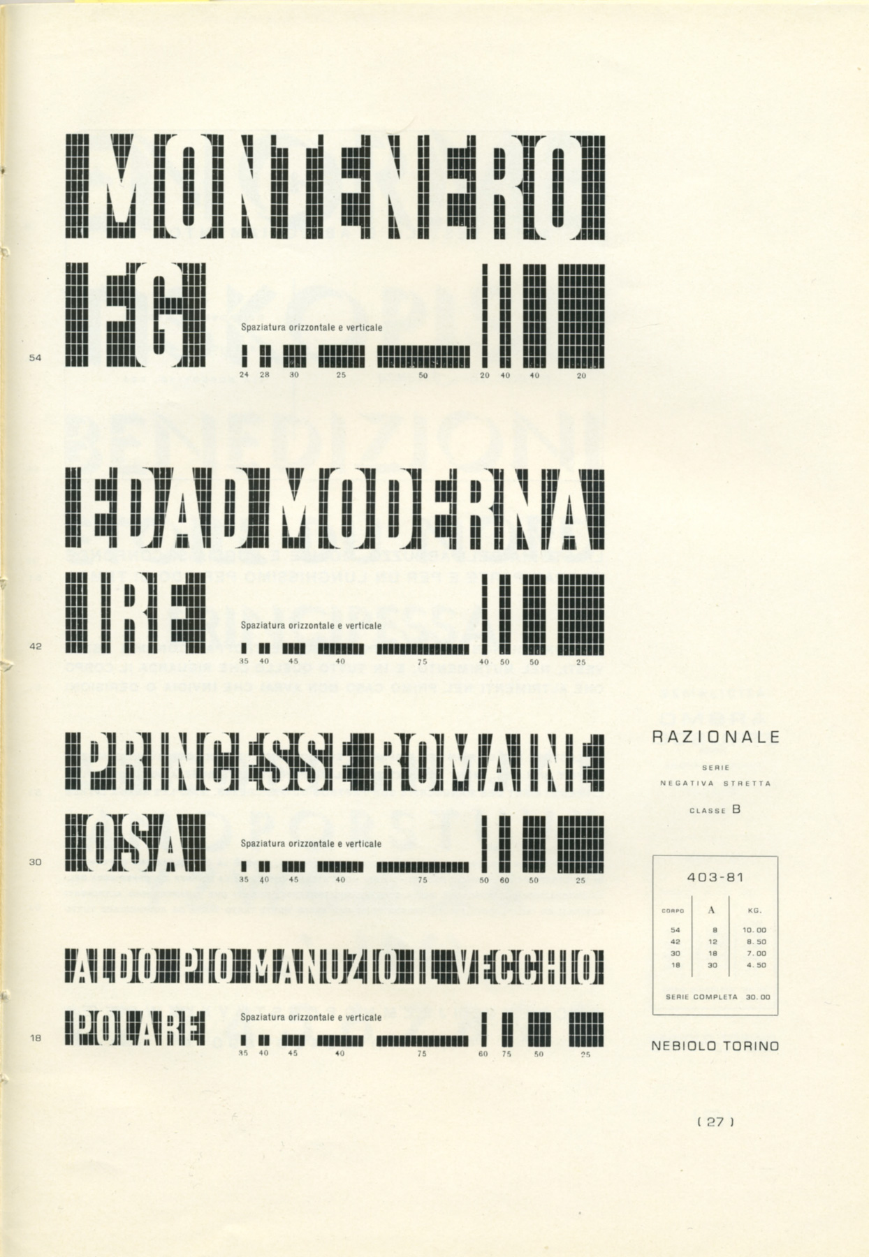
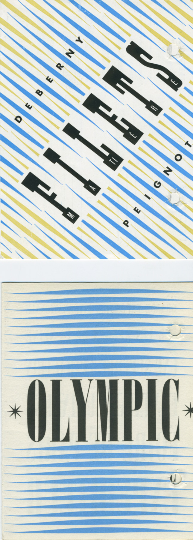
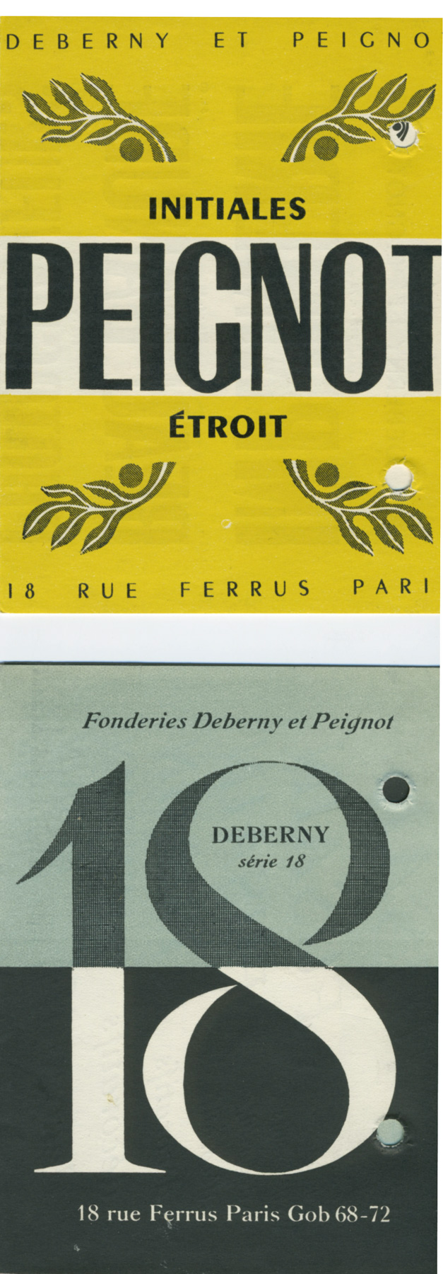
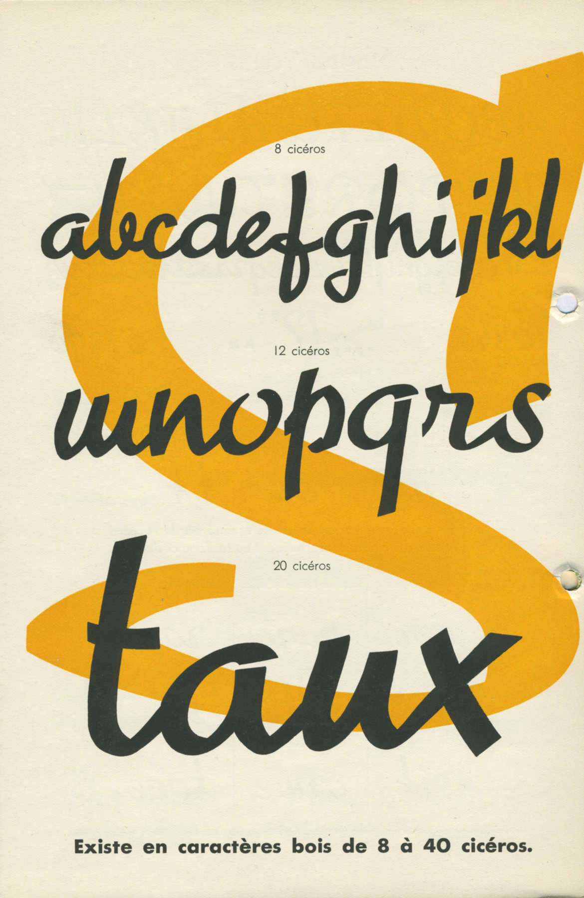
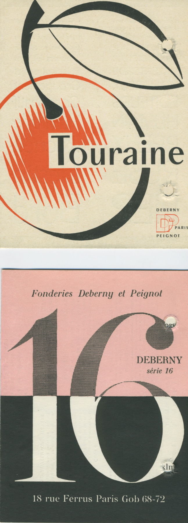
Above: Scans of ephemera
2016
Film: A to A
Maziar Raein, Kristina Ketola Bore and filmmaker Oda Hveem. A film that showed the range of varied lettering forms that existed in the archive that incorporated not only Modernists expressions but also many decorative and illustrative ephemera that existed in the C20 alongside the Modernist enterprise.
2018
Omnigraph, A font that investigated and celebrated drawing of letter forms in Statens håndverks og kunstindustriskole on its 200 years anniversary.
With Maziar Raein, Ane Thon Knutsen this project was principally lead and executed by Ellmer Stefan were the research undertaken for this project delivered insights, into the history of drawing lettering in the SHKS This 200 year history, provided a research enquiry that has created a unique analytical framework or model for exploring and unpacking tradition of type and lettering generation. This can be represented by the short hand of: Conventions, Tools and Gestures that enabled us as researchers to explore and develop understandings of history and form giving in lettering. This is an ongoing investigation that is enabling us to explore as design researchers lettering forms within graphic design.
2019
Anti Type
Maziar Raein, Ane Thon Knutsen and Ellmer Stefan with external partners Edwin Pickstone of the Glasgow School of Art and Helen Ingham of Central Saint Martins College of Art & Design.
This project explored the deep principal difference between looking and seeing, and claiming that seeing is a specialist skill. Therefore, it focused on the term ‘negative space’, which is the space between things when we draw. A space which describes the absence of form and structure by distinguishing between what is there and what is not. And a need to reinvestigate how we draw letter forms especially with contemporary digital tools – which is nearly always through the manipulation of line – and ask how can we re-evaluate seeing and giving form to letters through an understanding of negative space. Working with form, from outside in, or as attributed to Michelangelo “just chipping away everything that doesn’t look like David”!
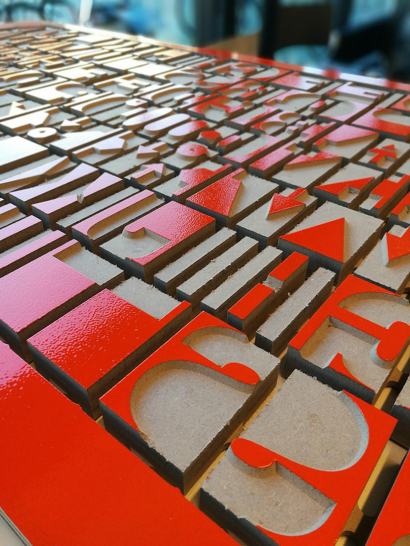
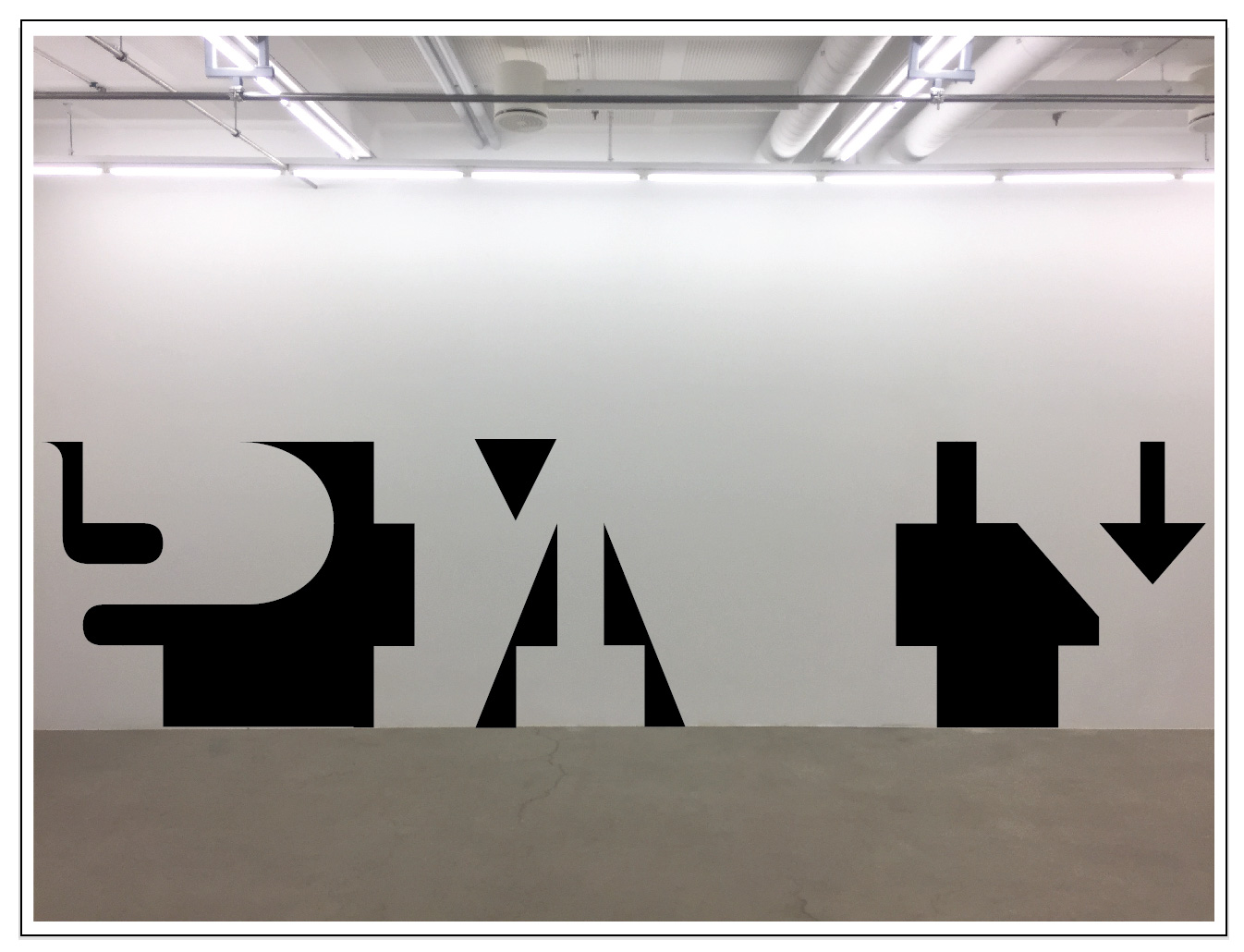
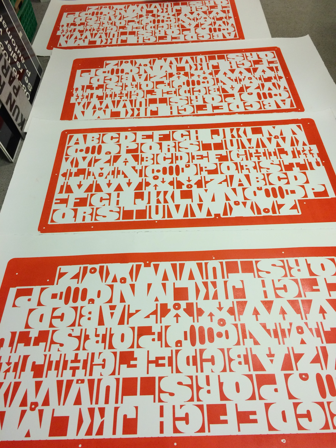
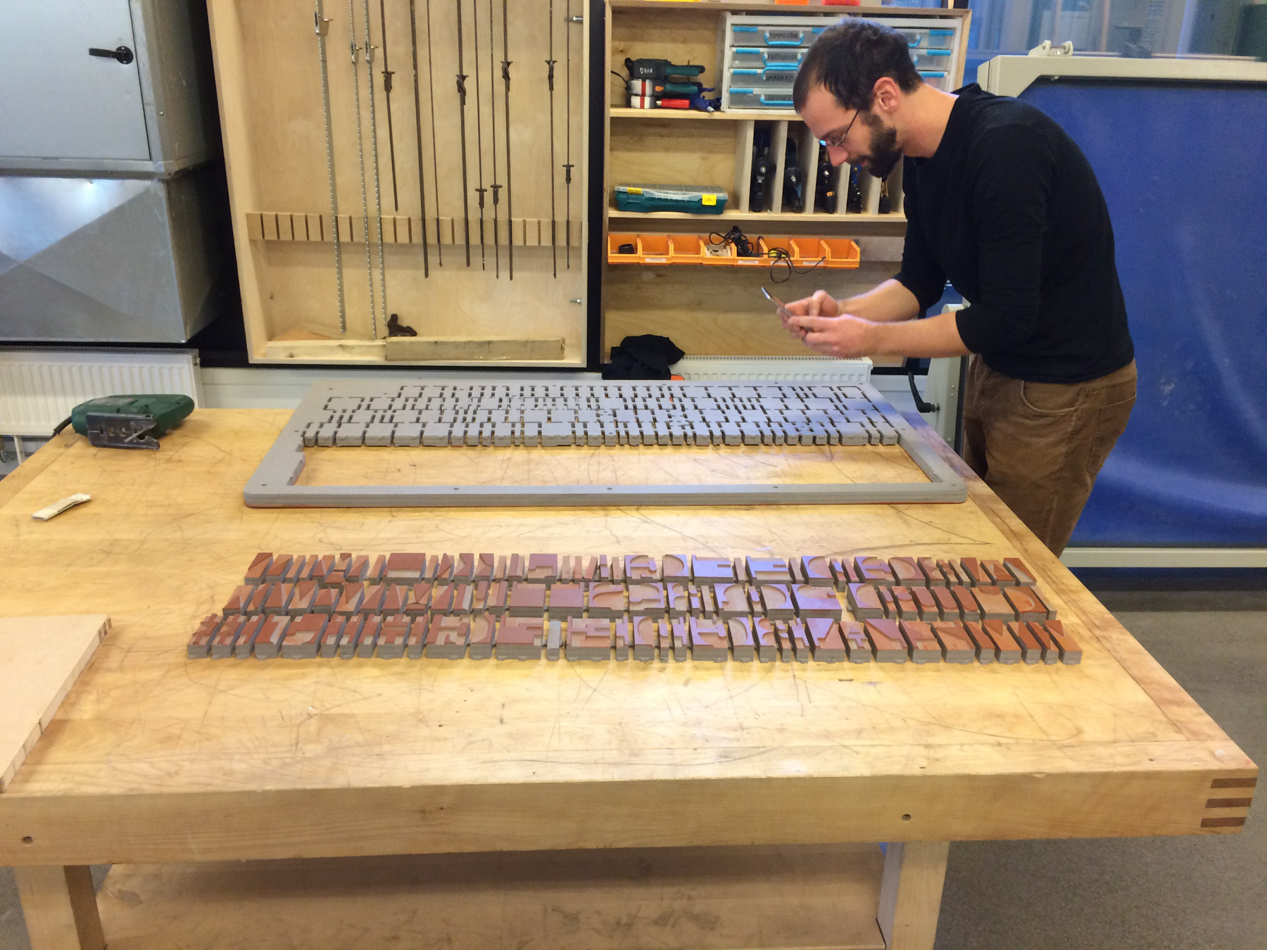
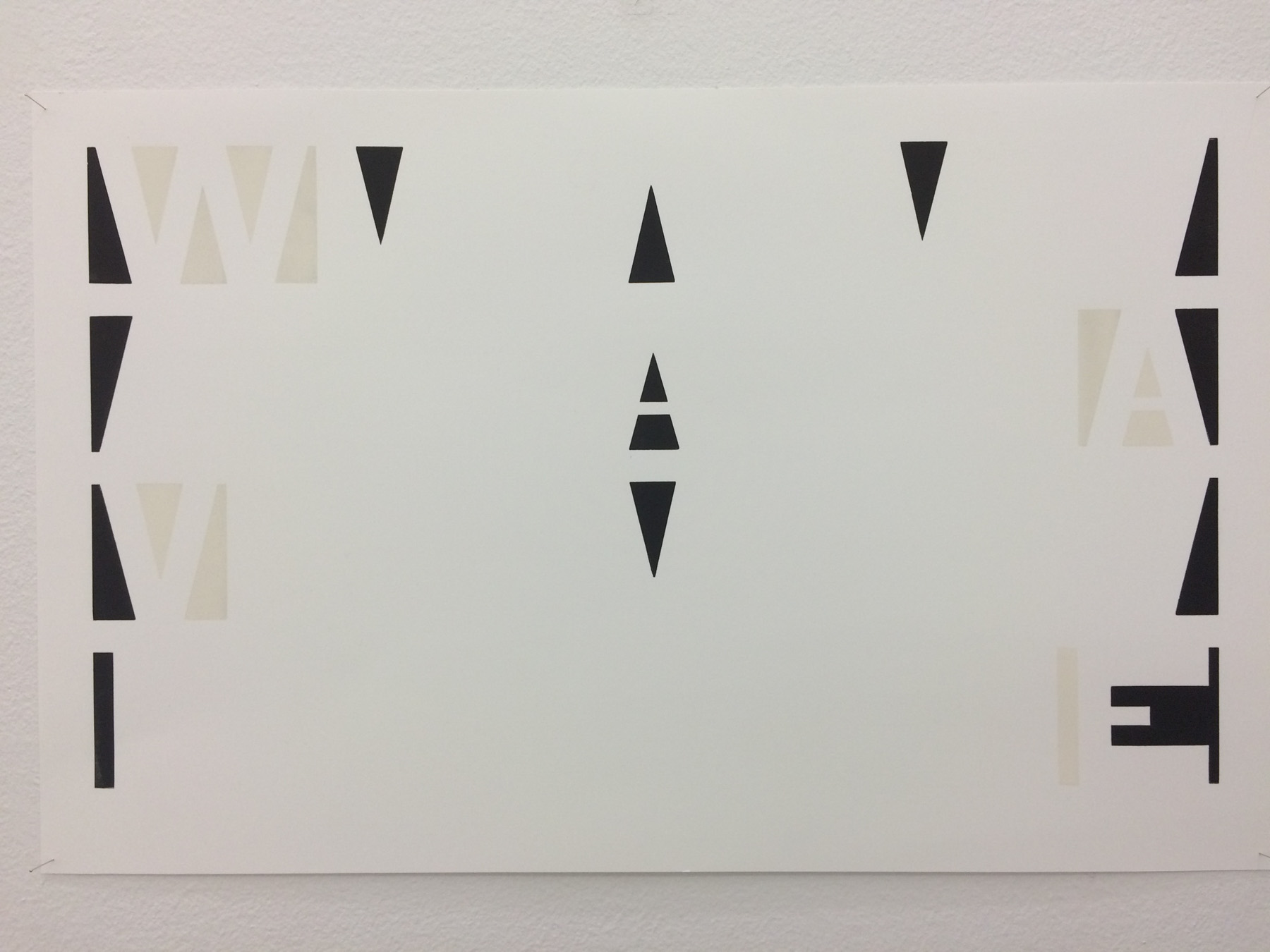
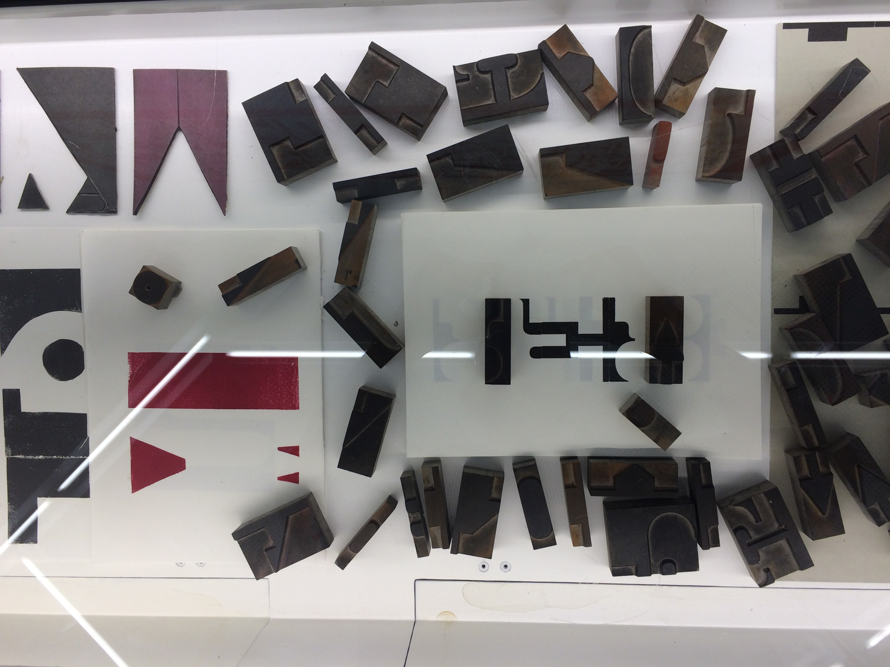
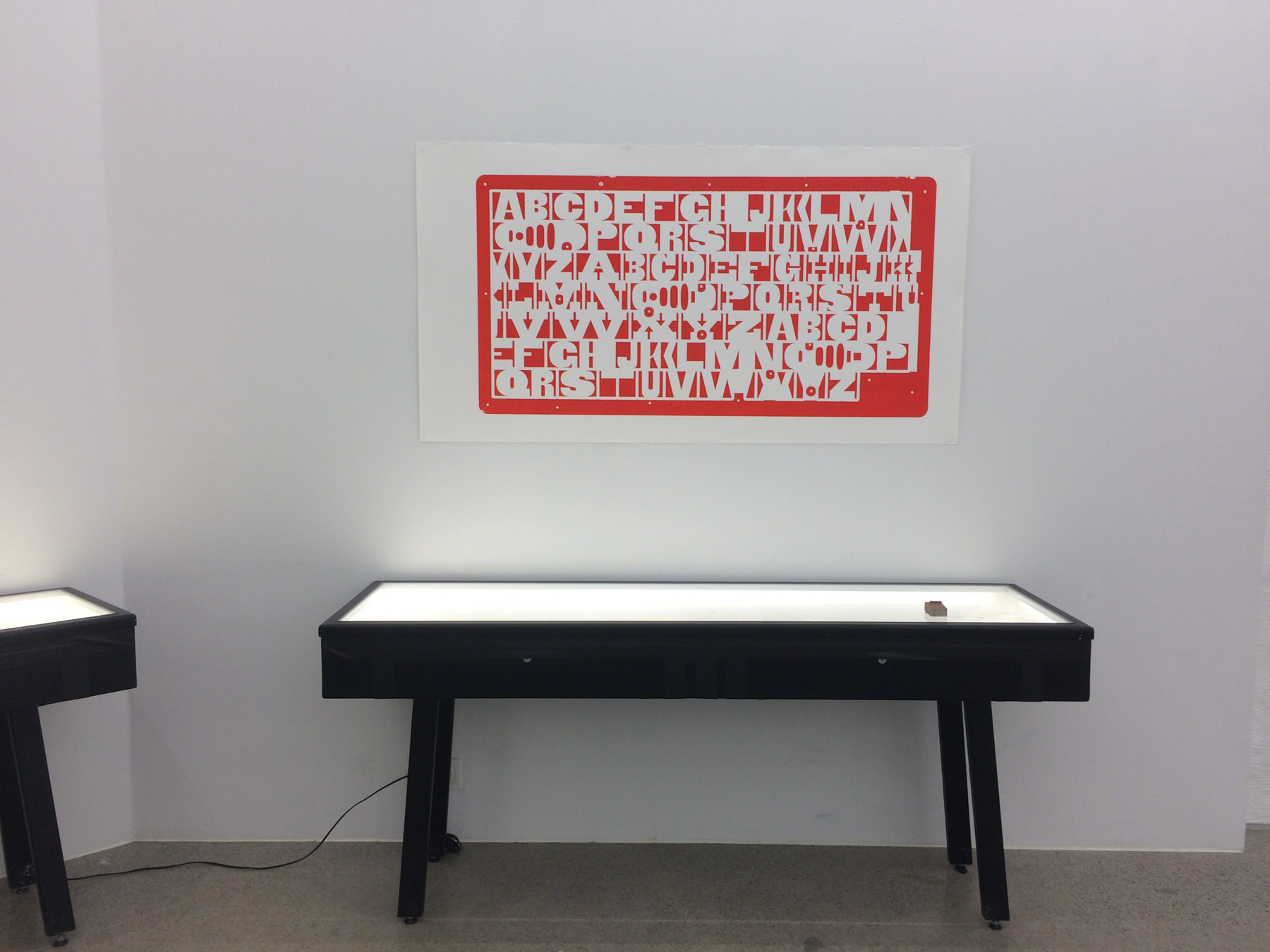
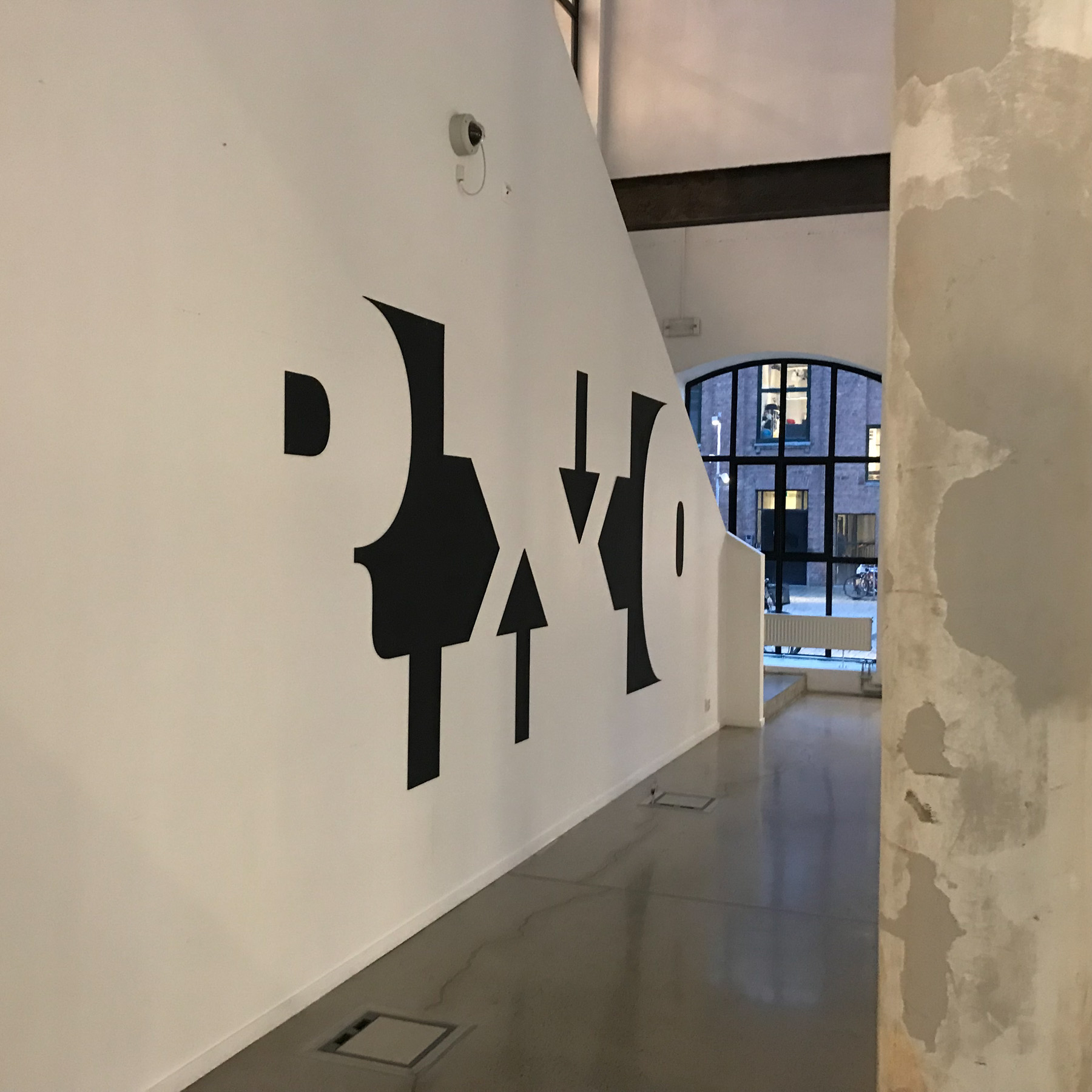
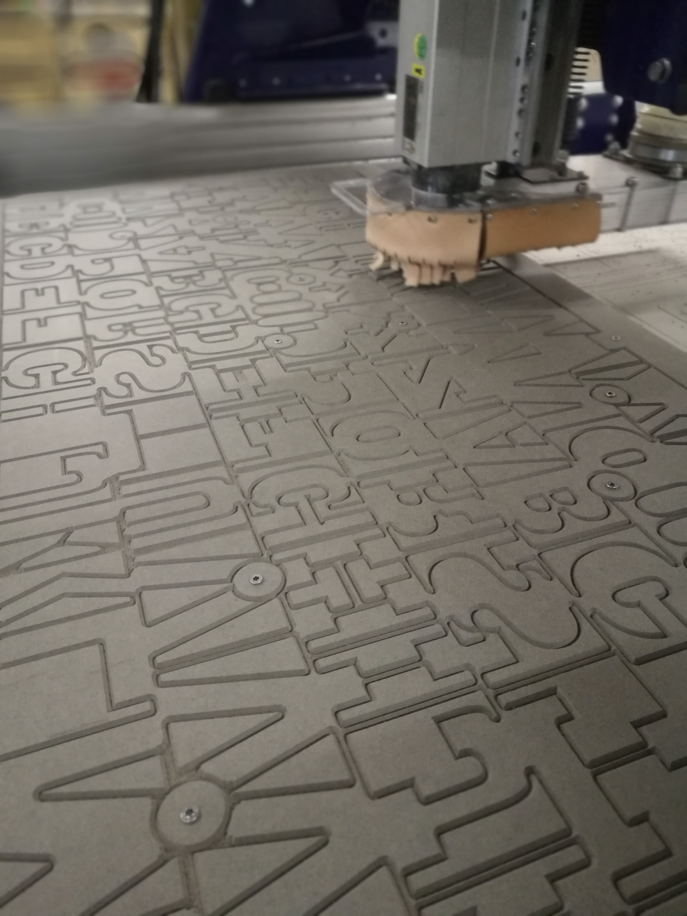
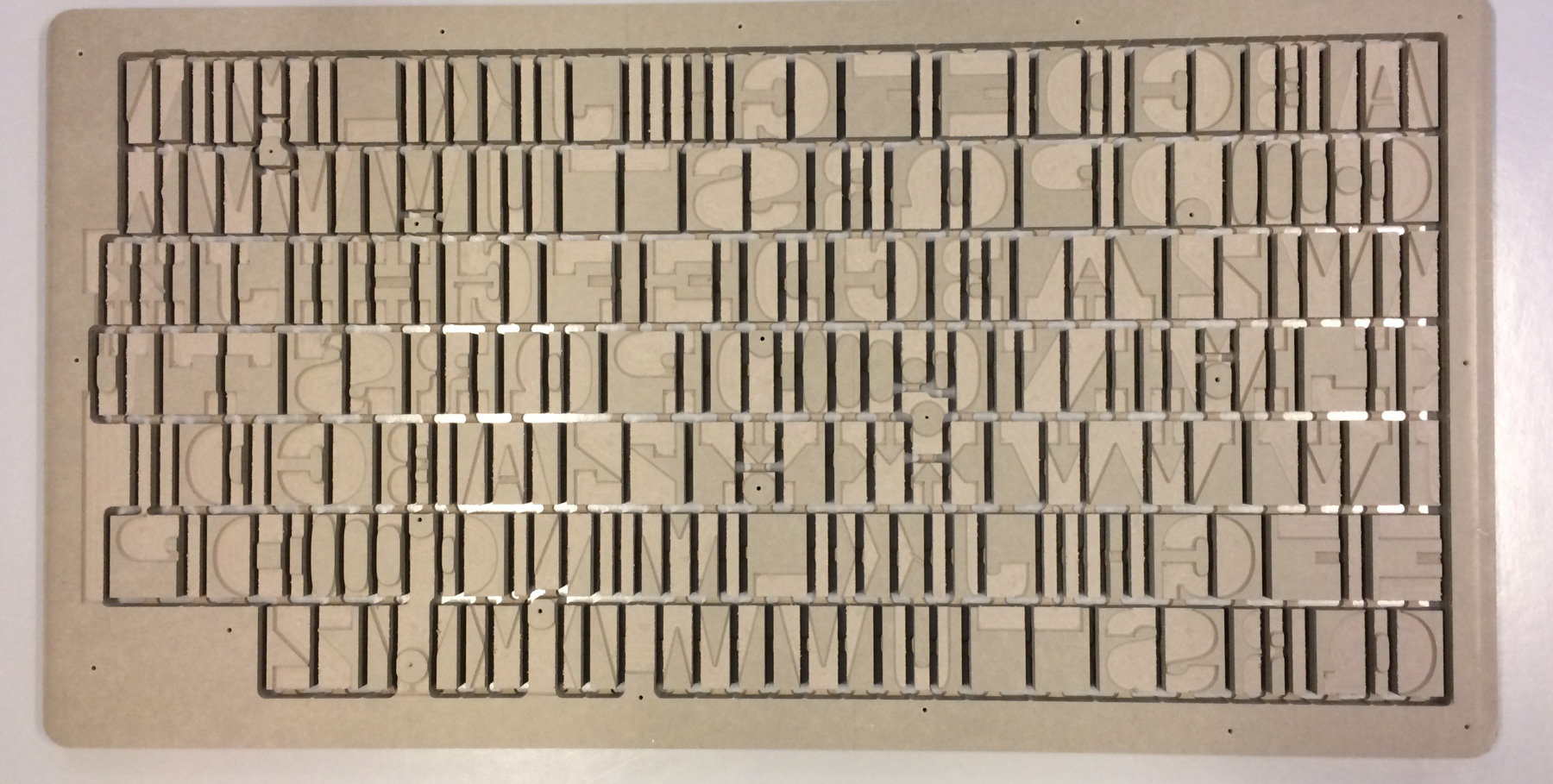
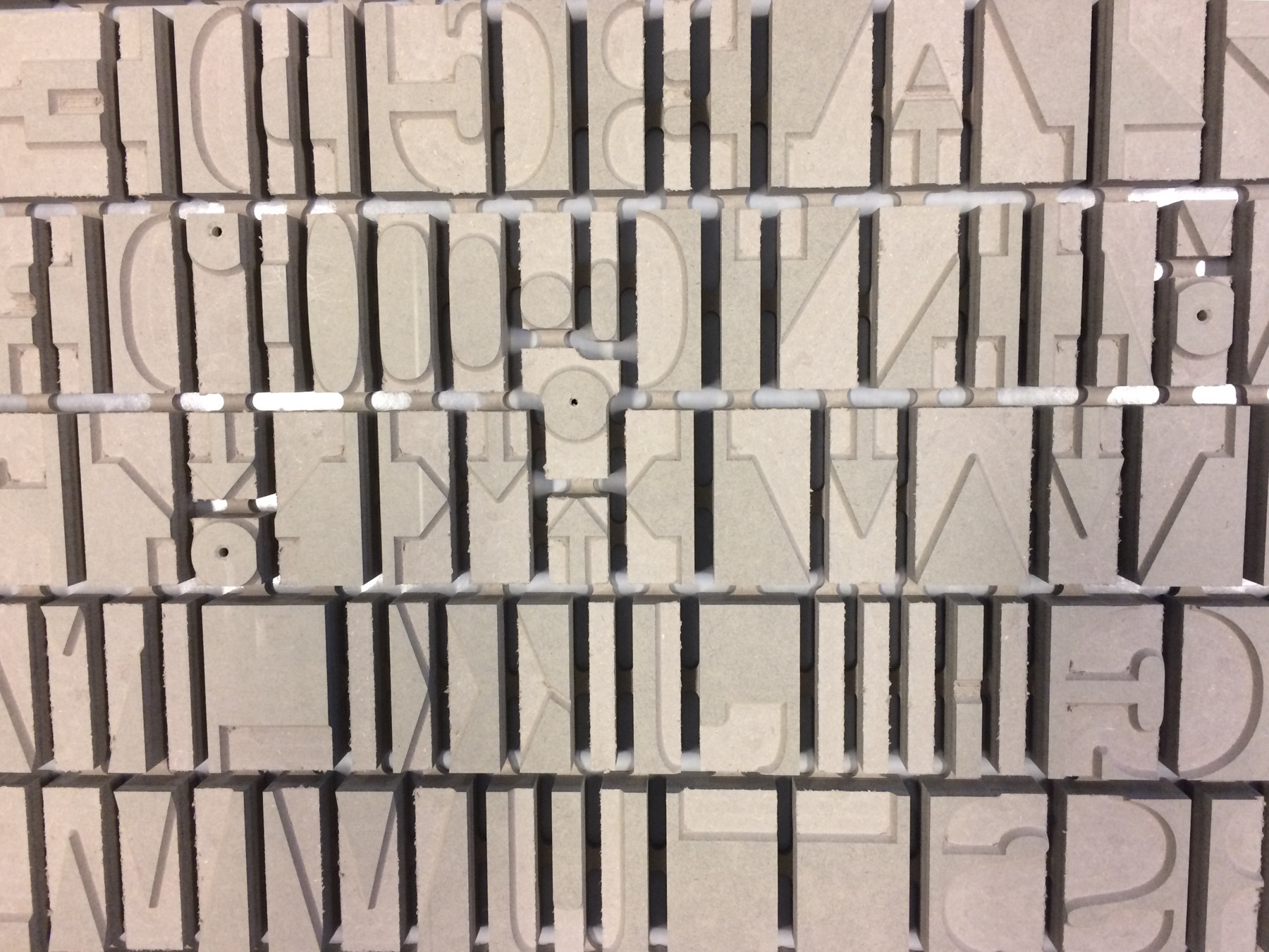
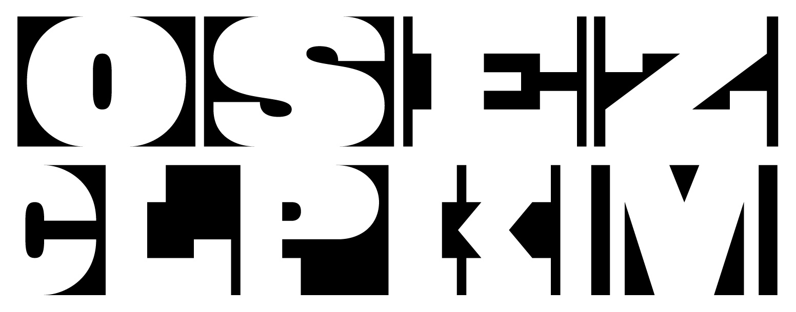
Above: Anti Type Project
2020 (work in progress)
Oslo Psychogeographic Lettering Walks
Maziar Raein, Ane Thon Knutsen and Ellmer Stefan. Oslo Psychogeographic Lettering is funded by GRAFILL, and this project set out to explore and celebrate the hidden and less researched gems that are the public lettering of Oslo. These public signs, lettering (tagging, graffiti and other non-official signage) and signage are a repository of signifiers of journeys through the city. From the centre to the deserted outskirts, by employing psychogeographic techniques of the “derive”, slow walking and observation such as: photography, drawings, maps and writing accompanying narratives, are being collected in order to give insight into an often overlooked aspect of the visual landscape of Oslo.
These projects have oscillated between a search for history and context of the practice of typography and lettering to more formalistic approaches where the form, shape, and drawing have been considered. Our hope is that the next phase of the project should consist of creating a more substantial and comprehensive collection of materials, in order to establish a centre for research for designers and historians in Norway.
There is a richness of graphic design culture here in Norway that needs to be explored and disseminated nationally and internationally.
References
- Maziar Raein, Sussanna Edwards & Julia Lockheart (2003) First published in Typographic 60, Codex, Issue: Summer 60, 2003 ISSN 0143 7623.
