Interview and type talk with Teo Tuominen
Teo Tuominen is a designer specialising in type and lettering. He started his studies doing graphic design at the Lahti institute of design. It was during his time in Lahti that Teo did a course doing type design that truly made him fall in love with the subject. He would design type in the evening besides his regular school work and grow his skills as a type designer. Teo graduated from the TypeMedia program located in The Hague, Netherlands in 2013 with a master’s degree in type design. Teo is currently based in Helsinki, Finland where he does projects for various types of clients, he’s worked with everything from big corporations to small local businesses. His projects are varied and he’s been involved in lettering, logo design, magazine and editorial design, brand identities, hand-lettering and more. When he is not doing client work he’s teaching freelance at Aalto University and the Lahti Institute of design where he does courses on typography and lettering.
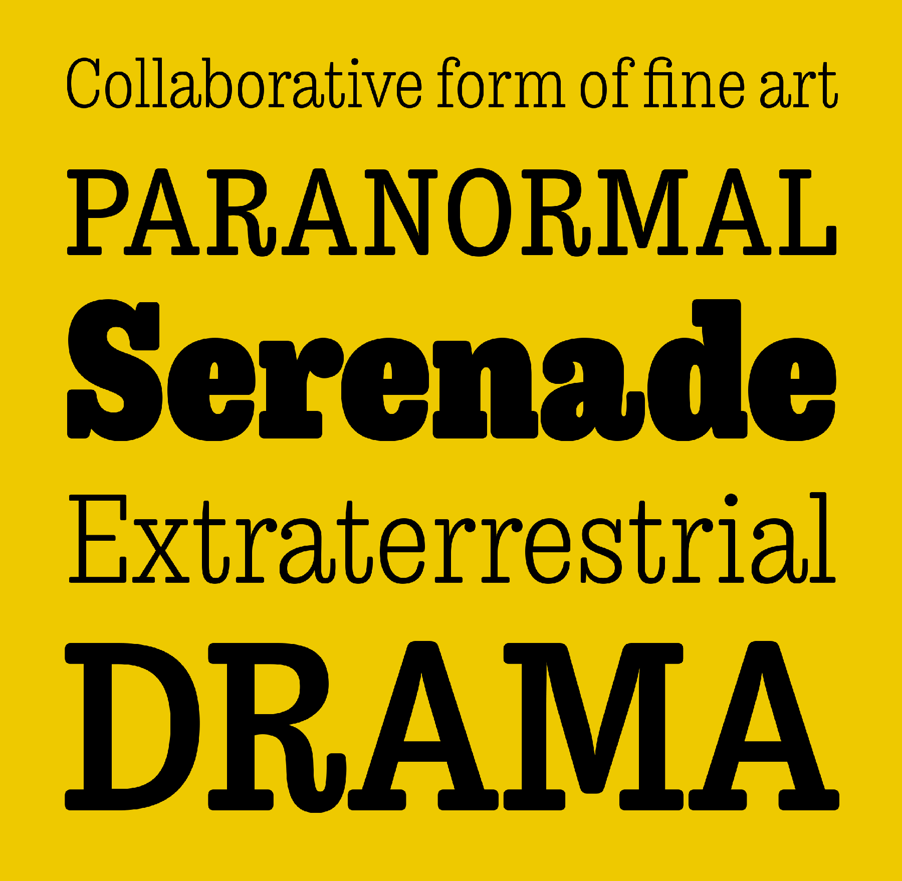
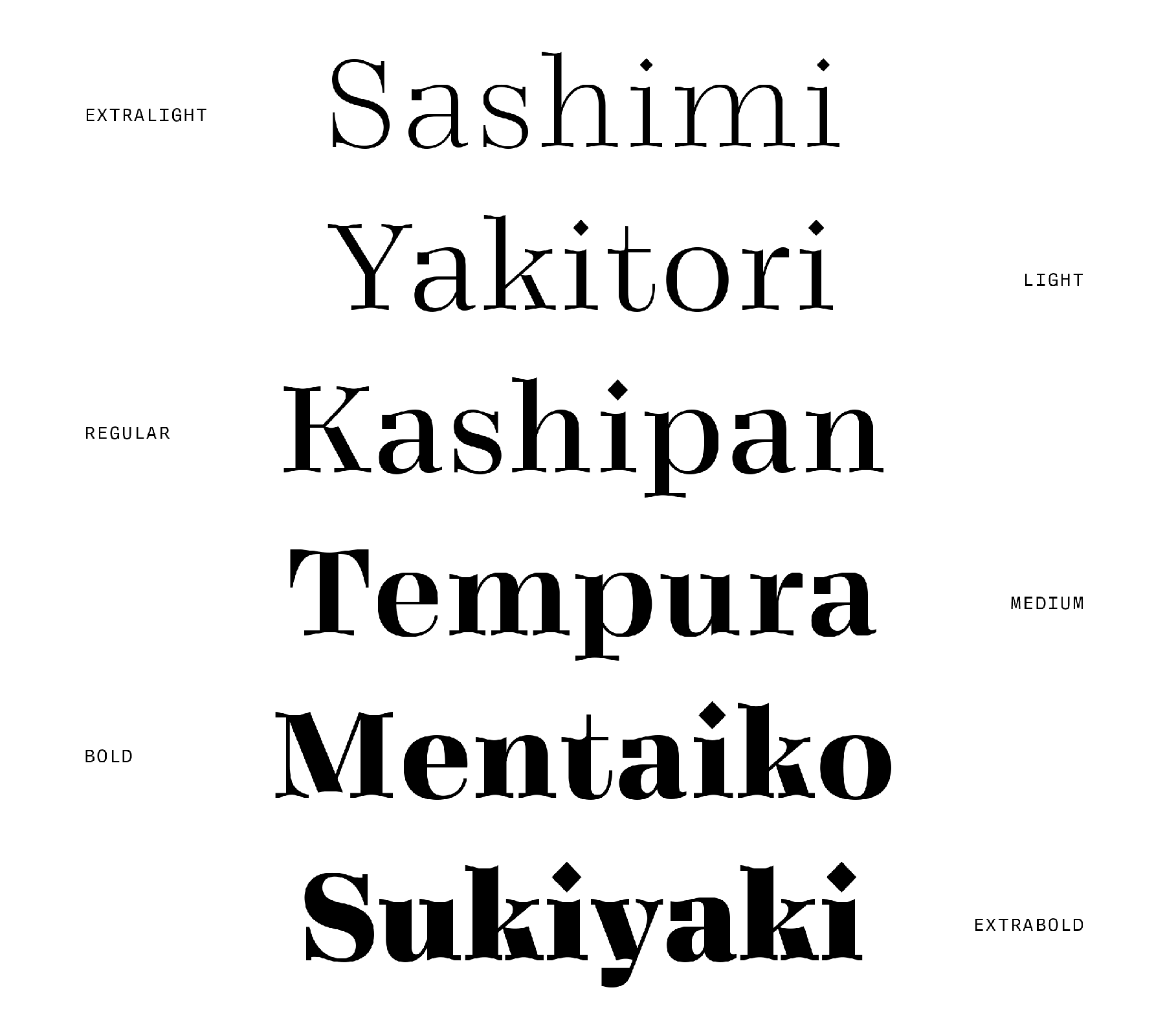
Teo Tuominen designs fonts in a broad range of different styles and aesthetics. His portfolio encompasses several finished retail fonts in addition to custom-made fonts for clients. From heavy but balanced slab serifs like “Trevor”, to classically elegant fonts like “Vieno”. What ties all the fonts of Tuominen together is a sense of modernity and an authenticity.
THE INTERVIEW
We asked Teo some questions about his work, his fonts in particular and wanted to know a bit more about how they are made, where his inspiration comes from and how they are being used in the real world.
INFLUENCES
Coming from Finland and having studied in the Netherlands, it’s almost impossible for a designer not be influenced by Nordic minimalism and Swiss style. Teo is no different. He used to think that this style was a pinnacle to strive for, but as time went on he started to rebel against it by doing more experimental work influenced by designs like American sign painting, something which he also found out was being done in other European countries like Germany and France.
Teo noted that he feels most designs from Europe are influenced by a lot of the same trends coming out of the western world. It’s not only the western world that has influenced Teo. He’s inspired by eastern written languages like kanji, cyrillics and arabian. He has also made type using both greek and cyrillic lettering.
When we asked Teo about his time in the Netherlands and if there were any notable differences to the approach of designing type, Teo told us that he feels like the Dutch style is bolder and more playful compared to what the Finnish designers are doing. He also noted that a trend that has made a big splash in the Finnish type community for quite some time is script fonts, but reassured us it’s not a style that is uniquely popular only in Finland.
PROCESS
The lens in which Teo looks through when making a font is that of a tool maker. He wants other designers to be able to use his fonts in dramatically different ways to accomplish their own unique designs. Teo told us about a stereotype that says “all new fonts need to look similar in order to be readable”, but that is just not true. Although most body fonts are based on the same shapes, there is still room to give them their own distinct personality.
The way Teo brings character to his fonts starts by sketching shapes with pen and paper. While studying in the Hague Teo observed how the Dutch put more emphasis on the design process itself, and how they did not shy away from using pen and paper. It would seem like this is something that stuck with him, by the way he explained his process. First he starts by sketching a lot of different shapes on paper. Then he roughly refines them into letters, and can start experimenting with words to see how the letters work together.
Tuominen would say that he has a certain style in the way he draws letters. However, he knows this due to other people telling him that he has a certain style. He is not aware of it himself, nor does he try to force it. He believes that a style is something that naturally occurs in the design process by the way a designer thinks and naturally draws shapes. That is why he does not want to investigate too much into how his style works, as one might lose some of these natural elements if one becomes too aware and intentional of executing a certain style.
WHY TYPE DESIGN?
The fascination that Teo has with type design seems to stem mostly from a fascination with how shapes behave and how they are able to communicate with the viewer. Everything visual and sensory inspires him. It could be anything: a car, a graphic element or an old poster. He told us that his brain works very visually, but also other sensations like the sounds of music or even tastes can trigger some sort of inspiration or idea for his next design. All in all he takes inspiration from a lot of aspects of everyday life to fuel his creativity. This ability to get inspired by seemingly mundane sources is maybe what fuels many type designers, as typeface is one of the most universal design fields. Letters are used everywhere – as one of the most common ways to communicate between humans.
Tuominen also said he loves the challenge of designing fonts. The combination of having to create something new and exciting while still having to work with all the restraints that type design encompasses is something that he enjoys.
USAGE OF FONTS
Teo explained to us that his goal while making fonts is for them to be useful and readable, but also bring something new to the landscape of typography. He does not want to restrict where people are using his fonts. Teo believes that the field of type design is very much about creating a tool for the designer to use. That is why he does not want to present the fonts in a very specific manner or talk too much about where he would use them.
When it comes to weird or unexpected places that he has seen his work show up, Teo told us a story about his time in university where he would post some of his fonts for free online. One of the fonts made during this time, “Winnie the hoop”, actually found it’s way all across the world to Japan, where it was used in a book of fonts he didn’t find out about before they kindly sent him a copy of the book for free. Another place he did not expect to see his font was on the packaging for a toilet paper brand. Nonetheless, Teo loves the ideas of his fonts living their own life and being used in designs of all types.
When asked about favourite fonts, Teo further explained his mentality on type design. He believes that all fonts have potential if they are used right, and enjoys looking at bad fonts used in interesting ways. He has even seen comic sans been used in good ways. There is actually a movement in Finland which uses ugly fonts on purpose.