I grew up in a period of time (1991– ) when the technological media landscape changed dramatically in just a few years. When I look at oldimages of myself I not only see my adolescent self growing into adulthood, but also a time-lapse movie of how modern media has unfolded.I notice how images serve as proof of how our behaviour and culture has changed alongside the technology.
My master project started when I noticed how images and visual expressionare occupying an increasingly prominent position in our everyday life. Today, everyone with a camera phone and internet connection, amateurs as well as professionals, are invited to create, observe and circulate images. This is the genesis of a visual revolutiondefined by media theorists as “The Pictorial Turn”.
The project explores our image culture by assembling all images taken of a person through a lifespan. This dataset is used to produce a variety of categorizations and graphical representations of different findings, compiled as an atlas. The matter of contention is: Who are we through all these pictures we capture of ourselves?
The Pictorial Turn
In 2014 alone, one trillion photographs were produced worldwide (Nicholas Mirzoeff 2015, p.6). Every day, 55 million images are uploaded to Instagram, 400 million stories are made on Snapchat, 8 billion videos are displayed on Youtube and 200 million Skype calls are made. (Internet Live Stats, 2018)
We have throughout the history of humanity witnessed several visual revolutions. These were triggered by new technology like microscopes, telescopes, the developmentof maps, photography, film, and x-ray imaging. These pictorial revolutions can be said to have had a huge impacton culture and society. However, Nicholas Mirzoeff argues that the amount of digital images produced and shared over the Internet today draws no parallel to previous pictorial revolutions. (Nicholas Mirzoeff 2015, p.16).
In 1994, W.J.T Mitchell and Gottfried Bohmen independently formulated a term describing the new visual revolution that unfolded at the same time. W.J.T Mitchell called it “The Pictorial Turn”, while Gottfried Bohmen used“Iconische Vende”. (Sándor Hornyik, 2002). In Norwegian, the term translates to 'Den visuelle vendingen' and is explainedas a two fold “turn”:
- Increased and changed use of visual expressions such as images, videos, colours and layouts in a variety of genres and discourses.
- Increased professional interest in the use and effect of these expressions. (Martin Engebretsen 2013, p.13)
Both Mitchell and Bohmen borrowed the rhetorical topos“turn” from philosopher Richard Rorty who popularized the term “The Linguistic Turn” in 1967. Mitchell compares“The Pictorial Turn” with “The Linguistic Turn” that Rorty formulated which has affected cultural studies the last decades. (Sándor Hornyik, 2002)
The linguistic philosophy of the 1970s was concerned with how language laid the premise for our understanding of the world. Now this point of view is equally assumed forpictures. (Martin Engebretsen 2013, p.13)
Project outline
The point of departure for the master project was to research “The Pictorial Turn” through design. This to see how or if the treatment of the data, through design, allows for new knowledge and patterns to emerge. The project then steps away from the premise of design as always being a problem solving discipline. Instead design is used to find problems and ask questions.
Design is used to observe, organize, analyse and eventually visualize the information extracted froma dataset of 5696 images. In the end this process culminated in an artifact which is the embodiment ofthe design research knowledge.
The dataset assembles all images taken of a person through a lifespan. I use this data-set of images as raw material for exploring image culture and the behaviour of this person in the context of “The Pictorial Turn”.
The images in the data-set was retrieved from the subjects family, friends, acquaintances as well as the internet. It was gathered a total of 5696 images.
The collection is limited to private photos from the sources available. Sources like surveillance cameras in public places, random passers-by and private databases associated with work and school were not used due to limited access. Including these sources would raise the amount of images considerably.
Getting the full picture
The strategy for the collecting part was to retrieve pictures from several, sources such as 1: The internet which include pictures shared on social media platforms like Facebook and Instagram, and 2: the private picture archive of the subject, and the subject’s family and friends. To do so USB-sticks were sent out to the contributors and selected pages of more than 30 family foto albums were scanned.
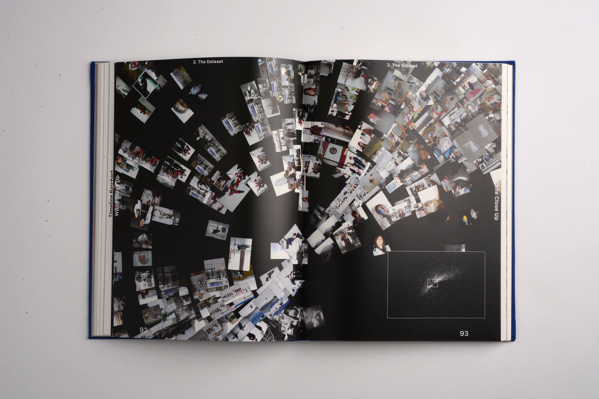
After completing the image-database i wanted to grasp the full extend of it. Knowing the number of images,or seeing the list of image-files in my harddrive, I thought, would not be as impressive as trying to visualise the full collection in one place.
The dutch artist, Erik Kessels, has done several projects concerned with photography and images. In his exhibition'24 hrs in photos', he printed one million photos that were uploaded to Flickr, Facebook and Google over a 24 hour period. This exhibition inspired me to print out the data-set, as you can see in the image at the previous page.
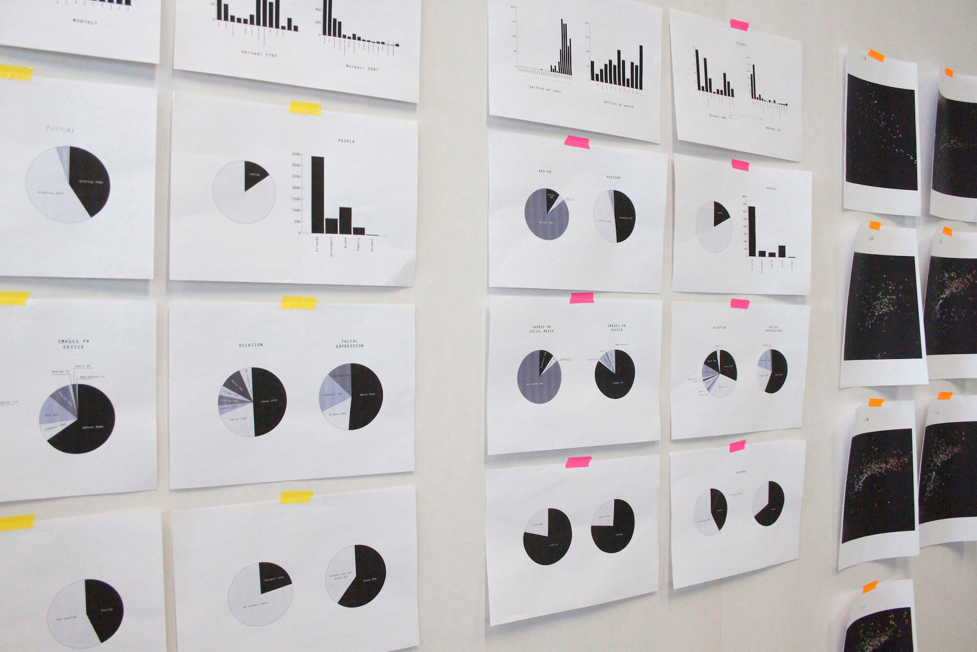
Organizing with meta tags
Creating order in a data-set of 5696 images would ultimately demand a great amount of time. Seeing the amount of data during the print out made it clear that I could not just spread the data across the kitchen table to examine it. How could the data be organized and analyzed to make interesting discoveries?
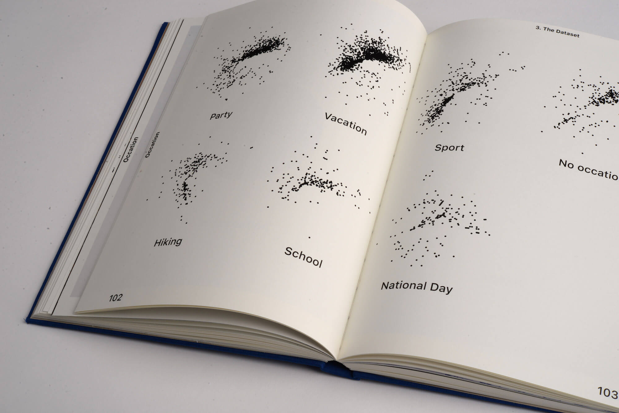
I had to find a system to group image files based on their content, form, context, setting, or purpose. I figured the most effective way to do this was by adding keywords as meta information in every image file. To meta tag them, like you would hashtag an image on instagram.
All digital image files contain some sort of meta information, generated automatically by the device capturing the image. Information such as size, measurements, colorspace, when it was created, by which device, maybe GPS coordinates and so on. What information each device generates varies. In order to organize the collection according to my own categories, I had to add meta data manually through software.
As an example: I could tag all selfies with the keyword'selfie' and search for all images marked 'selfie' to see what portion of the data-set was selfies. Or to investigate the timeline of selfies by adding the month or year the specific image was taken and so on.
Adobe Bridge were used to add and search through meta information.
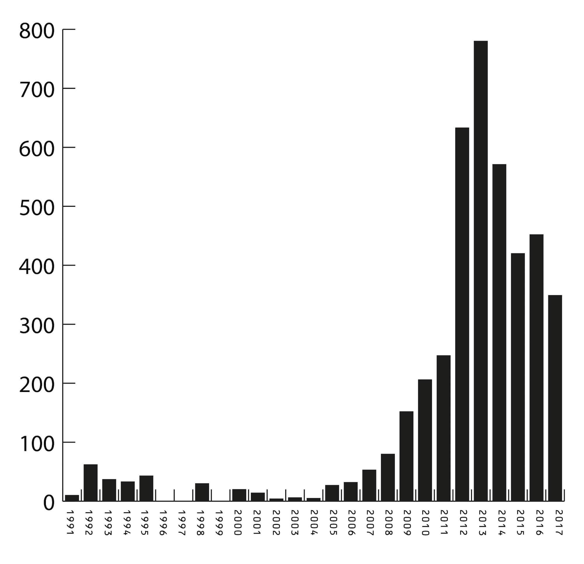
Numbers and graphs
Once the meta information was added to the images, I sorted them out in categories and made graphs according to the numbers. The first and most striking example of the pictorial turn was visualized in the graph below.
It shows the total number of pictures per year from 1991to 2017. While slowly growing from 2005 to 2011, the number more than doubled in 2012. The effect of being able to carry around cameras in our pockets wherever we go is clearly visible.
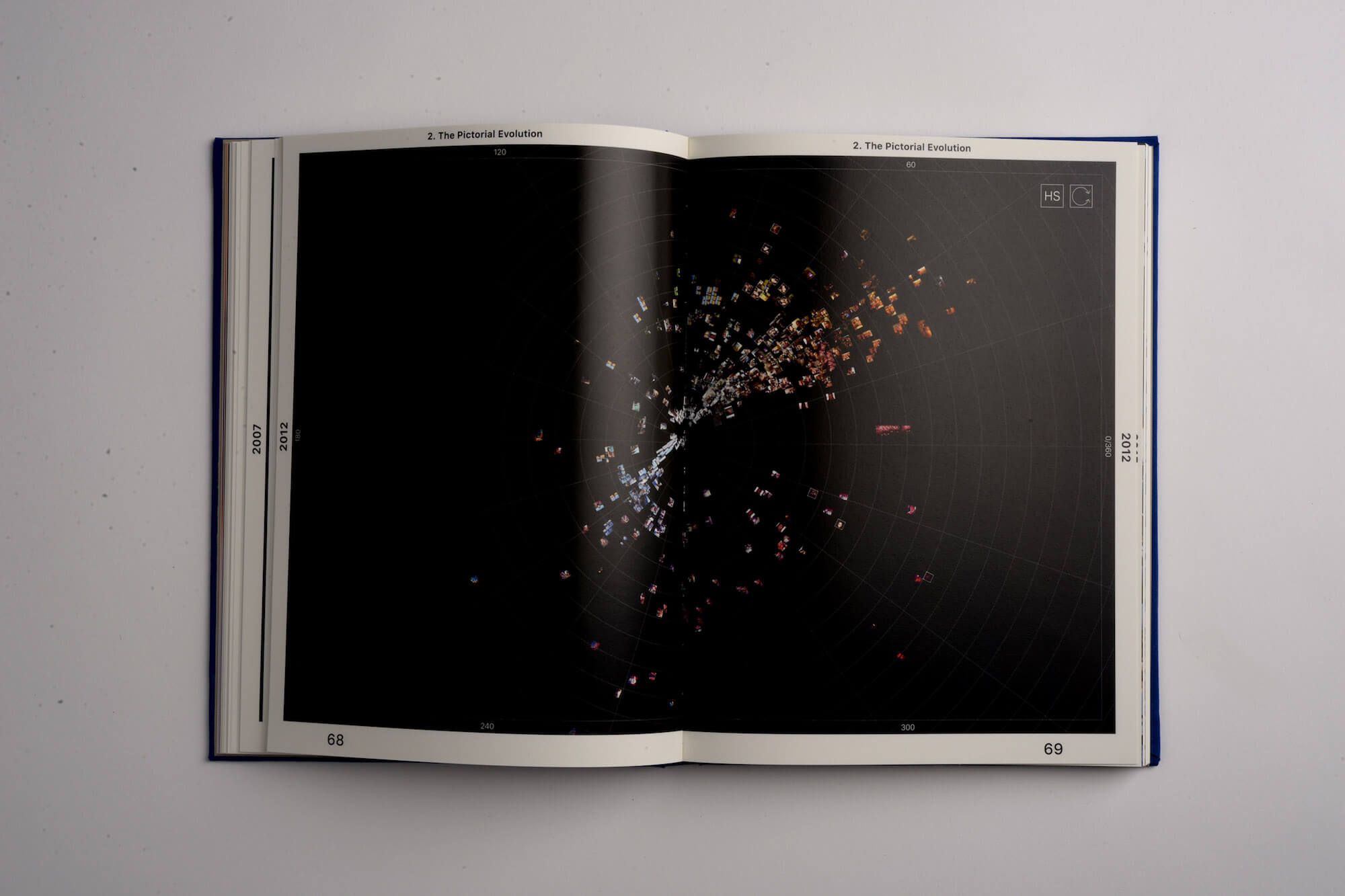
Computational exploration
Reading and visualizing the numbers extracted from the meta tag categories is one way of sorting and reading the information of the image collection. I was however looking for a way to see the pictures all together and to be able to read their interface without having to open each and everyone separately.
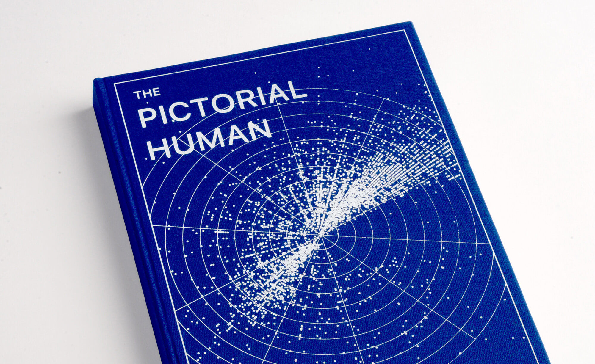
To do that I used ImagePlot, a software tool to visualize large image collections, to better understand their similarities and differences. The image above is a mapping of the complete data-set by parameters of hue and saturation. It is a radial plot showing low saturation in the center and high saturation on the edges.
Seeing the images mapped out like this gave room for a different type of discovery. Now I could see images of similar visual properties lining up to each other.
Presenting the findings
The graphical representations of the findings from the data-set was in the end compiled as an atlas. The final form of the project draws inspiration from two precedent projects. They are examples of how others have used the atlas as a medium to present findings from design research.
The first is Above the Cloud, an atlas about social networks archeology, death and digital footprints left in distress on the internet, by Boris Meister at ECAL in 2012. The other is Scandatlas, a book on the New York vs. Strauss-Kahn trial, made by Graphic Designer Helge Hjort Bentsen. It chronologically contextualizes the events of the case through visual analysis. They are both examples of how serious research can be presented in a playful way as a coherent object tying to gather images, illustrations, data-visualizations and text.
The Pictorial Human Atlas was hand-bound in two editions. It is divided into 6 parts: an introduction with explanation of symbols, a timeline, overview and a zoomin, presentation of the subject, a closer look at the selfie and in the end an image index, a listing of all the images by filename and values used to generate the plots.
Final notes
This project has helped me understand how design research can contribute to a discourse by treating informationin a way that allows for new and interesting patterns to emerge. And it has helped me understand the importance of contributing to a discourse by asking questions and finding problems.
I present one way of researching the topic of “The Pictorial Turn” through design, and I’m sure there exists infinite other. I hope the project will stand as an example that may inspire others to reflect on our contemporary image culture and approach the topic of their interest by researching it through design.
References
- Engebretsen, M. (2013). Visuelle Samtaler, Bergen: Fagbokforlaget
- Hjort Bentsen, H. (2018) Scandatlas. [internet] http://www.helgebentsen.com/?projects=work
- Hornyik, S. (2002). On The pictorial Turn. [internet] http://exindex.hu/index.php?l=en&page= 3&id=417
- Meister, B. (2012) Above the Cloud. [internet] http://www.ingoodwetrust.ch/projects/abovethe- cloud
- Mirzoeff, N. (2015). How To See The World, United Kingdom: Penguin Random House Internet Live Stats (March, 2018) Internet Users in The World. [internet] http://www.internetvestats. com