The world has become ever more complex. Our economy is no longer local but global, and increasingly characterised by complex interdependencies. Nationstates are often involved in various types of supranational cooperation that reduce the possibility of democratic influence. And to tackle the crisis of climate change, we need a better overview of the interaction between different systems in the natural world. In recent decades, the world has experienced a historic explosion in data volume. In 2013, figures from SINTEF, an independent research organisation, showed that 90% of all the world’s data had been generated during the previous two years (Dragland, 2013).
Confronted with what we call “big data” and the world’s growing complexity, we must ask: Do our present circumstances require a fresh approach and new methods for data visualization?
This article will first review some of the momentous changes that have taken place in the history of data visualization, and then examine the concept of complexity and what characterises a complex system. Finally, the article discusses how the visualization of complexity can help us develop new perspectives and answers, which may be very different from what we expected.
A tool for understanding the world
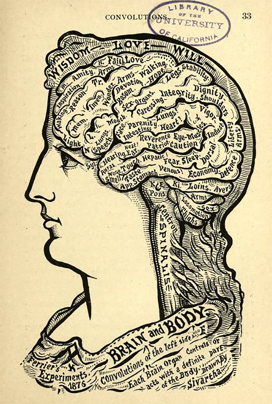
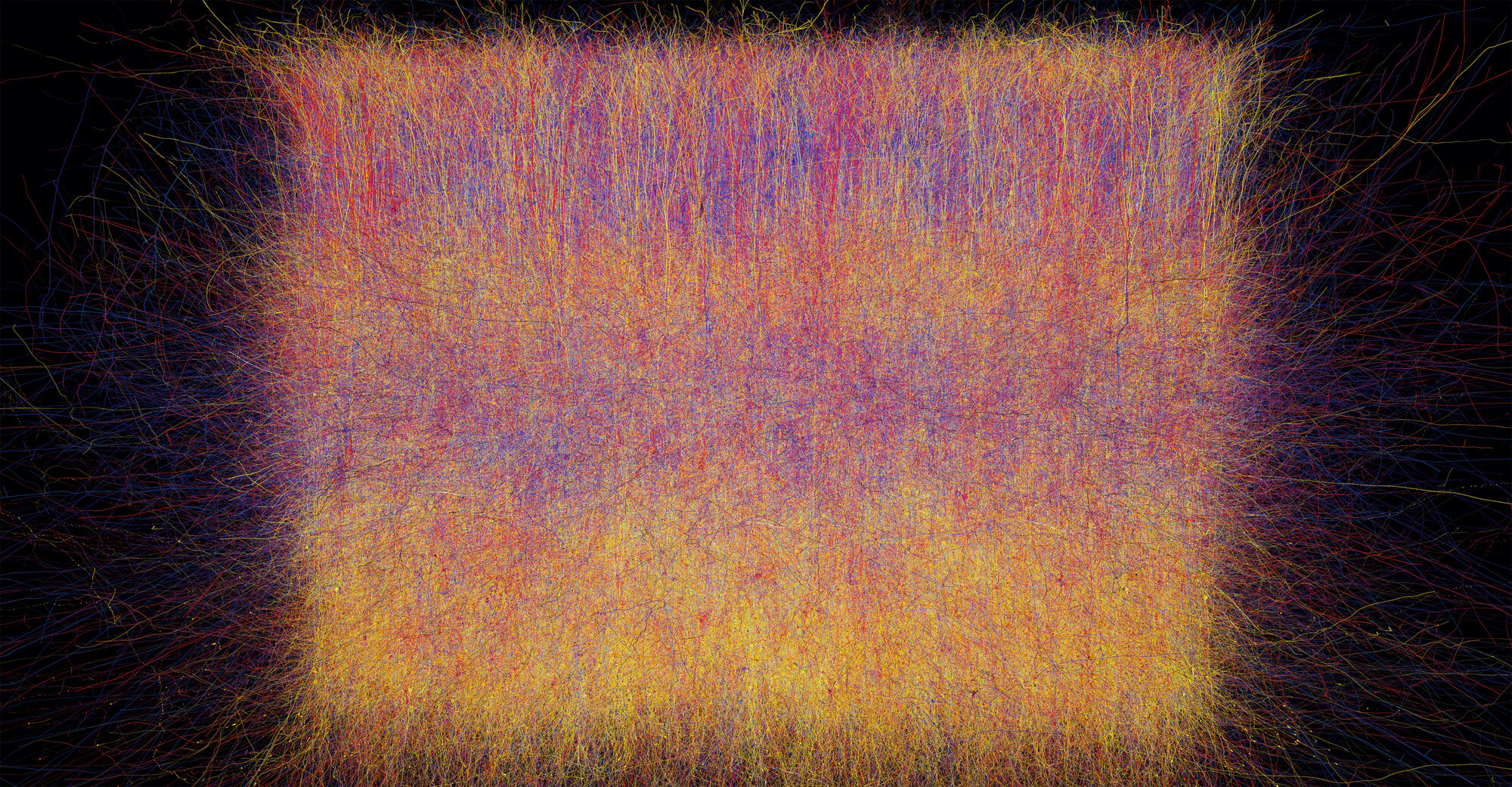
A brief review of the history of data visualization can help us understand why we visualise data in the way we do today. Take a closer look at Figures 1 and 2. These two visualizations, made roughly 100 years apart, summarise the radical changes in our understanding of the world, and how we visualise it. Both images attempt to show how the human brain works. Figure 1, from Alesha Sivartha’s book The Book of Life (1912), is a drawing that describes the varied functions of different parts of the brain. Figure 2, from IBM’s “Blue Brain Project” (2008), is a visualization of roughly ten percent of the neocortex. These two examples are sufficient to show not only how much more we know about the brain than 100 years ago, but also how far we’ve come when it comes to visualising this knowledge.
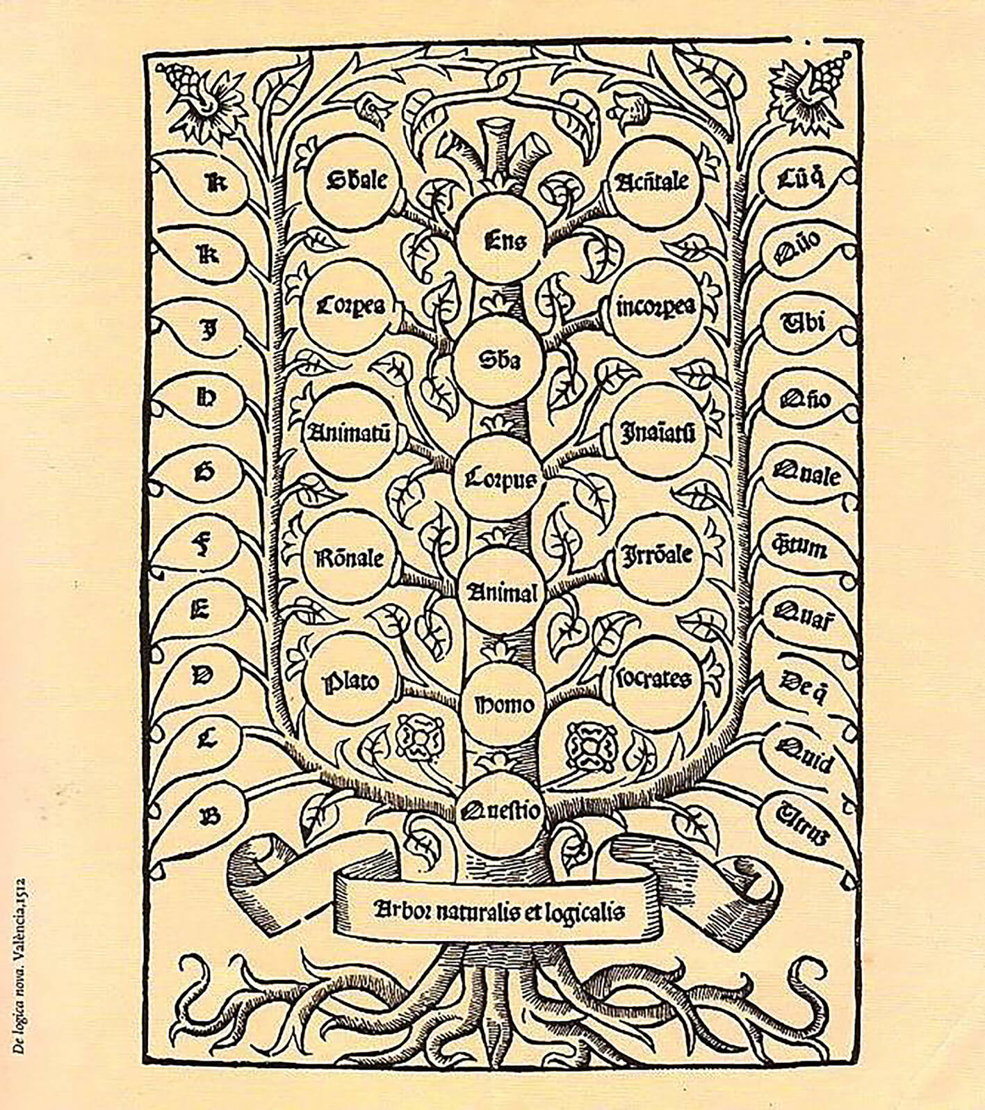
To make data visualizations more tangible, we use metaphors that refer to the real world. For example, pie diagrams and network graphics inspired by spider-webs or other natural nets. In fact, the history of information design begins with a very simple metaphor: the tree. The image of the tree has been used to map many disciplines of knowledge: animal species, legal systems, family ties, nobility, religious narratives, and variations in morals and ethics (Lima, 2015).
The image of the tree has carried great importance in many cultures. In ancient Egypt, for the Vikings and for the Navajo, in Greek mythology and in Hinduism, the tree was a vital symbol (Lima, 2014, p. 16). In Europe during the High Middle Ages, the tree flourished as the dominant symbol for visualising knowledge, during a time when information about the world was much more limited than today. The tree’s hierarchical structure was consistent with the reigning perception of social, cultural and religious relations. A good example is the medieval concept scala naturae, “The Great Chain of Being”, the idea that all of creation has its natural place in a predetermined hierarchy. God is at the top, of course, then angels, human beings, animals, birds, reptiles, insects, worms and plants; at the bottom are stones and minerals (Store norske leksikon, 2009). The entire medieval world view was characterised by hierarchy, and this was easily visualised as having the form of a tree (Lima, 2014, p. 29).
Not until the Enlightenment (1688–1789) and the emergence of modern science did the visualization of information begin to play an active role in scientific research and the development of new knowledge (Lima, 2014, p. 38). During this period, there was an increasing interest in studying animals and nature based on empirical data, as opposed to preconceived notions of a universal hierarchy. As more knowledge was gained, greater demands were made for its visualization, because within the various sciences additional information and complex connections were discovered that could not be forced into the predetermined structures. For over 2000 years, we had tried adapting the world to our preconceived ideas and structures. In accordance with the core ideas of the Enlightenment, however, the natural sciences began to lay new guidelines for the visualization of information—visualizations that could actually also help detect new patterns in the data collected.
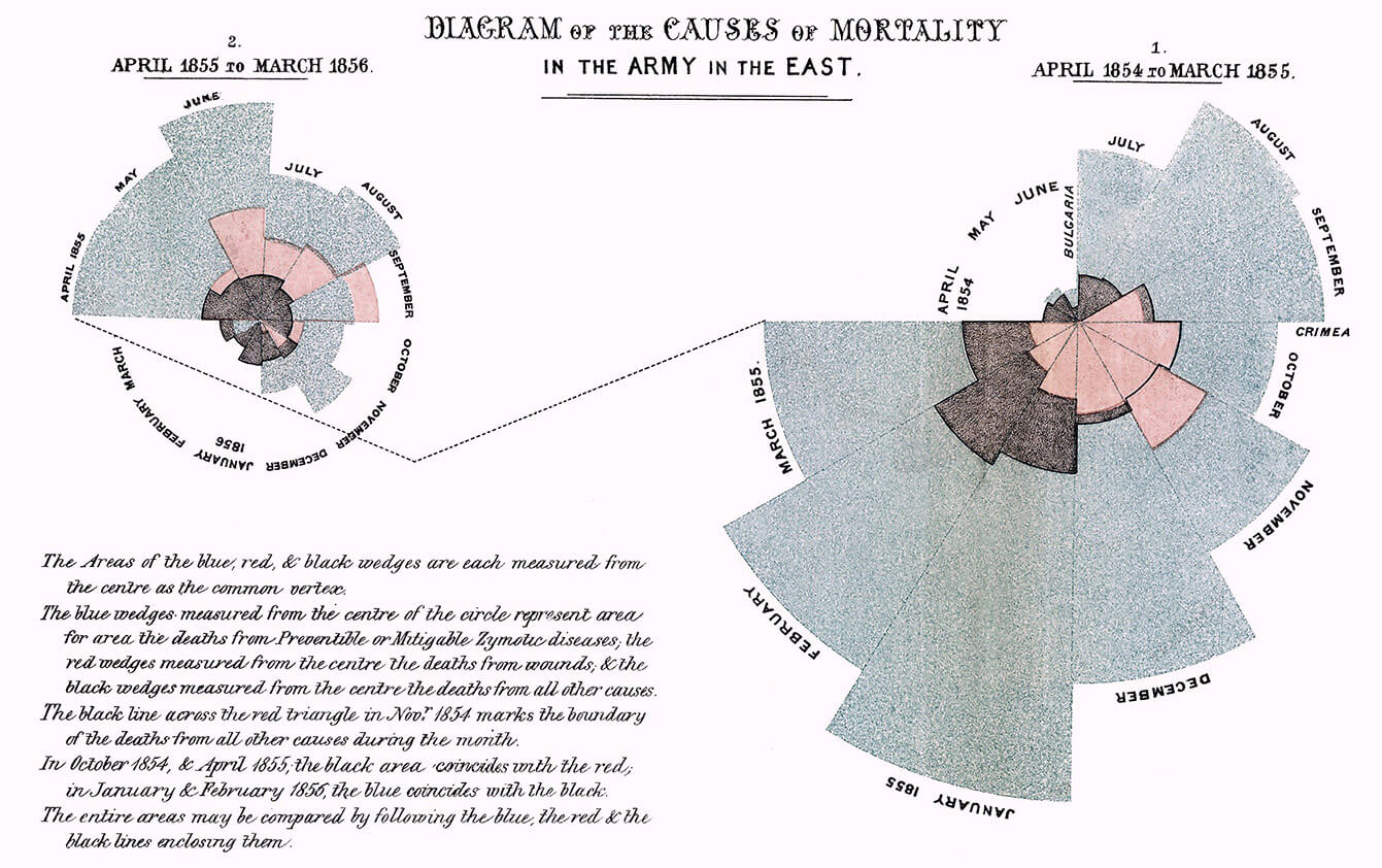
A good example of this new methodology was the work of Florence Nightingale (1820–1910). While she is best known for founding the modern nursing profession, Nightingale also made important contributions to how we visualise empirical data. She herself used visualizations to map patterns that would have been very difficult to spot just reviewing raw numbers. For instance, when she worked at an English field hospital in Turkey during the Crimean War, Nightingale saw a clear connection between hygiene and survival rates, which inspired her to developed strict routines to counteract infection (Rehmeyer, 2008). During her lifetime, we saw the adoption of new visual metaphors and the development of new models. The network model (showing multiple nodes and their connections) eventually became the dominant structure for data visualization—and it has remained so.
Nightingales work represents an important shift. Up until the Enlightenment, what we might call information design had a purely communicative role. Models and charts were drawn to show something that had already been interpreted and determined by an authority, be it the artist, the Church or the King. During the Enlightenment, data visualization began to be used as a tool for analysis, with the visualizations providing answers that might not have been discovered at all without such visual presentation.
In 1941, the Argentine author Jorge Luis Borges wrote The Library of Babel, a short story that describes a huge library consisting of many hexagonally-shaped rooms. The library is filled with books containing every possible combination of 25 basic characters (22 letters plus spaces, commas and periods). In theory, Borges library contains absolutely all information about the past and present and future; the story describes how the librarians are driven insane trying to figure out the system and how to distinguish between useful information and meaningless combinations.
It is as though Borges looks into the future when he is able to describe a superabundance of information that was, 60 years later, made possible by the invention of the Internet and other new technologies.
Today and every day, we generate 2.5 quintillion terabytes of new data, also known as 2.5 thousand million trillions terabytes. Such numbers are incomprehensibly large, and much of what is generated is completely meaningless, at least from a social perspective. That is why it is essential for us to learn how to handle huge amounts of data—and to be able to distinguish the important from the unimportant.
Manuel Lima’s books, The Book of Trees: Visualizing Branches of Knowledge and Visual Complexity: Mapping Patterns of Information, are two important sources for understanding how we visualise data, today as well as historically. Lima is currently working as a designer for Google in New York. During a study trip to New York, as part of my Master studies, I was lucky enough to meet Manuel Lima and interview him. We discussed the question of visual metaphors. I asked him whether the type and quantity of data that we have today require other visual metaphors and structures than in the past. Lima replied:
“I think we need to explore new visual metaphors. Like I was saying, its striking how even though we have much more powerful machines, a lot more data, and arguably more complex challenges than we had in the past, just think about, again, the political systems and financial systems, or even the ecosystems on our planet, right? There are so many connections and so many interdependencies. And for those, a lot of metaphors—visual metaphors—that we’ve been using for centuries just do not work. So we need to be more creative and come up with new visual metaphors. I think its just critical ( ... ) Our ability to gather data and collect data is always ahead of our ability to make sense of that data. Always one step ahead. And as designers we always try to catch up. Its great that we can get one million nodes of scheme, but how to make sense of it is the challenge.”
During the Enlightenment, new knowledge demanded that we change the visual metaphor from the tree to the network. Now that we are seeing such a profound increase in the amount of data, still more flexible visual metaphors are required. We need new visualizations, and this entails stepping beyond the network structure that is so widely used today.
To embrace the complex
The evolution from the rather rigid tree structure to more flexible network structures was a major and necessary step. An integral aspect of the network metaphor is the connections between different nodes in the system. But can the network structure show the interaction between its different parts?
To better understand what complexity is, we can contemplate the difference between complicated and complex. When solving a complicated problem, we can take its components apart and solve the individual problems. If we are solving a complex problem, we must first analyse in order to understand which parts of the problem are interdependent, and furthermore how changing one part may affect the others. A system may be defined as complex if its individual parts are characterised by connections and interdependencies. We use the terms inter-connected and inter-dependent describe this. As a rule, a complex system is usually complicated—but a complicated system is not necessarily complex.
Until today, reductionism has been at the core of all scientific methods. Reductionism is the idea that the analysis of the individual components in a system enables an understanding of how each part functions, and thus an understanding of the system as a whole. Through extrapolation a set of rules for the components is created, and then these rules are used to predict how the rest of the system works. In other words, if we have understood that two comes after one, then we also understand that three comes after two. Similarly, with the algebraic method, available information is used to deduct the value of “x”.
The problem with extrapolation as a method is that this method of analysis works only if the rules that apply are universal for the system. If there are interdependencies that vary from component to component, then this method will collapse (Stanford University, 2011). In his book A Crude Look at the Whole, the economist John H. Miller describes how the following factors are key to understanding complex systems: interaction, feedback, heterogeneity, turbulence, noise, non-centralised intelligence, group intelligence, scaling and cooperation. In other words, according to Miller, there are aspects of complex systems that simply cannot be captured through a reductionistic approach.
“Reduction gives us little insight into construction. And it is in construction that complexity abounds.”– John H. Miller, economist.
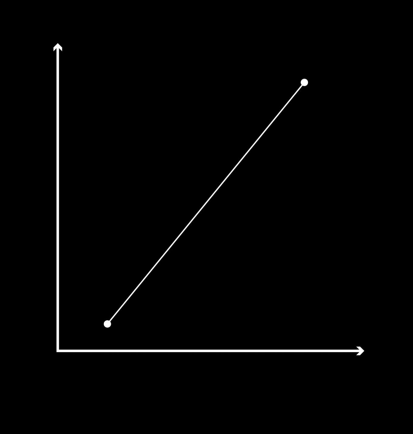
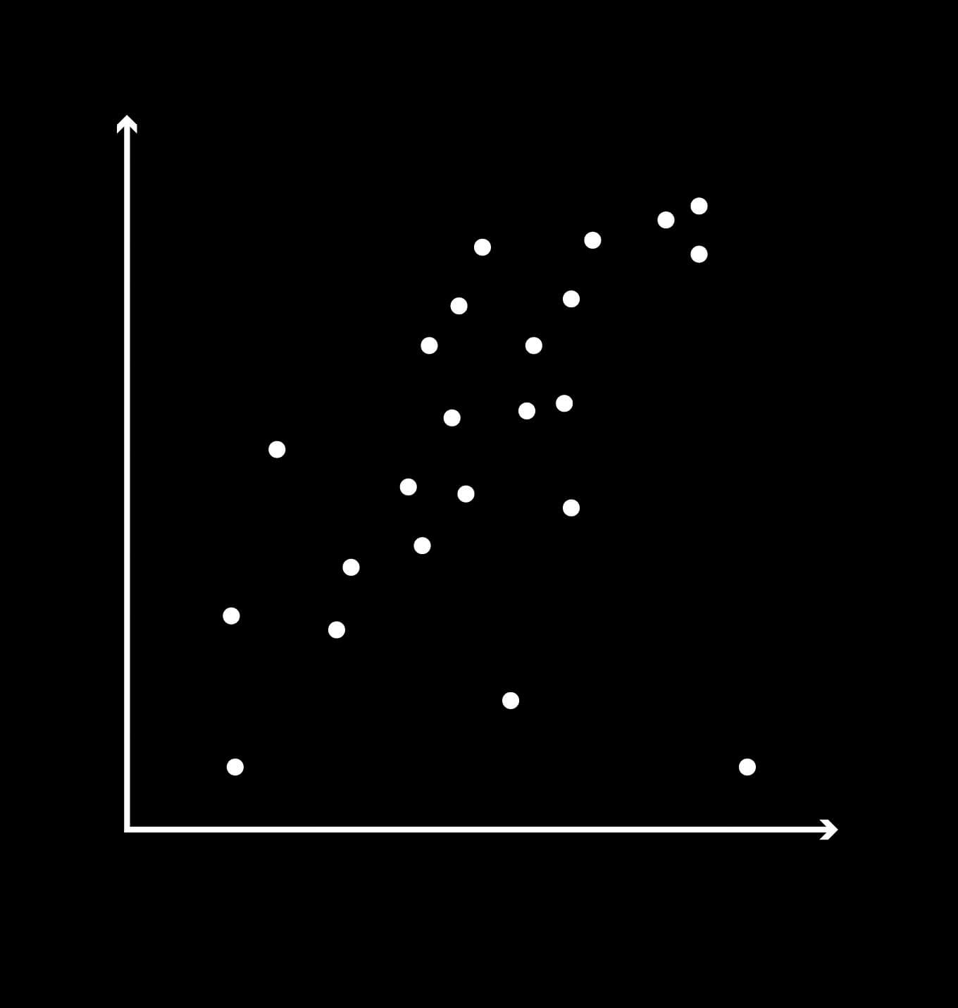
The opposite of reductionism is holism: the idea that the whole is more than the sum of its parts. Figures 5 and 6 present two imagined data sets. The reductionist will point out a general trend in the data and say that this constitutes the system. The data points that fail to fit are interpreted as noise or deviation and removed from the survey.
On the other hand, an observer with a holistic approach will say that the deviations, too, are part of the system. In other words, we must embrace complexity rather than sweep it under the rug. The models we have for visualising data are sufficient to explain the individual parts of a system, but are they good enough to visualise complex interconnections and interdependencies between these components? In my opinion, it is important to take a step back and think about how we can visualise data holistically and intuitively, rather than merely in a simplified and technical manner.
Design that facilitates reflection
In his 1967 book, Semiology of Graphics, the French cartographer Jacques Bertin shows how different types of mediated communication give rise to different communicative qualities, as shown in Figure 7. Music and abstract elements lead to open communication with room for interpretation. The term pansemic refers to the fact that music and abstract images can have an almost infinite number of interpretations (Margolin, 1996, p. 203). Bertin characterises our verbal languages and figurative images as polysemic, i.e. having multiple meanings. Graphic representation (Bertin considers data visualization specifically) and mathematics are mediated systems that he defines as monosemic, i.e. forms of communication that have only a single possible interpretation.
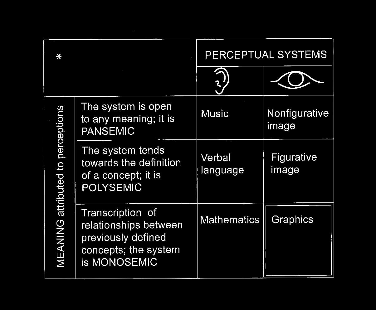
“Graphic representation constitutes one of the basic sign-systems conceived by the human mind for the purposes of storing, understanding, and communicating essential information. As a ‘language’ for the eye, graphics benefits from the ubiquitous properties of visual perception.” –Jacques Bertin (Lima, 2013, p. 159).
Semiology of Graphics (Bertin, 1983) is considered to be the first attempt to build a theoretical foundation for data visualization. A more philosophical approach to the topic is found in the graphic novel Unflattening by Nick Sousanis. Unflattening is an experiment in visual thinking; it was also a doctoral thesis at Columbia University—probably the only doctoral thesis written exclusively as a graphic novel. The book highlights how we can use visualization to free ourselves from preconceptions and automatic thinking. Visualization can be a method for an expanded form of thinking that enables us to be more critical and creative. Sousanis begins by describing a dystopia where everything is flat. It is not a literal flatness but rather a “flatness of sight” (Sousanis, 2015, p. 6).
“By flatness I didn’t mean something literal. I meant patterns of thought, patterns of behavior that we’re trapped in. A place where we sort of forget what might be and we’re trapped in how it is.” Nick Souansis, Lecture at the National Gallery of Art, (2017), Unflattening: Revolutionizing Thought in Comics.
When we look at a photo, we cannot avoid perceiving the entire picture at once, absorbing all its information. This differs radically from how we read text, where we are by-and-large compelled to read linearly, from start to finish. Sousanis believes that the non-linear manner in which we read images is more in line with the natural way our thoughts wander.
”While image is, text is always about.” –Nick Sousanis (Sousanis, 2015, p. 6).
In a lecture at the National Gallery of Art in Washington, Nick Sousanis explained that there is a widespread opinion that complex subjects such as philosophy, science or psychology can be treated visually only if done with great simplification (Sousanis, 2018). This attitude that can be traced back to the time when data visualizations first appeared in newspapers and magazines and were aimed at a general audience. The idea was that information design was merely “a tool to show the obvious to the ignorant” (Tufte, 2001, p. 53). Today, we are well aware that a visual presentation can provide commentary and criticism, and can speculate, adding an extra dimension rather than functioning only as decoration for the text.
Data visualization has at least two distinct functions. First and foremost, it can effectively provide a visual overview of large amounts of data. Furthermore, the graphics may act as additional illumination of the topic at hand. However, to do the latter, the chosen graphic solution must leave room for reflection by the viewer. In other words, the user must be trusted to mentally add meaning when faced with an ambiguous image. When such communicative devices are used consciously and successfully, I believe they can be incredibly powerful. Sousanis describes this interaction between text, graphics and thought as “separate paths joined in dialogue” (Sousanis, 2015, p. 37).
“Reliance on a solitary vantage point fails to illuminate the whole picture. A fixed viewpoint—a single line of thought—can be a trap where we see only what we are looking for. Blind to other possibilities. In order to see what we’re not, another approach is necessary.”– Nick Sousanis, Unflattening (Sousanis, 2015, p. 36).
Five criteria for the data visualizations of the future
Based on my analysis of how we visualise data, both historically and today, as well as opportunities facilitated by big data and new technology, I am convinced we need to rethink how we present data visually. I believe there are five qualities that characterise today’s discourse, and where I think there is room for innovation. In my opinion, today’s data visualizations are for the most part overcoded, reductionistic, monosemic, static, and produced through a manual design process. For each of these five attributes, I have come up with a counter-quality that may be useful as we seek new approaches to data visualization:
Overcoded -> Flexible
We need to develop flexible visual systems that are capable of being adapted to the data, rather than adapt the data to our visual systems. To do this, we must develop new visual metaphors.
Reductionist -> Holistic
Data visualization of the future ought to be able to show a complex holistic image, without simplification or omission. We should aim to emphasise the existing complexity rather than hiding it away, and we should clarify the links between the individual parts of the system. This is only possible through a holistic approach.
Monosemic -> Polysemic
If we examine data visualization today, we see that it is mostly characterised by the use of monosemic communication features and, in addition, the greater the data set the more technical the visualization. As we process larger and larger data sets, there will be less and less room for presenting all the technical information contained therein; we must therefore use polysemic visualization, allowing the user to interpret and search for meaning. In this way we can facilitate an intuitive reading of data, rather than a merely technical one.
Static -> Interactive
Today’s data visualization is largely static, but there are great opportunities in screen-based interaction, as well as in physical and virtual spaces (AR/VR technology). The Internet and new digital media allow us to create interactive visualizations, enabling the user to explore multiple aspects of a data set within the same visualization. When the user interacts with the data, rather than just reading it, we increase the visualization’s potential for inviting expanded reflection about the topic at hand. In other words, we can foster a fruitful and self-reinforcing feedback loop between the user’s eyes, hands and mind.
Static -> Interactive
Even today, many of us are still using traditional manual software for data visualization. However, since we now have to process ever-larger data sets, it will no longer be possible to manually design each and every node or link. It is therefore imperative that we explore additional tools that can generate the desired design. Examples of these are coding languages such as Processing and openFrameworks. If designers fail to acquire knowledge of such tools, we risk that the technical disciplines will be the ones that define the look of data visualizations of the future. And that this instead will be what defines the look of the data visualizations of the future. Should that happen, the communicative as well as aesthetic aspects of our work will suffer.
Chaosmos
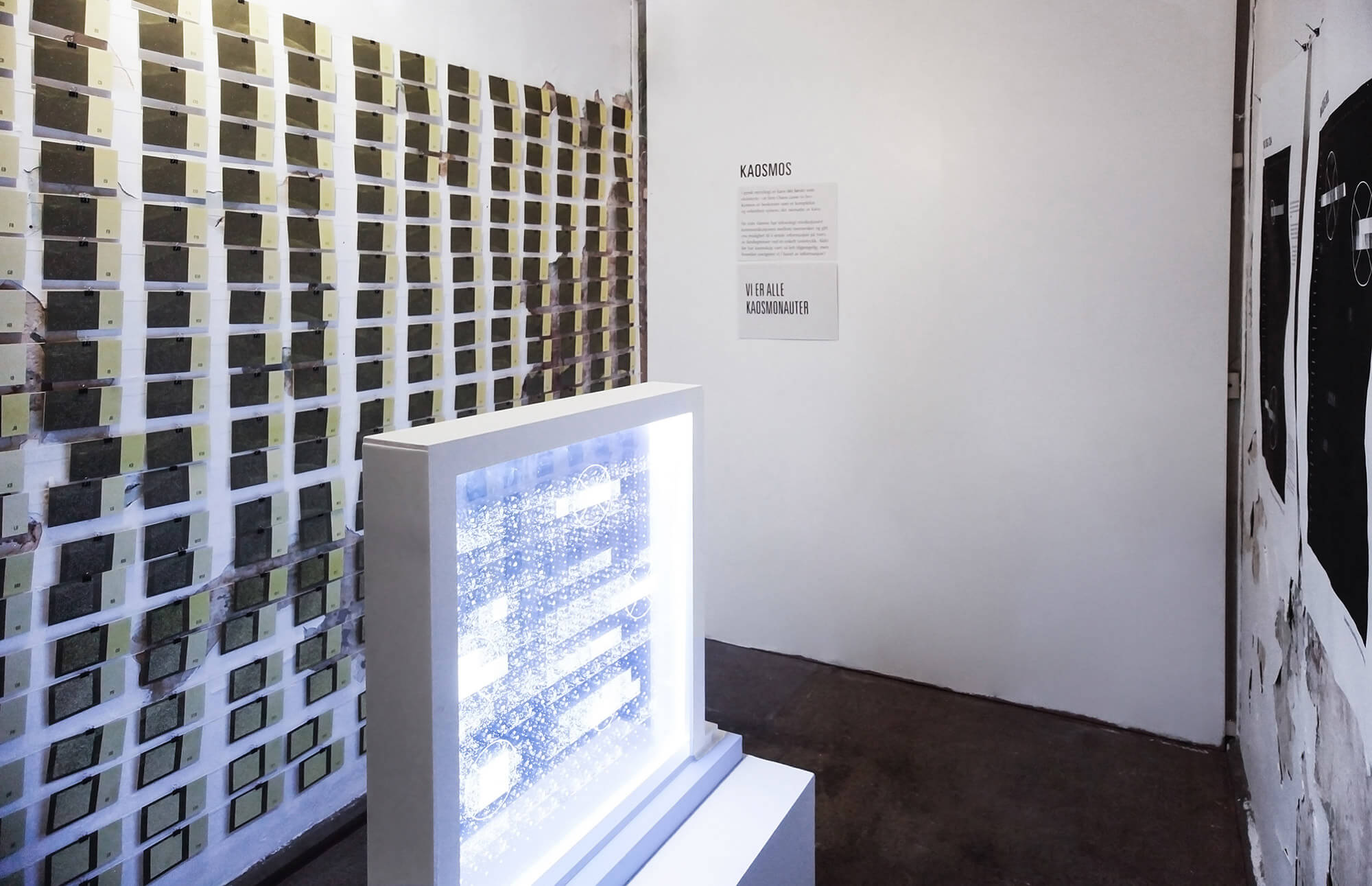
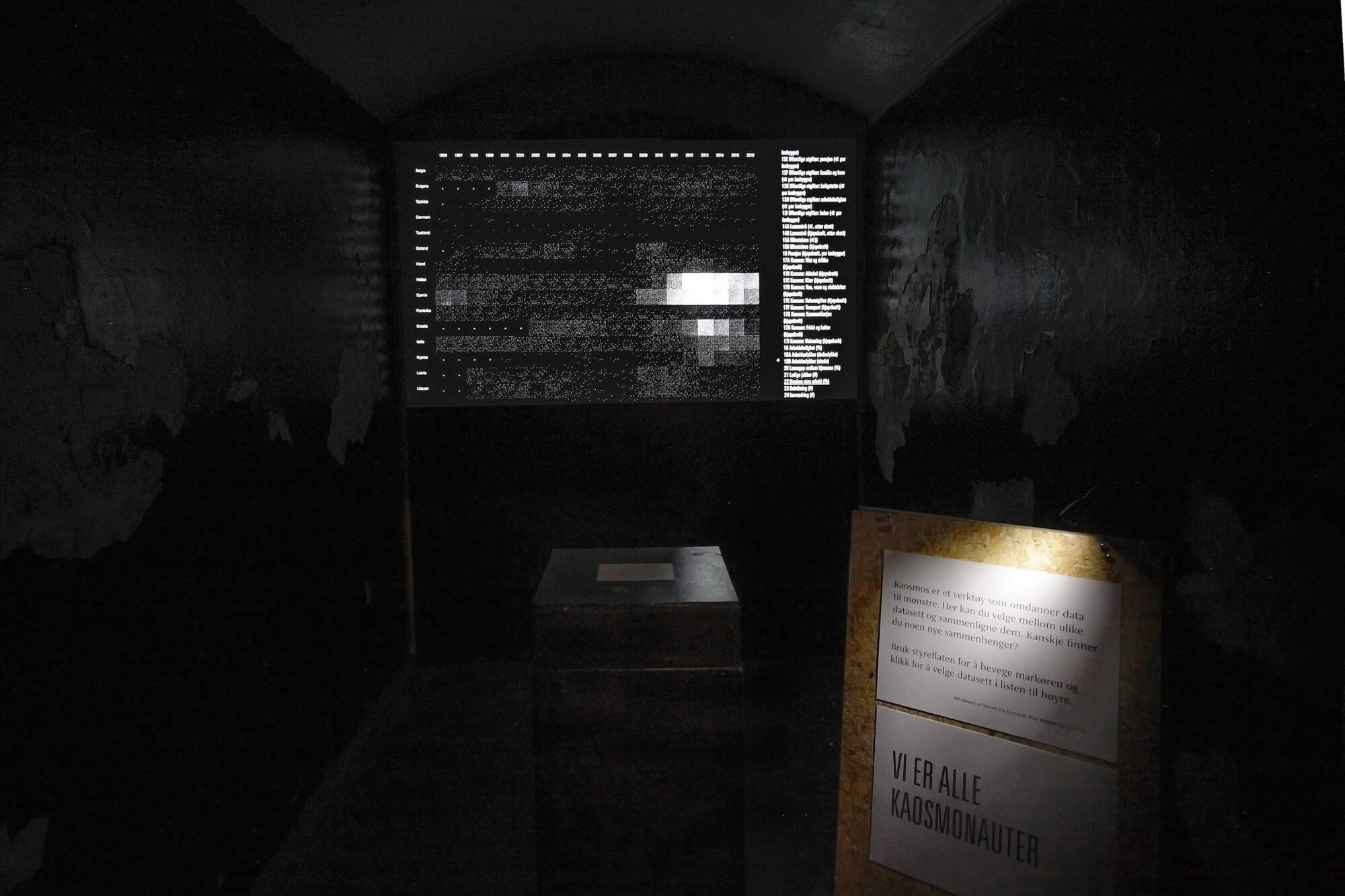
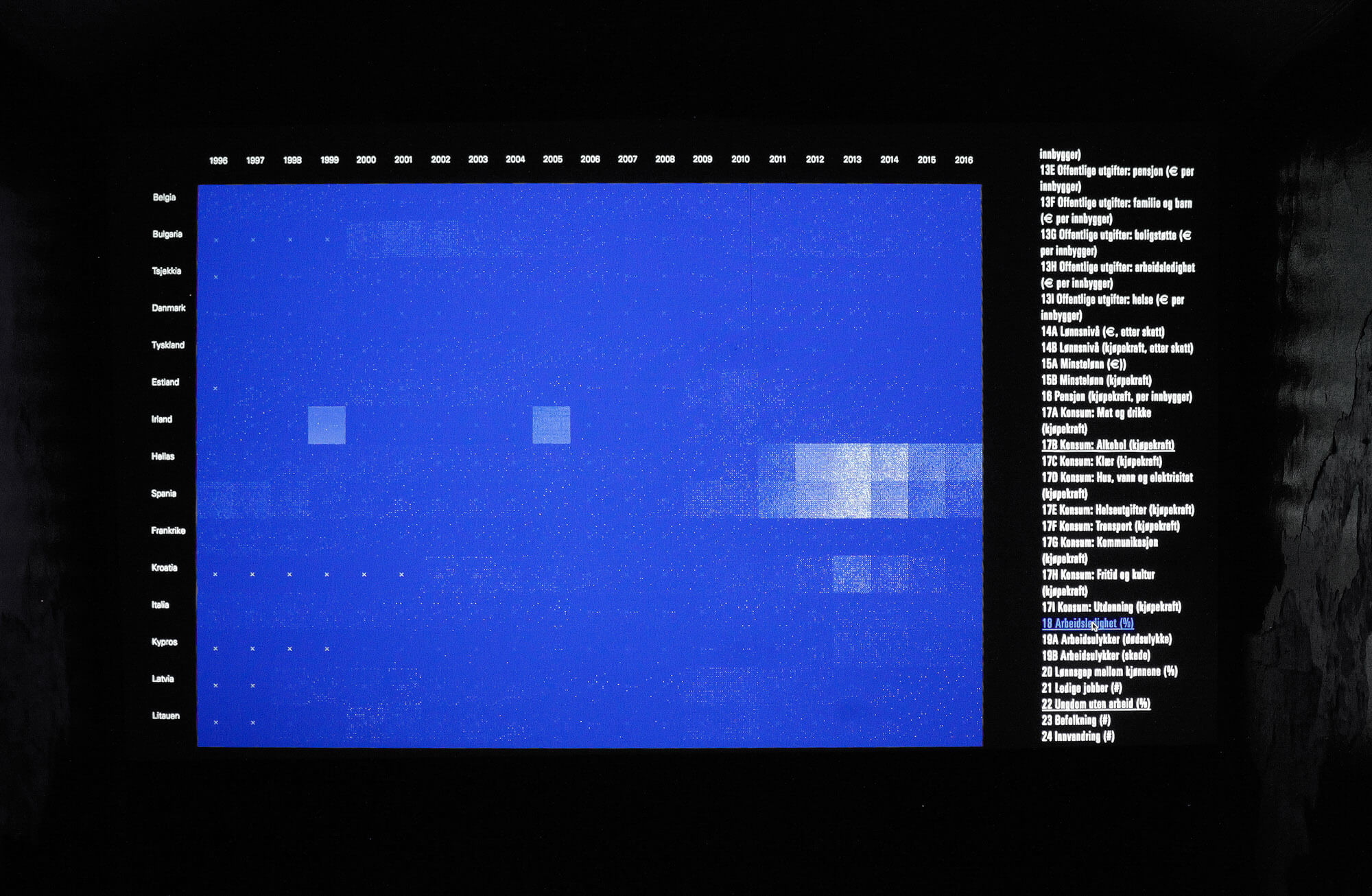
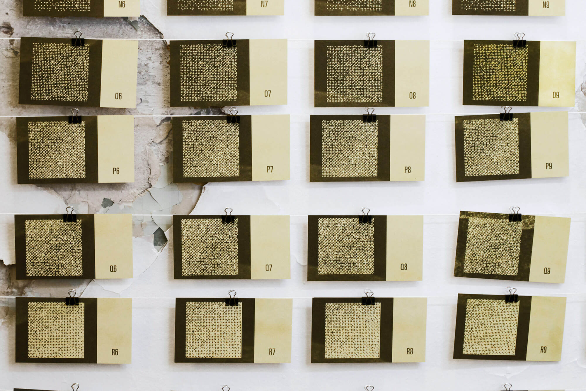
Having said that, there are many exciting projects that violate all of these five criteria, and which challenge us to further move the limits of data visualization. For example, the projects 20Hz (Jarman and Gerhardt, 2011) and Cosmos (Jarman and Gerhardt, 2014) by the artistic duo Semiconductor, as well as the installation Frequencies (Light Quanta) by Nicolas Bernier (Bernier, 2014). I recommend anyone who is interested in alternative forms of data visualization to take a closer look at these three projects.When I worked on this theme in my master’s thesis at the Faculty of Art, Music and Design in 2017, I developed a digital tool that processed data from the EU system into images. Those who visited the master exhibition that year were able to test the digital tool and select, overlap and compare the data, searching its visualization for meaning. Is there, for example, a link between unemployment and emigration rates? How does a financial crisis impact young people? Does pollution affect life expectancy? By utilising our mind’s innate ability to find patterns in complex information, this installation aimed to make data more accessible and make the visitors curious about the numbers behind the patterns. My project was titled Kaosmos, which is a combination of the words chaos and cosmos. According to Greek mythology, first there was chaos—described as a gap or void, and it lasted until the gods created the cosmos, a complex and orderly system built upon logical rules.
There is great untapped potential in the interaction between big data and design. “Big data” is not interesting in and of itself; but the processing of this information can give us interesting answers. The data sets we are working on are getting larger, and they increasingly take the form of a dynamic stream rather than a static source. If old methods are used when visualising data with new qualities, then there is an inherent danger that the data will be adapted to visualization, and not vice versa. This mistake has been repeated throughout history. It is therefore very important to develop new methods of data visualization that enables us to convey complexity without simplification or distortion, and which furthermore has the ability to engage the user through intuitive interaction with the data.
References
Books:
- Bertin, J. (1983). Semiology of graphics. Redlands, Calif.: Esri Press.
- Lima, M. (2014). The Book of Trees: Visualizing Branches of Knowledge. Princeton Architectural Press.
- Lima, M. (2013). Visual complexity: Mapping Patterns of Information. New York: Princeton Architectural Press.
- Margolin, V. (1996). Design discourse. Chicago [u.a.]: Univ. of Chicago Press.
- Sousanis, N. (2015). Unflattening. Cambridge, Massachusetts: Harvard University Press.
- Tufte, E. (2001). The Visual Display of Quantitative Information. 2nd ed. Cheshire, Conn.: Graphics Press.
Internet:
- Dragland, Å. (2013). Big Data, for better or worse: 90 % of world’s data generated over last two years, [internet] ScienceDaily. https://www.sciencedaily. com/releases/2013/05/130522085217. htm [Read 12 Sept. 2018.]
- Jarman, R. & Gerhardt, J. (2011). 20Hz. [internet] http://semiconductorfilms.com/art/20hz/ [Read 17 Sept. 2018.]
- Jarman, R. & Gerhardt, J. (2014). Cosmos. [internet] http://semiconductorfilms.com/art/cosmos/ [Read 17 Sept. 2018.]
- Rehmeyer, J. (2008). Florence Nightingale: The passionate statistician. [Internet] Science News. https://www.sciencenews.org/article/florence- nightingale-passionate-statistician [Read 11 March 2017.]
- Smyers, K. (2013). John Wilder Tukey: The Pioneer of Big Data and Visualization. [Internet] ControlTrends. http://controltrends.org/building- automation-and-integration/05/john-wilder- tukey-the-pioneer-of-big-data-and-visualization/ [Read 14 March 2017.]
- Store norske leksikon (2009). Værenskjeden. [Internet] https://snl.no/v%C3%A6renskjeden [Read 10 Mar. 2017.]
Videos:
- Bernier, N. (2014). Frequencies (light quanta). [video] https://vimeo.com/104745321 [Read 17 Sept. 2018.]
- Lima, M. (2015). A Visual History of Human Knowledge. [video] https://www.youtube.com/ watch?v=BQZKs75RMqM [Read 11 March 2017.]
- Stanford University, (2011). Chaosand Reductionism. [video] https://www.youtube.com/watch?v=_njf8jwEGRo&index=21&list=PL150326949691B199 [Read 12Nov. 2016.]
- Sousanis, N. (2018). Unflattening: Revolutionizing Thought in Comics. [Video] https://www.youtube.com/watch?v=Ln7J10yn9iA [Read 16 Sept. 2018.]
Diagrams:
- Figure 1: Sivarthas, A. (1912). Brain and Body. [illustration] https://www.atlasobscura.com/articles/ map-your-murderousness-with-these-19thcentury- brain-charts [Read 16 Sept. 2018.]
- Figure 2: IBM, (2016). Blue Brain Project. [photo] http://bluebrain.epfl.ch/page-58108-en.html [Read 16 Sept. 2018.]
- Figure 3: Llull, R. (1512). Porphyrian Tree. [illustration] http://www.scottbot.net/HIAL/index. html@p=39166html [Read 16 Sept. 2018.]
- Figure 4: Nightingale, F. (1858). Diagram of the causes of mortality in the army in the East. [diagram] https://commons.wikimedia.org/wiki/File: Nightingale-mortality.jpg [Read 16 Sept. 2018.]
- Figure 7: Bertin, J. (1983). Semiology of graphics. Redlands, Calif.: Esri Press.